library(dplyr)
library(tidyr)
library(ggplot2)Using R to explore and visualize decoupling
Using dplyr, ggplot2 and tidyr with data from Our World in Data
R
ecology
economics
Decoupling is the notion that economic growth can continue without accompanying increases in energy use, greenhouse gas emissions, resource use, biodiversity loss, pollution and other adverse environmental and sociological impacts. This phenomena is highlighted and relied upon as a critical linchpin in the green growth movement. Without decoupling, it is hard to see how economic growth can continue indefinitely on a planet with finite resources and a finite capacity to absorb the byproducts of perpetual growth.
In this post we are going to use R to explore decoupling and hopefully learn a few ggplot things along the way. The data we’ll use is from the well known Our World in Data (OWID) site which has done a great job of making well curated and carefully processed data about our world available for all of us. Their lead researcher is data scientist Hannah Ritchie, who recently wrote a book entitled “Not the End of the World: How We Can Be the First Generation to Build a Sustainable Planet” (Ritchie (2024)) which features numerous visualizations based on OWID data.
We’ll need a few libraries.
Creating the dataset
In the decoupling conversation, GDP is generally used as the measure of economic growth - one of the things that is coupled. It is the driving variable. GDP is tricky to measure and not necessarily a great measure of prosperity. For the driven variable, many possibilities exist but essentially it boils down to resource use or its impact (Vadén et al. (2020)). So, decoupling could occur, or not occur, for any subset of potential driven variables and might involve resource use or environmental impact. It also may be temporary or permanent. Its magnitude may be sufficient to avert some pretty bad outcomes or it may not be. Decoupling might be local, regional or global. Of course, the earth probably isn’t interested in local decoupling unless the ideas underpinning it lead to global decoupling.
I created two dataframes, one at the country level and one at the global level containing a range of variables that would seem to be relevant and for which data was generally available from 1980 until the near present. Data acquisition and processing scripts were written using R and can be found in the data_prep.qmd file in the GitHub repository for this post. The variables included in the global dataframe include:
year- four digit year,population- see https://ourworldindata.org/grapher/population,gdp_per_capita- measured in international $ pegged to year 2011 and adjusted for inflation and differences in cost of living - see https://ourworldindata.org/grapher/gdp-per-capita-maddison-project-database. For the global metrics file, the Maddison source for GDP has many missing values at the World level. So, we are populating the global dataframe from FRED for this metric - see https://fred.stlouisfed.org/series/NYGDPPCAPKDWLD. The units are 2010 dollars.primary_energy_consumption_per_capita__kwh- see https://ourworldindata.org/grapher/per-capita-energy-use. Units are kilowatt-hours per person.annual_emissions_ghg_total_co2eq_per_capita- a measure of greenhouse gas emissions per person which includes land use and forestry in addition to fossil fuel use. Greenhouse gas emissions are measured in tonnes per person of carbon dioxide-equivalents over a 100-year timescale. See https://ourworldindata.org/grapher/total-greenhouse-gas-emissions-per-capita.annual_emissions_ghg_fossil_co2eq_per_capita- same as previous but emissions due to land use changes and forestry are excluded. See https://ourworldindata.org/grapher/per-capita-ghg-excl-land-use.*_consumption_twh- consumption of various fossil fuels (gas, oil and coal and their total) in terawatt-hours. See https://ourworldindata.org/grapher/fossil-fuel-consumption-by-fuel-type.production.*.Mine.tonnes- cobalt, copper, lithium, nickel and steel production - see https://ourworldindata.org/metals-minerals.freshwater_withdrawals_m3- total water withdrawals, not counting evaporation and in cubic meters. See https://ourworldindata.org/grapher/annual-freshwater-withdrawals.mean_surface_temp_2m- mean temperature of the earth in Celsius at 2m above the surface. See https://ourworldindata.org/grapher/average-monthly-surface-temperature.ocean_heat_content_*_2000m- amount of heat in the top 2000m of the oceans. See https://ourworldindata.org/grapher/ocean-heat-top-2000m. The units are relative to 1971 and based on a large multiple of joules.under_five_mortality- number of deaths per 100 births before the age of 5. See https://ourworldindata.org/grapher/child-mortality.children_per_woman- See https://ourworldindata.org/grapher/children-per-woman-un.gini_coefficient- a measure of societal inequality on a [0, 1] scale. Values closer to 1.0 mean more inequality. See https://ourworldindata.org/what-is-the-gini-coefficient.life_expectancy- in years at birth. See https://ourworldindata.org/grapher/life-expectancy.
The country level dataframe includes a country identifier. The following aggregate country related fields were populated using the countrycode package.
continent- each country belongs to a continent.region23- each country is classified as being part of one of twenty-three regionsiso3c- a unique 3 character code for each country
There are a few computed fields:
primary_energy_consumption_Twh- product ofpopulationandprimary_energy_consumption_per_capita__kwhand rescaled to terrawatt hours.annual_emissions_ghg_total_co2eq- product ofpopulationandannual_emissions_ghg_total_co2eq_per_capita.annual_emissions_ghg_fossil_co2eq- product ofpopulationandannual_emissions_ghg_fossil_co2eq_per_capita.gdp_total- product ofpopulationandgdp_per_capita.
The basic data processing steps were:
- download a number of different datasets using the Our World in Data API into individual dataframes,
- combine all the dataframes by left joining on
EntityandYear, - use
dplyr::filter()to only keep data from 1980 on, - use
dplyr::filter()along with thegrepl()function to get rid of rows that are not associated with countries (e.g. continents), - create a separate global level dataframe (filtering on `Entity == ‘World’),
- add variables to the global dataframe that aren’t relevant at the country level,
- create a few computed features,
- added codes such as
region23andiso3c, - exported the dataframes to CSV files.
The final result is two CSV files, country_metrics.csv and world_metrics.csv. Let’s read these in and take a look.
country_metrics_df <- read.csv('data/owid/country_metrics.csv')
world_metrics_df <- read.csv('data/owid/world_metrics.csv')summary(world_metrics_df) Entity year population
Length:44 Min. :1980 Min. :4.448e+09
Class :character 1st Qu.:1991 1st Qu.:5.396e+09
Mode :character Median :2002 Median :6.296e+09
Mean :2002 Mean :6.298e+09
3rd Qu.:2012 3rd Qu.:7.224e+09
Max. :2023 Max. :8.092e+09
primary_energy_consumption_per_capita__kwh
Min. :16753
1st Qu.:17641
Median :18067
Mean :18891
3rd Qu.:20448
Max. :21394
annual_emissions_ghg_total_co2eq_per_capita
Min. :6.440
1st Qu.:6.753
Median :6.907
Mean :6.904
3rd Qu.:7.093
Max. :7.498
annual_emissions_ghg_fossil_co2eq_per_capita gas_consumption_twh
Min. :4.817 Min. :14237
1st Qu.:4.961 1st Qu.:19850
Median :5.160 Median :24673
Mean :5.205 Mean :26128
3rd Qu.:5.454 3rd Qu.:33333
Max. :5.652 Max. :40239
coal_consumption_twh oil_consumption_twh tot_fossil_fuel_consumption_twh
Min. :20878 Min. :33100 Min. : 69136
1st Qu.:25766 1st Qu.:37668 1st Qu.: 83248
Median :28416 Median :43508 Median : 96597
Mean :33040 Mean :43571 Mean :102739
3rd Qu.:42851 3rd Qu.:48850 3rd Qu.:126842
Max. :45565 Max. :54564 Max. :140231
production.Cobalt.Mine.tonnes production.Copper.Mine.tonnes
Min. : 18000 Min. : 7200000
1st Qu.: 35700 1st Qu.: 9297500
Median : 51800 Median :13650000
Mean : 73541 Mean :13704773
3rd Qu.:104750 3rd Qu.:17125000
Max. :230000 Max. :22000000
production.Lithium.Mine.tonnes production.Nickel.Mine.tonnes
Min. : 13100 Min. : 621000
1st Qu.: 19650 1st Qu.: 968500
Median : 30650 Median :1350000
Mean : 48612 Mean :1540250
3rd Qu.: 77925 3rd Qu.:2115000
Max. :180000 Max. :3600000
NA's :20
production.Steel.Processing..crude.tonnes freshwater_withdrawals_m3
Min. :6.440e+08 Min. :3.856e+12
1st Qu.:7.362e+08 1st Qu.:3.875e+12
Median :8.795e+08 Median :3.900e+12
Mean :1.127e+09 Mean :3.898e+12
3rd Qu.:1.542e+09 3rd Qu.:3.920e+12
Max. :1.950e+09 Max. :3.949e+12
NA's :36
mean_surface_temp_2m under_five_mortality children_per_woman life_expectancy
Min. :13.85 Min. :3.712 Min. :2.251 Min. :60.50
1st Qu.:14.10 1st Qu.:4.425 1st Qu.:2.584 1st Qu.:64.04
Median :14.29 Median :6.032 Median :2.699 Median :66.91
Mean :14.31 Mean :6.287 Mean :2.865 Mean :67.11
3rd Qu.:14.47 3rd Qu.:8.143 3rd Qu.:3.176 3rd Qu.:70.83
Max. :14.97 Max. :9.303 Max. :3.744 Max. :73.17
NA's :11
gdp_per_capita ocean_heat_content_noaa_2000m ocean_heat_content_mri_2000m
Min. : 5897 Min. :-2.249 Min. :-2.8327
1st Qu.: 6791 1st Qu.: 1.666 1st Qu.: 0.9673
Median : 7953 Median : 8.016 Median : 7.5673
Mean : 8263 Mean : 9.976 Mean :10.2786
3rd Qu.: 9651 3rd Qu.:16.803 3rd Qu.:17.0373
Max. :11579 Max. :29.105 Max. :29.2773
NA's :3
ocean_heat_content_iap_2000m primary_energy_consumption_Twh
Min. :-4.85103 Min. : 77357
1st Qu.: 0.02597 1st Qu.: 96337
Median : 8.30797 Median :113072
Mean :10.20616 Mean :120461
3rd Qu.:18.53997 3rd Qu.:148203
Max. :29.42097 Max. :173112
NA's :3
annual_emissions_ghg_total_co2eq annual_emissions_ghg_fossil_co2eq
Min. :3.232e+10 Min. :2.302e+10
1st Qu.:3.733e+10 1st Qu.:2.722e+10
Median :4.150e+10 Median :3.070e+10
Mean :4.337e+10 Mean :3.298e+10
3rd Qu.:5.116e+10 3rd Qu.:4.078e+10
Max. :5.382e+10 Max. :4.411e+10
gdp_total
Min. :2.657e+13
1st Qu.:3.658e+13
Median :5.007e+13
Mean :5.389e+13
3rd Qu.:6.972e+13
Max. :9.369e+13
The country_metrics_df dataframe has most of the same columns but is by country by year.
Defining decoupling is tricky
Decoupling is a complex topic. I highly recommend Parrique et al. (2019) to get a concise overview of what decoupling is and analysis of whether or not or to what degree it is happening and is likely to happen in the future.
- Parrique, Timothée, Jonathan Barth, François Briens, Christian Kerschner, Alejo Kraus-Polk, Anna Kuokkanen, and Joachim H Spangenberg. “Decoupling Debunked.” Evidence and Arguments against Green Growth as a Sole Strategy for Sustainability. A Study Edited by the European Environment Bureau EEB 3 (2019).
For this post, a couple of concepts are important. Relative decoupling is when the driven variable is growing slower than the driving variable (i.e. GDP). Absolute decoupling is when the driving variable is not growing (decreasing hopefully) even though the driving variable continues to grow. In the EEB study, it is argued that:
The validity of the green growth discourse relies on the assumption of an absolute, permanent, global, large and fast enough decoupling of economic growth from all critical environmental pressures.
There’s a lot to chew on there and we certainly aren’t going to get into all of it in this post. Instead, this is just a glimpse at a handful of metrics to see if there’s evidence of decoupling and if it’s relative or absolute. We’ll use R to do it and hopefully learn a few dplyr, tidyr, and ggplot2 tricks along the way.
Basic time series plots of GDP vs primary energy consumption
What if we want to compare two time series such as gdp_total and primary_energy_consumption_Twh? The units are different so we really shouldn’t plot together with two y-axes. We could facet them using a long version of the data.
world_metrics_df |>
  select(year, gdp_total, primary_energy_consumption_Twh) |>
  pivot_longer(cols = c(gdp_total, primary_energy_consumption_Twh), names_to = 'metric', values_to = 'value') |>
  ggplot(aes(x = year, y = value)) +
  geom_line() +
  facet_grid(metric ~ ., scales = 'free_y')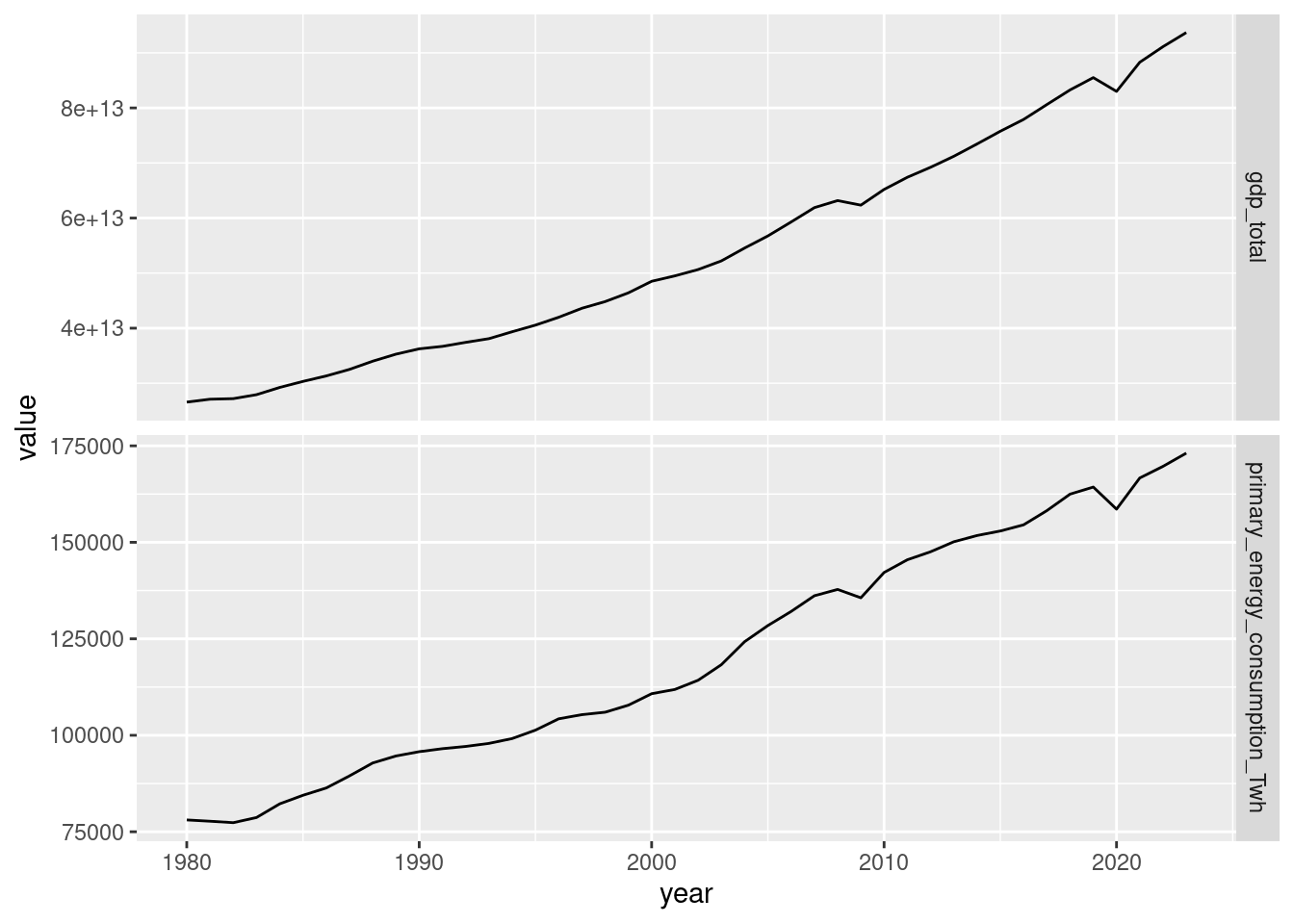
The slopes look similar but that’s just due to the axis limits on the graphs. We could also scatter them against each other.
world_metrics_df |>
  ggplot() +
geom_point(aes(x = gdp_total, y = primary_energy_consumption_Twh, colour = year)) 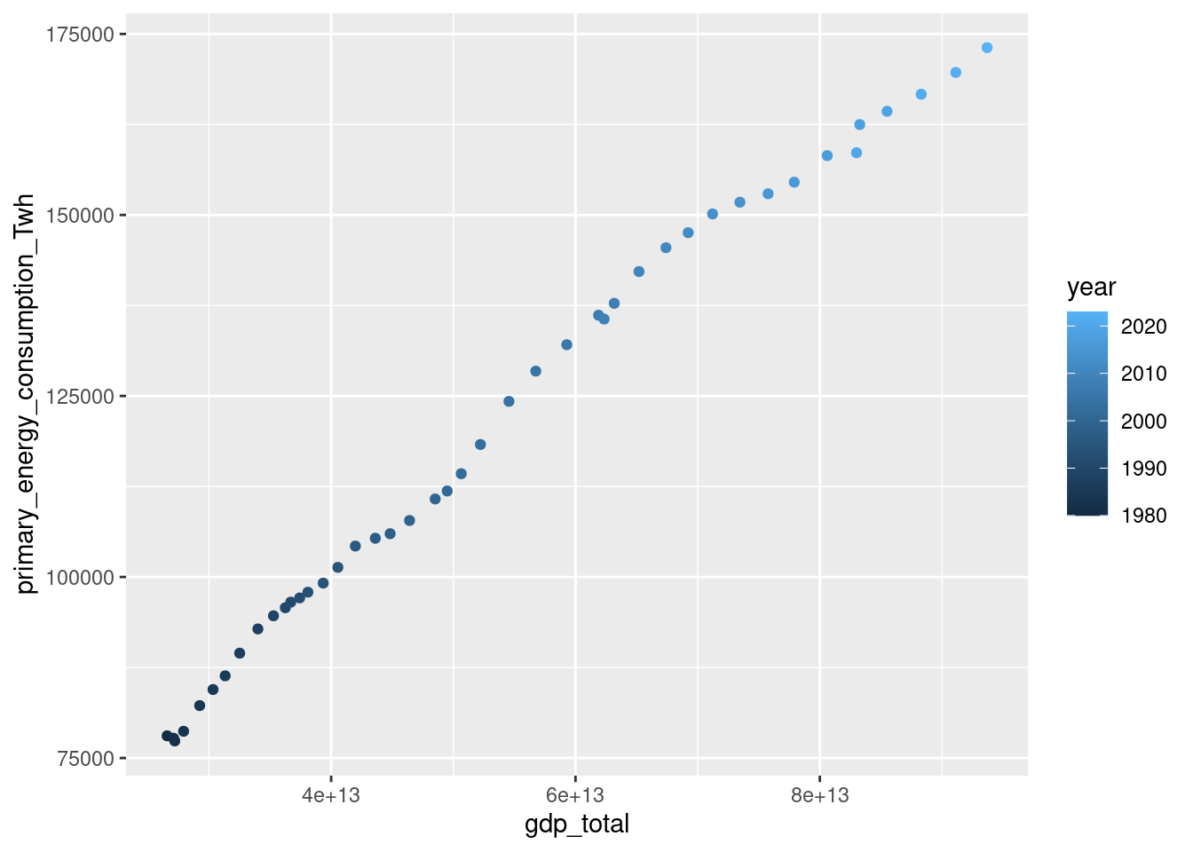
Looks like GDP and PEC (primary energy consumption) are not decoupled.
Another option is to index the different series to year 1. Since world_metrics_df is ordered by year, this is relatively straightforward to do for that dataframe. However, for country_metrics_df this will require some careful dplyr use.
For world_metrics_df we can use mutate() to compute the indexed series. For this first plot, I’ll use separate geom_line() objects. The downside of doing plots in this way is that it’s tricky to create a legend. You have to map color in aes() to a string representing the variable as you want it to read in the legend and then use scale_color_manual with a named vector of colors. See https://forum.posit.co/t/adding-manual-legend-to-ggplot2/41651. That is not straight forward and definitely not the “tidy” way to do it.
colors <- c("gdp_total_idx" = "blue", "primary_energy_consumption_Twh_idx" = "black")

world_metrics_df |>
  mutate(gdp_total_idx = gdp_total / gdp_total[1],
         primary_energy_consumption_Twh_idx = primary_energy_consumption_Twh / primary_energy_consumption_Twh[1]) |>
  ggplot() +
  geom_line(aes(x=year, y = gdp_total_idx, color = "gdp_total_idx"), linetype = 'solid') +
  geom_line(aes(x=year, y = primary_energy_consumption_Twh_idx,
                color = "primary_energy_consumption_Twh_idx"), linetype = 'dashed') +
  labs(x = "Year (1980 is year 1)", y = "Multiple of year 1",
       color = "Legend", title = "Primary energy consumption") +
    scale_color_manual(values = colors)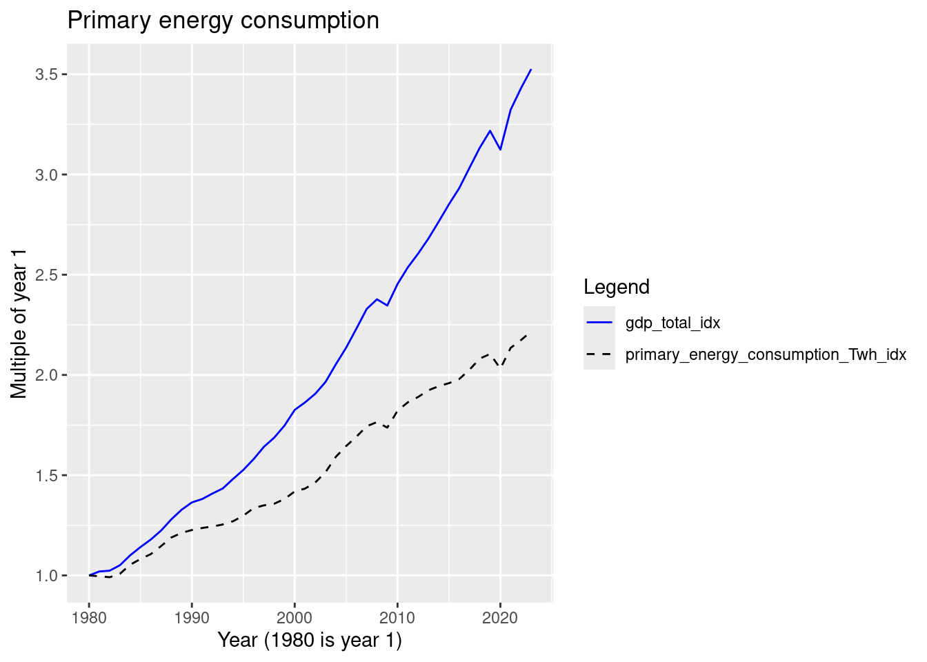
From this plot, we can see that the two series exhibit relative decoupling. The overall rate of increase for PEC is less than that of GDP, but it’s still increasing.
Instead of two geoms, we could pivot to long data and filter and facet by metric. This gives us the automatic legend creation and is the tidy approach.
world_metrics_df |>
  mutate(gdp_total_idx = gdp_total / gdp_total[1],
         primary_energy_consumption_Twh_idx = primary_energy_consumption_Twh / primary_energy_consumption_Twh[1]) |>
  select(year, gdp_total_idx, primary_energy_consumption_Twh_idx) |>
  pivot_longer(cols = c(gdp_total_idx, primary_energy_consumption_Twh_idx), names_to = 'metric', values_to = 'value') |>
  ggplot() +
  geom_line(aes(x=year, y = value, color = metric)) +
  scale_color_manual(values = c("#6C5043FF", "#A3BAC2FF")) +
  labs(x = "Year (1980 is year 1)", y = "Multiple of year 1",
       title = "Primary Energy Consumption")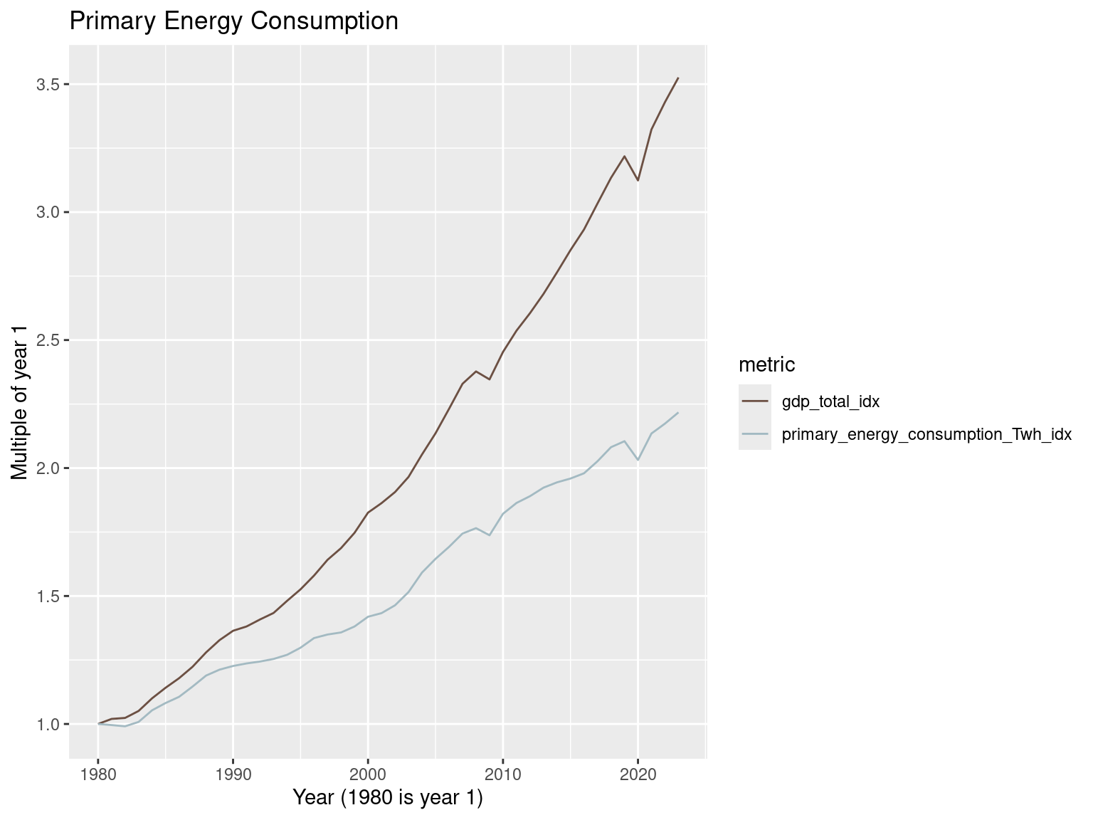
Let’s take a closer look at the most recent few years.
world_metrics_df |>
  filter(year >= 2020) |>
  mutate(gdp_total_idx = gdp_total / gdp_total[1],
         primary_energy_consumption_Twh_idx = primary_energy_consumption_Twh / primary_energy_consumption_Twh[1]) |>
  select(year, gdp_total_idx, primary_energy_consumption_Twh_idx) |>
  pivot_longer(cols = c(gdp_total_idx, primary_energy_consumption_Twh_idx),
               names_to = 'metric', values_to = 'value') |>
  ggplot() +
  geom_line(aes(x=year, y = value, color = metric)) +
  scale_color_manual(values = c("#6C5043FF", "#A3BAC2FF")) +
  labs(x = "Year (2020 is year 1)", y = "Multiple of year 1",
       title = "Primary Energy Consumption")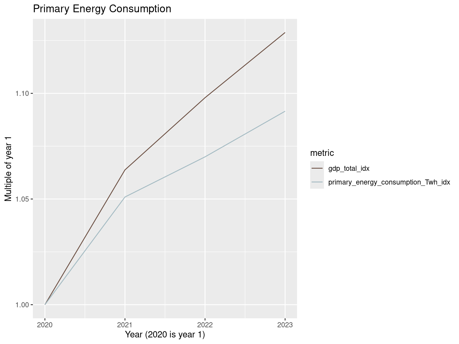
What if we use per-capita values for these same two metrics?
world_metrics_df |>
  mutate(gdp_per_capita_idx = gdp_per_capita / gdp_per_capita[1],
         primary_energy_consumption_per_capita__kwh_idx = primary_energy_consumption_per_capita__kwh / primary_energy_consumption_per_capita__kwh[1]) |>
  select(year, gdp_per_capita_idx, primary_energy_consumption_per_capita__kwh_idx) |>
  pivot_longer(cols = c(gdp_per_capita_idx, primary_energy_consumption_per_capita__kwh_idx),
               names_to = 'metric', values_to = 'value') |>
  ggplot() +
  geom_line(aes(x=year, y = value, color = metric)) +
  scale_color_manual(values = c("#6C5043FF", "#A3BAC2FF")) +
  labs(x = "Year (1980 is year 1)", y = "Multiple of year 1",
       title = "Primary Energy Consumption (per capita)")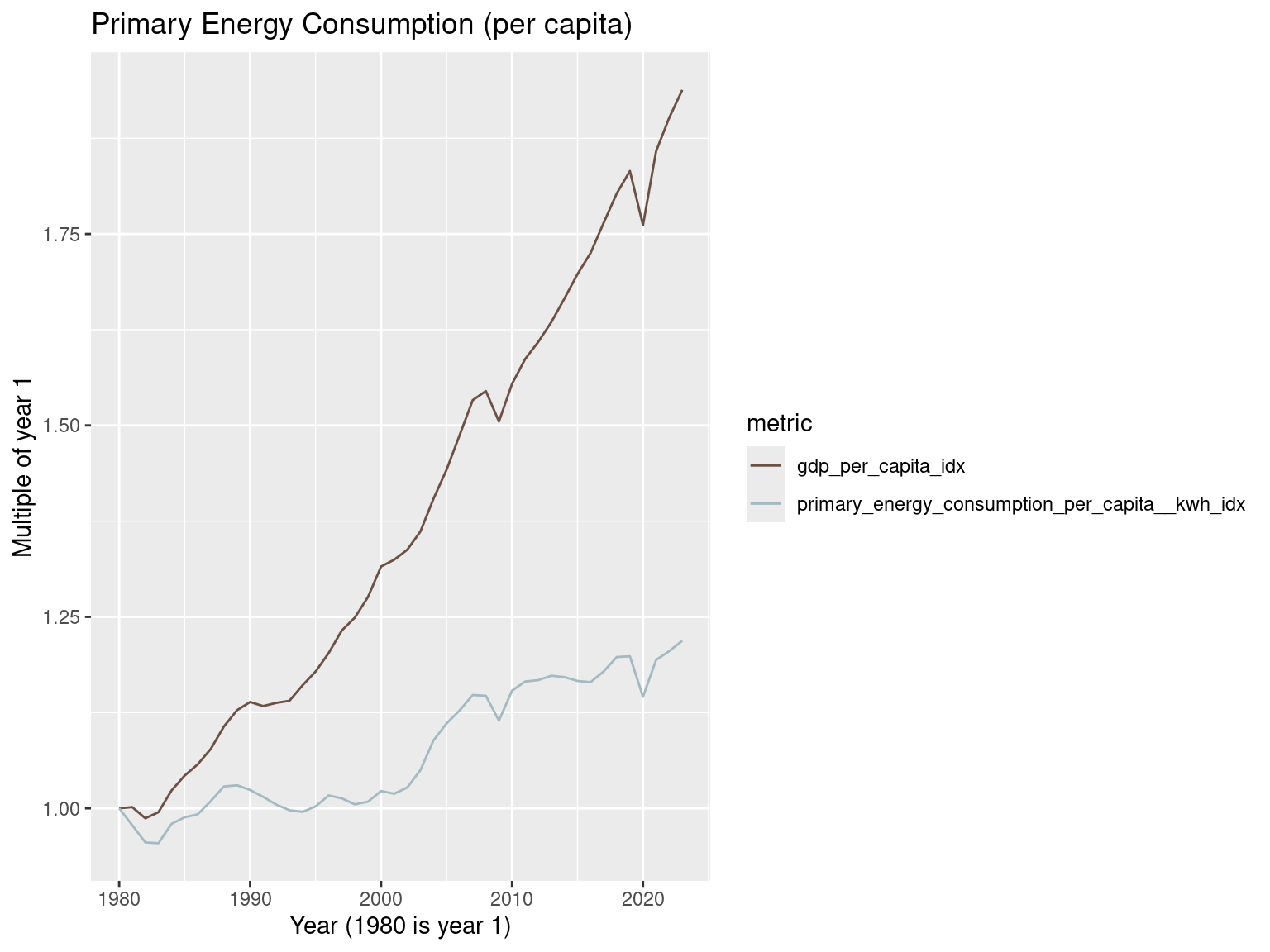
So, one sees a greater degree of relative decoupling in the per capita versions of these two metrics. From the earth’s perspective, it doesn’t really care so much about per capita statistics - it’s the overall amount that really matters.
Looking at the last few years, the slopes of the two series are more similar than in the plot starting at 1980. When looking at decoupling, the date range can matter. One might get relative (or even absolute) decoupling for a period of time, only to see that revert to more coupled behavior.
world_metrics_df |>
  filter(year >= 2020) |>
  mutate(gdp_per_capita_idx = gdp_per_capita / gdp_per_capita[1],
         primary_energy_consumption_per_capita__kwh_idx = primary_energy_consumption_per_capita__kwh / primary_energy_consumption_per_capita__kwh[1]) |>
  select(year, gdp_per_capita_idx, primary_energy_consumption_per_capita__kwh_idx) |>
  pivot_longer(cols = c(gdp_per_capita_idx, primary_energy_consumption_per_capita__kwh_idx),
               names_to = 'metric', values_to = 'value') |>
  ggplot() +
  geom_line(aes(x=year, y = value, color = metric)) +
  scale_color_manual(values = c("#6C5043FF", "#A3BAC2FF")) +
  labs(x = "Year (2020 is year 1)", y = "Multiple of year 1",
       title = "Primary Energy Consumption (per capita)")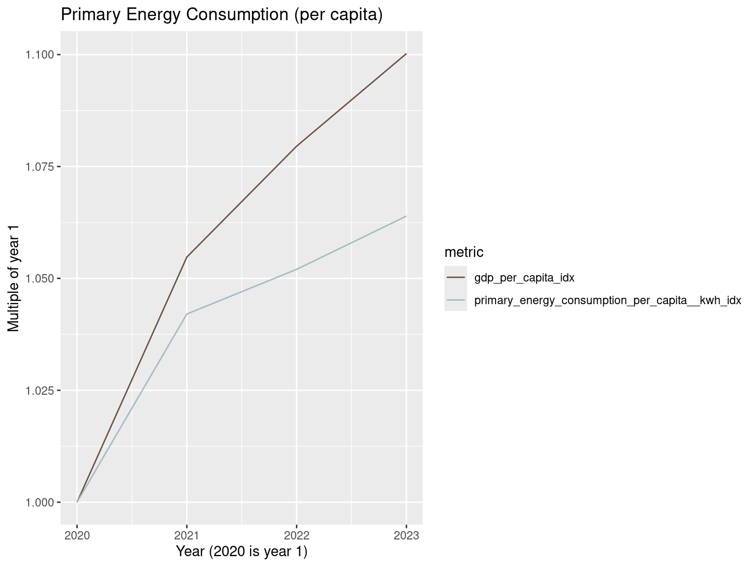
Greenhouse gas emissions
There was a high profile study done by the World Resources Institute in 2016 entitled The Roads to Decoupling: 21 Countries Are Reducing Carbon Emissions While Growing GDP. Reading the report, it would seem the analysis was production based and not consumption based - a comment is made near the end:
Beyond the aggregate trends described here, more information is needed on the potential leakage of carbon emissions to other countries as nations move their industries overseas, factors that enable sustained and absolute decoupling, and what’s needed to support larger-scale emissions mitigation.
Greenhouse gas emissions are measured in tonnes per person of carbon dioxide-equivalents over a 100-year timescale. See https://ourworldindata.org/grapher/total-greenhouse-gas-emissions-per-capita and https://ourworldindata.org/grapher/per-capita-ghg-excl-land-use.
Let’s start by looking at the whole world and just at fossil fuel emissions.
world_metrics_df |>
  mutate(gdp_total_idx = gdp_total / gdp_total[1],
         annual_emissions_ghg_fossil_co2eq_idx = annual_emissions_ghg_fossil_co2eq / annual_emissions_ghg_fossil_co2eq[1]) |>
  select(year, gdp_total_idx, annual_emissions_ghg_fossil_co2eq_idx) |>
  pivot_longer(cols = c(gdp_total_idx, annual_emissions_ghg_fossil_co2eq_idx),
               names_to = 'metric', values_to = 'value') |>
  ggplot() +
  geom_line(aes(x=year, y = value, color = metric)) +
  scale_color_manual(values = c("#A3BAC2FF", "#6C5043FF")) +
  labs(x = "Year (1980 is year 1)", y = "Multiple of year 1",
       title = "Annual GHG emissions (excluding land use)")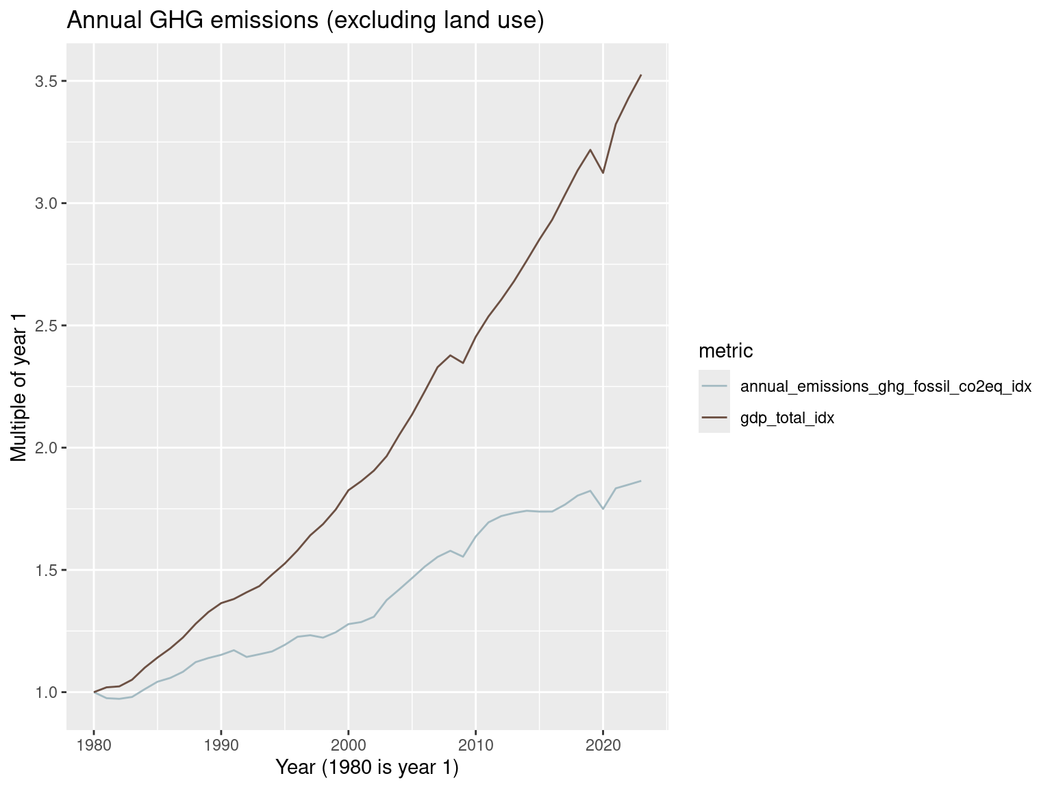
This plot reveals relative decoupling at the global level but still we have emissions increasing. That’s not terribly surprising if one keeps up with the various attempts at forging international agreements for reducing greenhouse gas emissions. There have been decades of talk with not much in terms of results. Meanwhile, the world keeps warming and the outlook isn’t great for our climate.
The last few years look like this.
world_metrics_df |>
  filter(year >= 2020) |>
  mutate(gdp_total_idx = gdp_total / gdp_total[1],
         annual_emissions_ghg_fossil_co2eq_idx = annual_emissions_ghg_fossil_co2eq / annual_emissions_ghg_fossil_co2eq[1]) |>
  select(year, gdp_total_idx, annual_emissions_ghg_fossil_co2eq_idx) |>
  pivot_longer(cols = c(gdp_total_idx, annual_emissions_ghg_fossil_co2eq_idx), names_to = 'metric', values_to = 'value') |>
  ggplot() +
  geom_line(aes(x=year, y = value, color = metric)) +
  scale_color_manual(values = c("#A3BAC2FF", "#6C5043FF"))+
  labs(x = "Year (2020 is year 1)", y = "Multiple of year 1",
       title = "Annual GHG emissions (excluding land use)")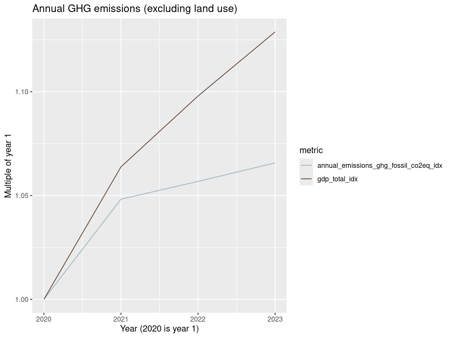
Now let’s consider greenhouse gas emissions that also factor in land use changes and forestry.
world_metrics_df |>
  mutate(gdp_total_idx = gdp_total / gdp_total[1],
         annual_emissions_ghg_total_co2eq_idx = annual_emissions_ghg_total_co2eq / annual_emissions_ghg_total_co2eq[1]) |>
  select(year, gdp_total_idx, annual_emissions_ghg_total_co2eq_idx) |>
  pivot_longer(cols = c(gdp_total_idx, annual_emissions_ghg_total_co2eq_idx),
               names_to = 'metric', values_to = 'value') |>
  ggplot() +
  geom_line(aes(x=year, y = value, color = metric)) +
  scale_color_manual(values = c("#A3BAC2FF", "#6C5043FF")) +
  labs(x = "Year (1980 is year 1)", y = "Multiple of year 1",
       title = "Annual GHG emissions (including land use)")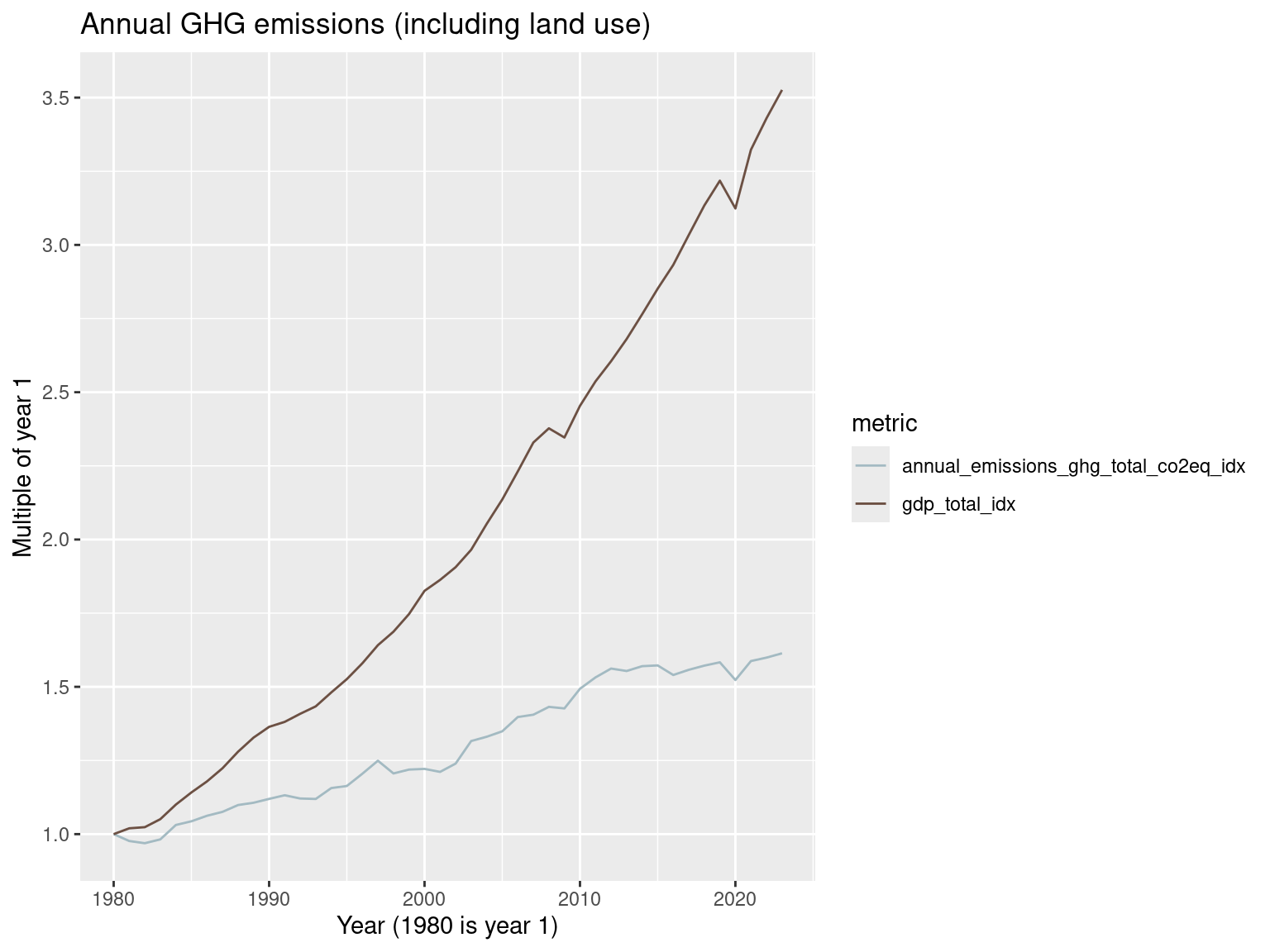
world_metrics_df |>
  filter(year >= 2020) |>
  mutate(gdp_total_idx = gdp_total / gdp_total[1],
         annual_emissions_ghg_total_co2eq_idx = annual_emissions_ghg_total_co2eq / annual_emissions_ghg_total_co2eq[1]) |>
  select(year, gdp_total_idx, annual_emissions_ghg_total_co2eq_idx) |>
  pivot_longer(cols = c(gdp_total_idx, annual_emissions_ghg_total_co2eq_idx),
               names_to = 'metric', values_to = 'value') |>
  ggplot() +
  geom_line(aes(x=year, y = value, color = metric)) +
  scale_color_manual(values = c("#A3BAC2FF", "#6C5043FF")) +
  labs(x = "Year (2020 is year 1)", y = "Multiple of year 1",
       title = "Annual GHG emissions (including land use)")
Still seeing relative decoupling.
What about those 21 countries in the 2016 report mentioned above?
wri_21 <- c('Austria',
  'Belgium',
  'Bulgaria',
  'Czechia',
  'Denmark',
  'Finland',
  'France',
  'Germany',
  'Hungary',
  'Ireland',
  'Netherlands',
  'Portugal',
  'Romania',
  'Slovakia',
  'Spain',
  'Sweden',
  'Switzerland',
  'Ukraine',
  'United Kingdom',
  'United States',
  'Uzbekistan'
  )
Here we need to be careful when computing the indexed values of our metrics. Notice we use a pattern that looks like this:
  arrange(country, year) |>
  group_by(country, year) |>
  mutate(indexed_variable = value / value[1]) |>
  ungroup()
We need to do a group_by() so that we divide by the group level base value. Then we need to ungroup() to get our detailed level data back for plotting.
country_metrics_df |>
  filter(country %in% wri_21, year < 2023) |>
  arrange(country, year) |>
  group_by(country) |>
  mutate(gdp_total_idx = gdp_total / gdp_total[1],
       annual_emissions_ghg_total_co2eq_idx = annual_emissions_ghg_total_co2eq / annual_emissions_ghg_total_co2eq[1]) |>
  ungroup() |>
  select(year, country, gdp_total_idx, annual_emissions_ghg_total_co2eq_idx) |>
  pivot_longer(cols = c(gdp_total_idx, annual_emissions_ghg_total_co2eq_idx),
               names_to = 'metric', values_to = 'value') |>
  ggplot() +
  geom_line(aes(x=year, y = value, color = metric)) +
  facet_wrap(~country, scales = 'free_y') +
  scale_color_manual(values = c("#A3BAC2FF", "#6C5043FF")) +
  labs(x = "Year (1980 is year 1)", y = "Multiple of year 1",
       title = "Annual GHG emissions (including land use)")
Warning: Removed 43 rows containing missing values or values outside the scale range
(`geom_line()`).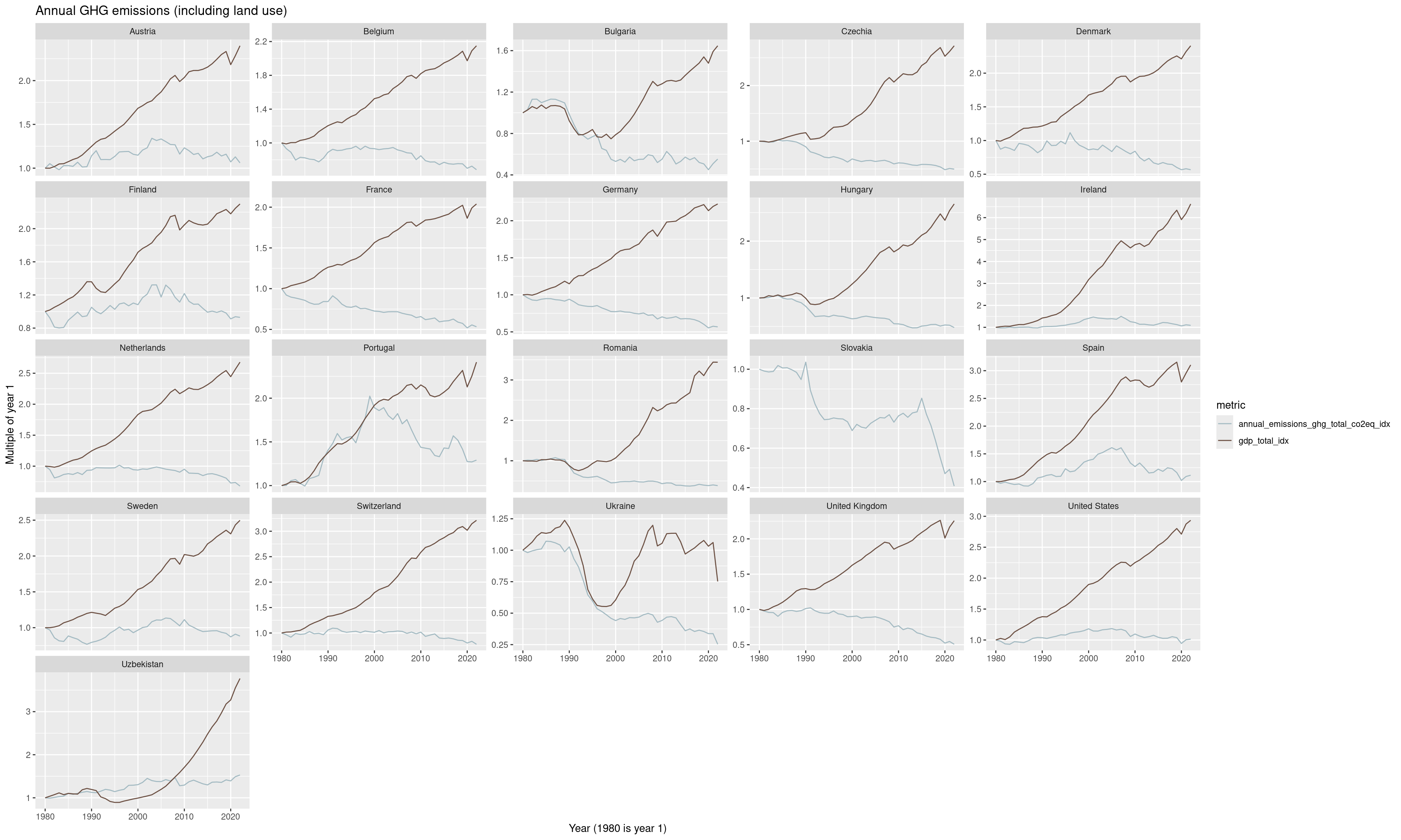
For these 21 countries, absolute decoupling of overall greenhouse gas emissions (production) from GDP seems to be ongoing for the most part. However, as mentioned earlier, one has to wonder about consumption based measures. It was shown by Davis and Caldeira (2010) that in developed countries the difference between production and consumption of greenhouse gas emissions to be around 30%. Developed countries can essentially offload their emissions to less developed countries, who might also have less efficient production technology, and then import the goods produced by those less developed countries. And of course, since globally we definitely do not see absolute decoupling, there must be several populous countries for which absolute decoupling is not happening. For example:
country_metrics_df |>
  filter(country %in% c('China', 'India', 'Brazil', 'Mexico', 'South Africa',
                        'Vietnam', 'Venezuela', 'Iran', 'Saudi Arabia')) |>
  arrange(country, year) |>
  group_by(country) |>
  mutate(gdp_total_idx = gdp_total / gdp_total[1],
       annual_emissions_ghg_total_co2eq_idx = annual_emissions_ghg_total_co2eq / annual_emissions_ghg_total_co2eq[1]) |>
  ungroup() |>
  select(year, country, gdp_total_idx, annual_emissions_ghg_total_co2eq_idx) |>
  pivot_longer(cols = c(gdp_total_idx, annual_emissions_ghg_total_co2eq_idx),
               names_to = 'metric', values_to = 'value') |>
  ggplot() +
  geom_line(aes(x=year, y = value, color = metric)) +
  facet_wrap(~country, scales = 'free_y') +
  scale_color_manual(values = c("#A3BAC2FF", "#6C5043FF")) +
  labs(x = "Year (1980 is year 1)", y = "Multiple of year 1",
       title = "Annual GHG emissions (including land use)")
Fossil fuel consumption
In countries such as the US, coal plants have been closing in recent years. What does coal consumption look like on a global scale?
world_metrics_df |>
  mutate(gdp_total_idx = gdp_total / gdp_total[1],
         coal_consumption_twh_idx = coal_consumption_twh / coal_consumption_twh[1]) |>
  select(year, gdp_total_idx, coal_consumption_twh_idx) |>
  pivot_longer(cols = c(gdp_total_idx, coal_consumption_twh_idx),
               names_to = 'metric', values_to = 'value') |>
  ggplot() +
  geom_line(aes(x=year, y = value, color = metric)) +
  scale_color_manual(values = c("#A3BAC2FF", "#6C5043FF")) +
  labs(x = "Year (1980 is year 1)", y = "Multiple of year 1",
       title = "Coal consumption")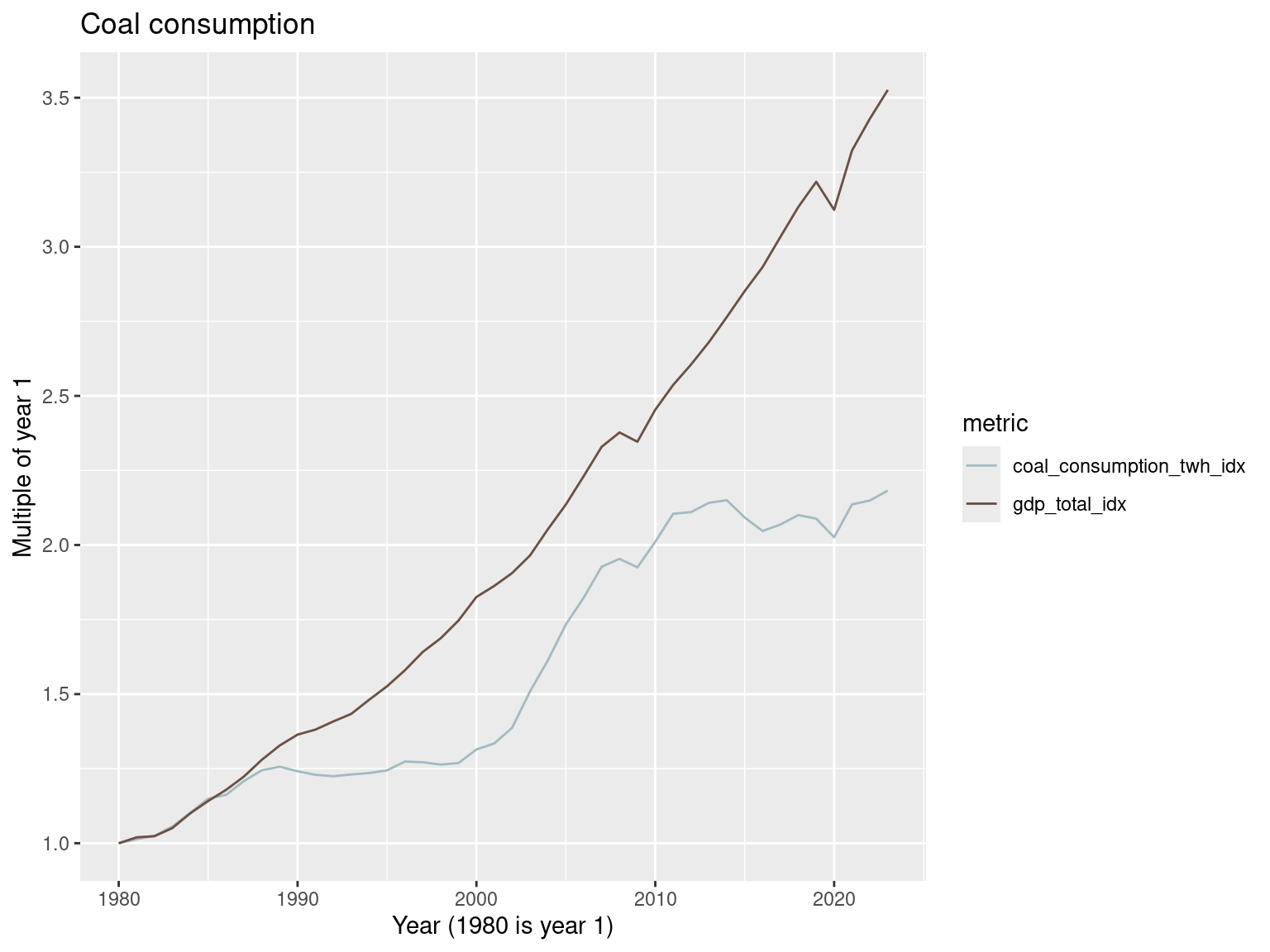
Looks like coal use is back on the rise.
world_metrics_df |>
  filter(year >= 2020) |>
  mutate(gdp_total_idx = gdp_total / gdp_total[1],
         coal_consumption_twh_idx = coal_consumption_twh / coal_consumption_twh[1]) |>
  select(year, gdp_total_idx, coal_consumption_twh_idx) |>
  pivot_longer(cols = c(gdp_total_idx, coal_consumption_twh_idx),
               names_to = 'metric', values_to = 'value') |>
  ggplot() +
  geom_line(aes(x=year, y = value, color = metric)) +
  scale_color_manual(values = c("#A3BAC2FF", "#6C5043FF")) +
  labs(x = "Year (2020 is year 1)", y = "Multiple of year 1",
       title = "Coal consumption")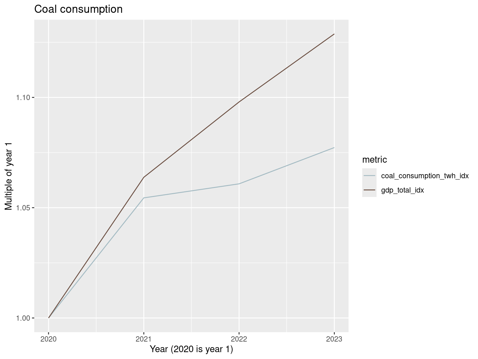
What about gas and oil?
world_metrics_df |>
  mutate(gdp_total_idx = gdp_total / gdp_total[1],
         oil_consumption_twh_idx = oil_consumption_twh / oil_consumption_twh[1]) |>
  select(year, gdp_total_idx, oil_consumption_twh_idx) |>
  pivot_longer(cols = c(gdp_total_idx, oil_consumption_twh_idx),
               names_to = 'metric', values_to = 'value') |>
  ggplot() +
  geom_line(aes(x=year, y = value, color = metric)) +
  scale_color_manual(values = c("#6C5043FF", "#A3BAC2FF")) +
  labs(x = "Year (1980 is year 1)", y = "Multiple of year 1",
       title = "Oil consumption")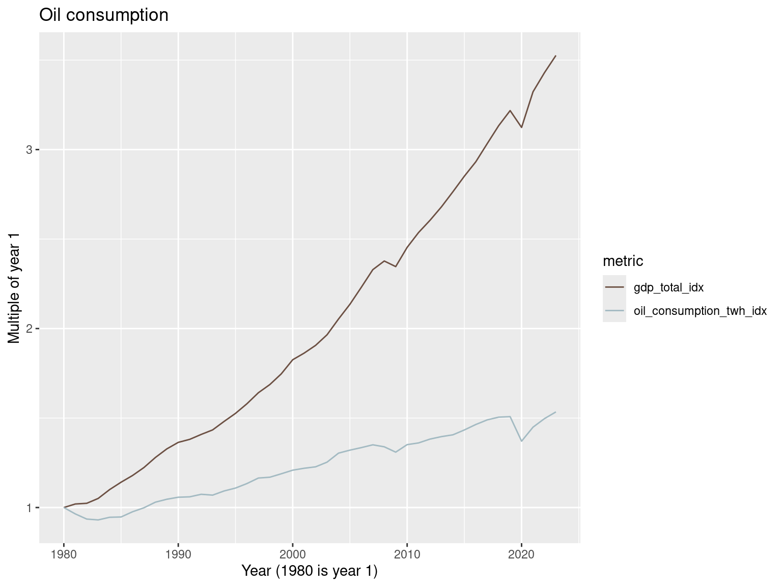
world_metrics_df |>
  filter(year >= 2020) |>
  mutate(gdp_total_idx = gdp_total / gdp_total[1],
         oil_consumption_twh_idx = oil_consumption_twh / oil_consumption_twh[1]) |>
  select(year, gdp_total_idx, oil_consumption_twh_idx) |>
  pivot_longer(cols = c(gdp_total_idx, oil_consumption_twh_idx),
               names_to = 'metric', values_to = 'value') |>
  ggplot() +
  geom_line(aes(x=year, y = value, color = metric)) +
  scale_color_manual(values = c("#6C5043FF", "#A3BAC2FF")) +
  labs(x = "Year (2020 is year 1)", y = "Multiple of year 1",
       title = "Oil consumption")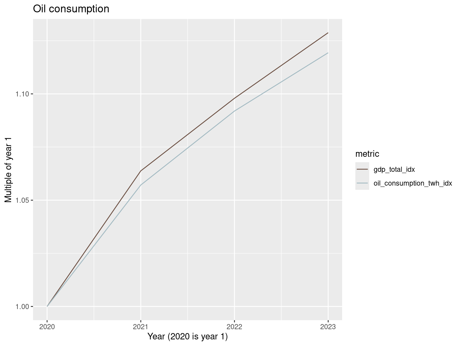
world_metrics_df |>
  mutate(gdp_total_idx = gdp_total / gdp_total[1],
         gas_consumption_twh_idx = gas_consumption_twh / gas_consumption_twh[1]) |>
  select(year, gdp_total_idx, gas_consumption_twh_idx) |>
  pivot_longer(cols = c(gdp_total_idx, gas_consumption_twh_idx),
               names_to = 'metric', values_to = 'value') |>
  ggplot() +
  geom_line(aes(x=year, y = value, color = metric)) +
  scale_color_manual(values = c("#A3BAC2FF", "#6C5043FF")) +
  labs(x = "Year (1980 is year 1)", y = "Multiple of year 1",
       title = "Gas consumption")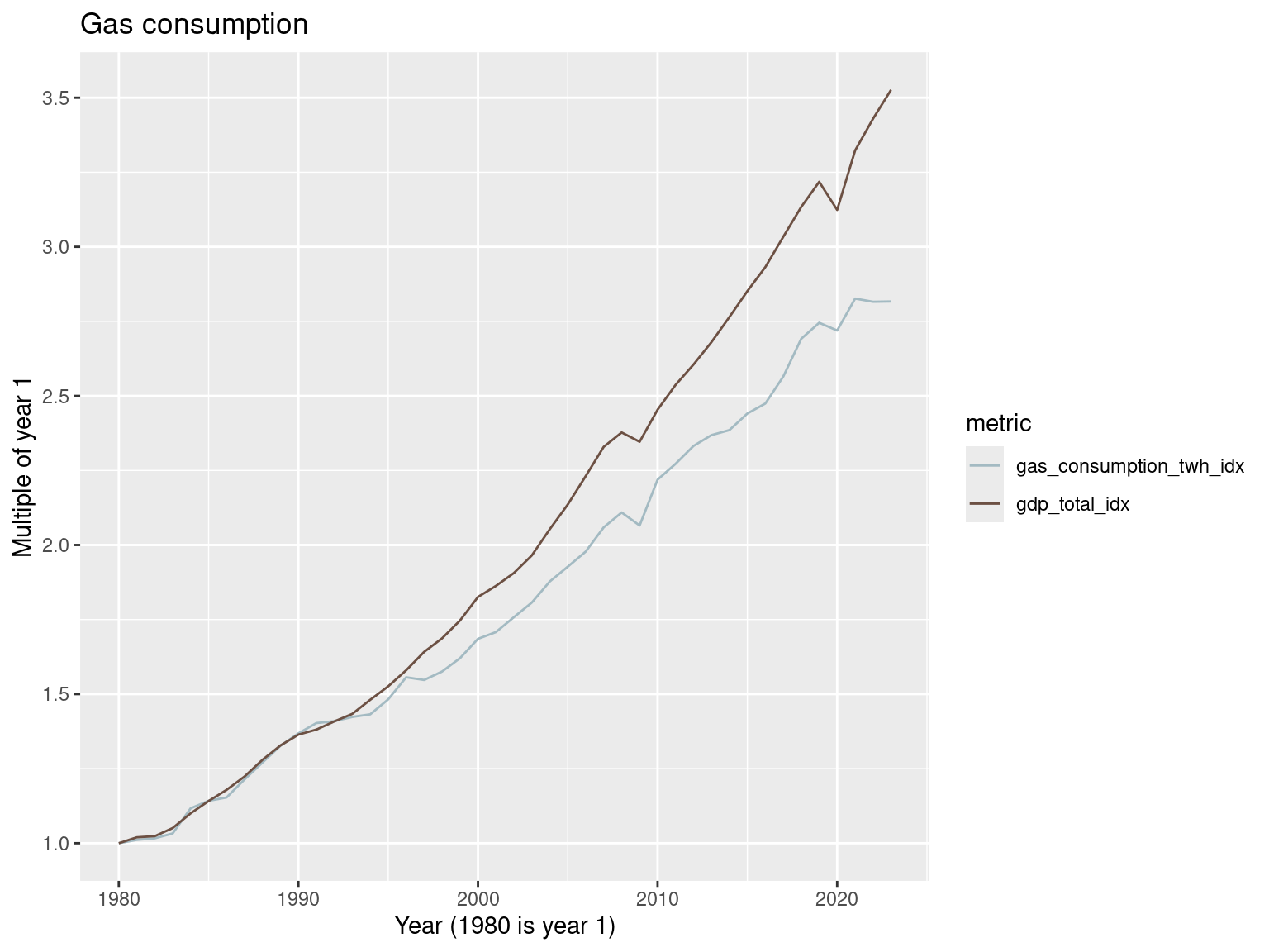
world_metrics_df |>
  filter(year >= 2020) |>
  mutate(gdp_total_idx = gdp_total / gdp_total[1],
         gas_consumption_twh_idx = gas_consumption_twh / gas_consumption_twh[1]) |>
  select(year, gdp_total_idx, gas_consumption_twh_idx) |>
  pivot_longer(cols = c(gdp_total_idx, gas_consumption_twh_idx),
               names_to = 'metric', values_to = 'value') |>
  ggplot() +
  geom_line(aes(x=year, y = value, color = metric)) +
  scale_color_manual(values = c("#A3BAC2FF", "#6C5043FF")) +
  labs(x = "Year (2020 is year 1)", y = "Multiple of year 1",
       title = "Gas consumption")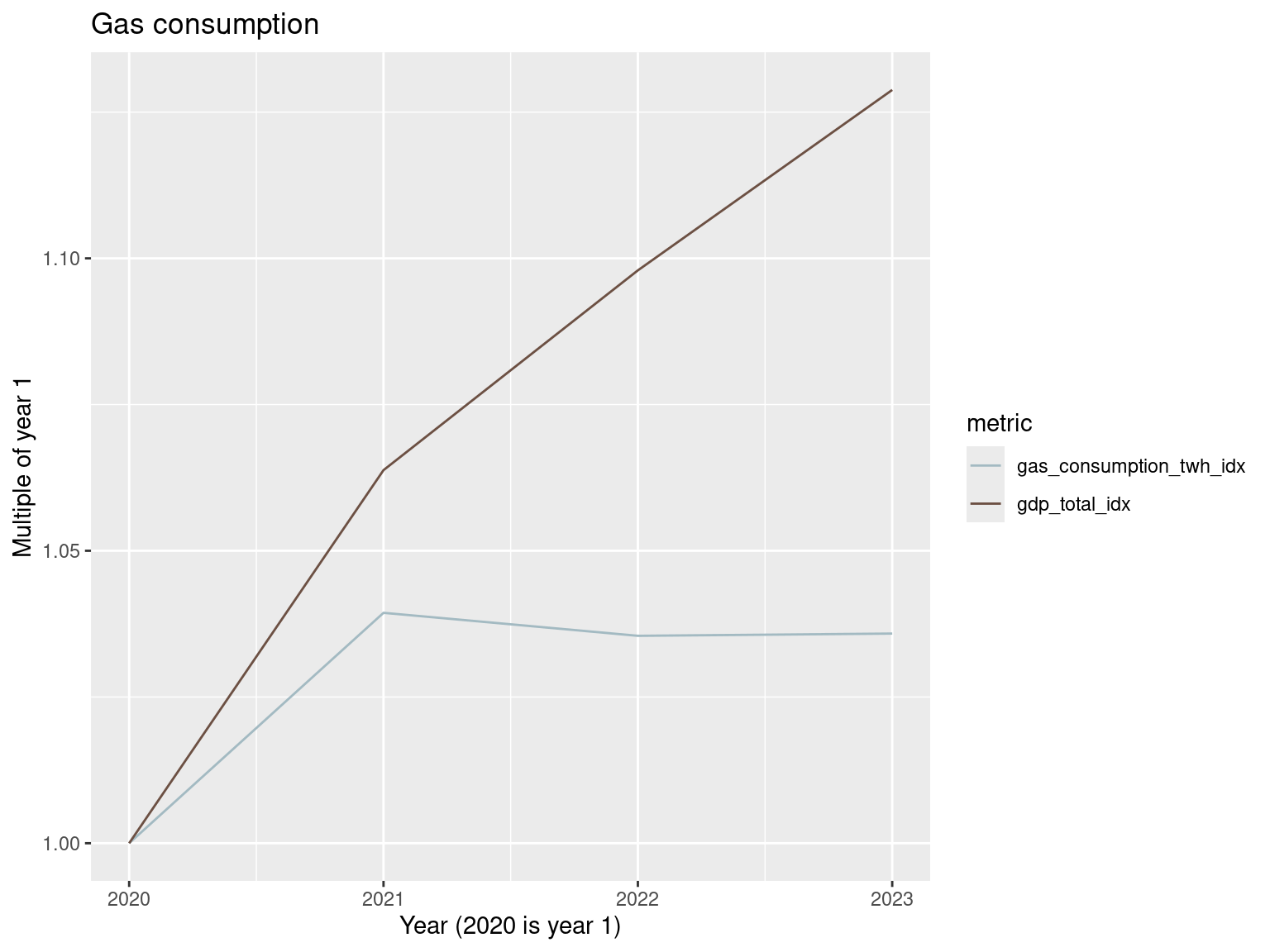
world_metrics_df |>
  mutate(gdp_total_idx = gdp_total / gdp_total[1],
         tot_fossil_fuel_consumption_idx = tot_fossil_fuel_consumption_twh / tot_fossil_fuel_consumption_twh[1]) |>
  select(year, gdp_total_idx, tot_fossil_fuel_consumption_idx) |>
  pivot_longer(cols = c(gdp_total_idx, tot_fossil_fuel_consumption_idx),
               names_to = 'metric', values_to = 'value') |>
  ggplot() +
  geom_line(aes(x=year, y = value, color = metric)) +
  scale_color_manual(values = c("#6C5043FF", "#A3BAC2FF")) +
  labs(x = "Year (1980 is year 1)", y = "Multiple of year 1",
       title = "Total fossil fuel consumption")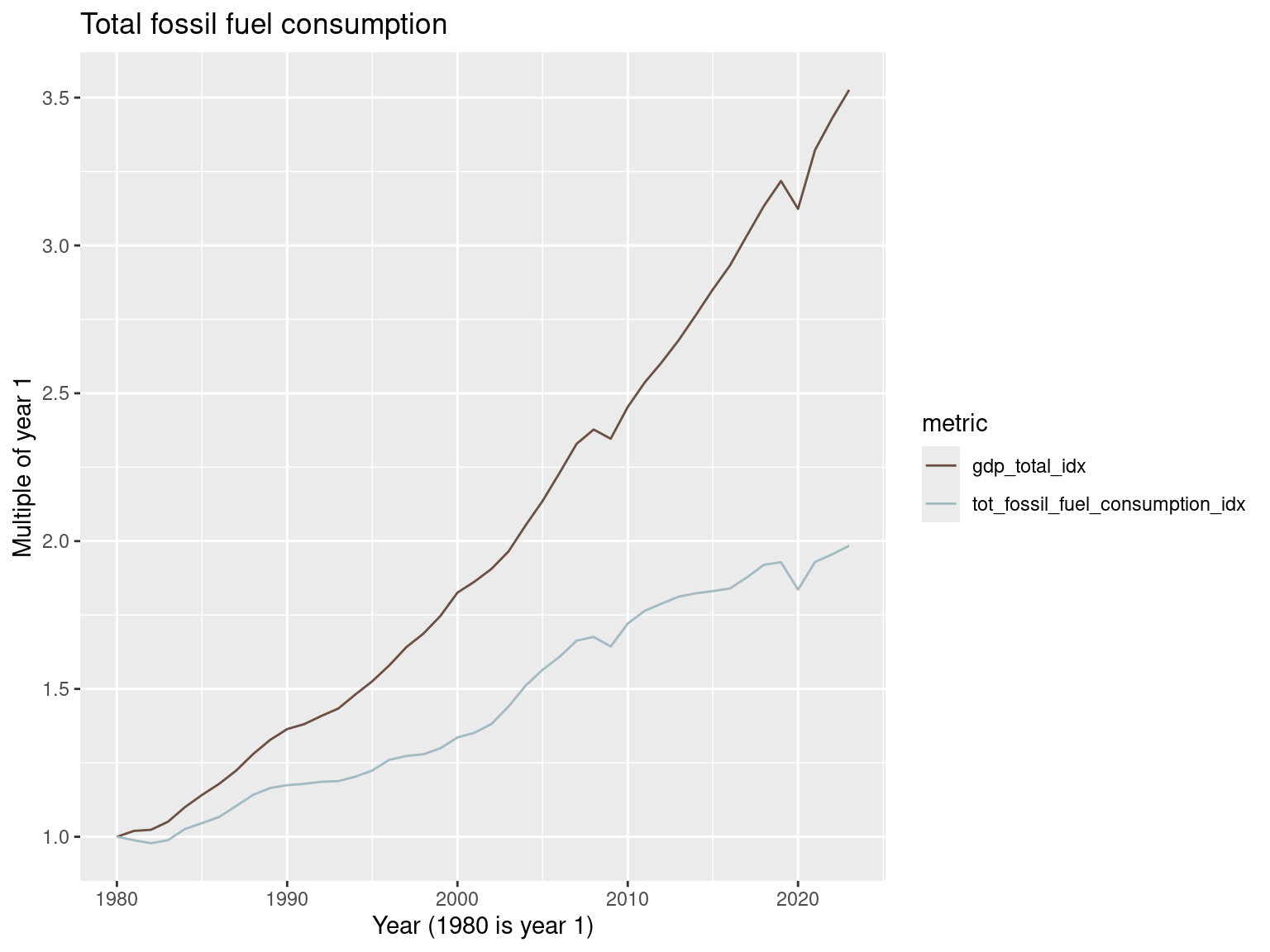
world_metrics_df |>
  filter(year >= 2020) |>
  mutate(gdp_total_idx = gdp_total / gdp_total[1],
         tot_fossil_fuel_consumption_idx = tot_fossil_fuel_consumption_twh / tot_fossil_fuel_consumption_twh[1]) |>
  select(year, gdp_total_idx, tot_fossil_fuel_consumption_idx) |>
  pivot_longer(cols = c(gdp_total_idx, tot_fossil_fuel_consumption_idx),
               names_to = 'metric', values_to = 'value') |>
  ggplot() +
  geom_line(aes(x=year, y = value, color = metric)) +
  scale_color_manual(values = c("#6C5043FF", "#A3BAC2FF")) +
  labs(x = "Year (2020 is year 1)", y = "Multiple of year 1",
       title = "Total fossil fuel consumption")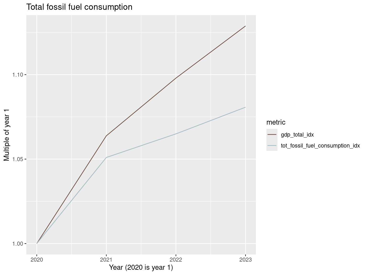
Safe to say there’s no absolute decoupling of fossil fuel use and GDP.
Minerals and metal production
We will look at cobalt, copper, lithium, nickel and steel production.
world_metrics_df |>
  mutate(gdp_total_idx = gdp_total / gdp_total[1],
         production.Steel.Processing..crude.tonnes_idx = production.Steel.Processing..crude.tonnes / production.Steel.Processing..crude.tonnes[1]) |>
  select(year, gdp_total_idx, production.Steel.Processing..crude.tonnes_idx) |>
  pivot_longer(cols = c(gdp_total_idx, production.Steel.Processing..crude.tonnes_idx),
               names_to = 'metric', values_to = 'value') |>
  ggplot() +
  geom_line(aes(x=year, y = value, color = metric)) +
  scale_color_manual(values = c("#6C5043FF", "#A3BAC2FF")) +
  labs(x = "Year (1980 is year 1)", y = "Multiple of year 1",
       title = "Steel production")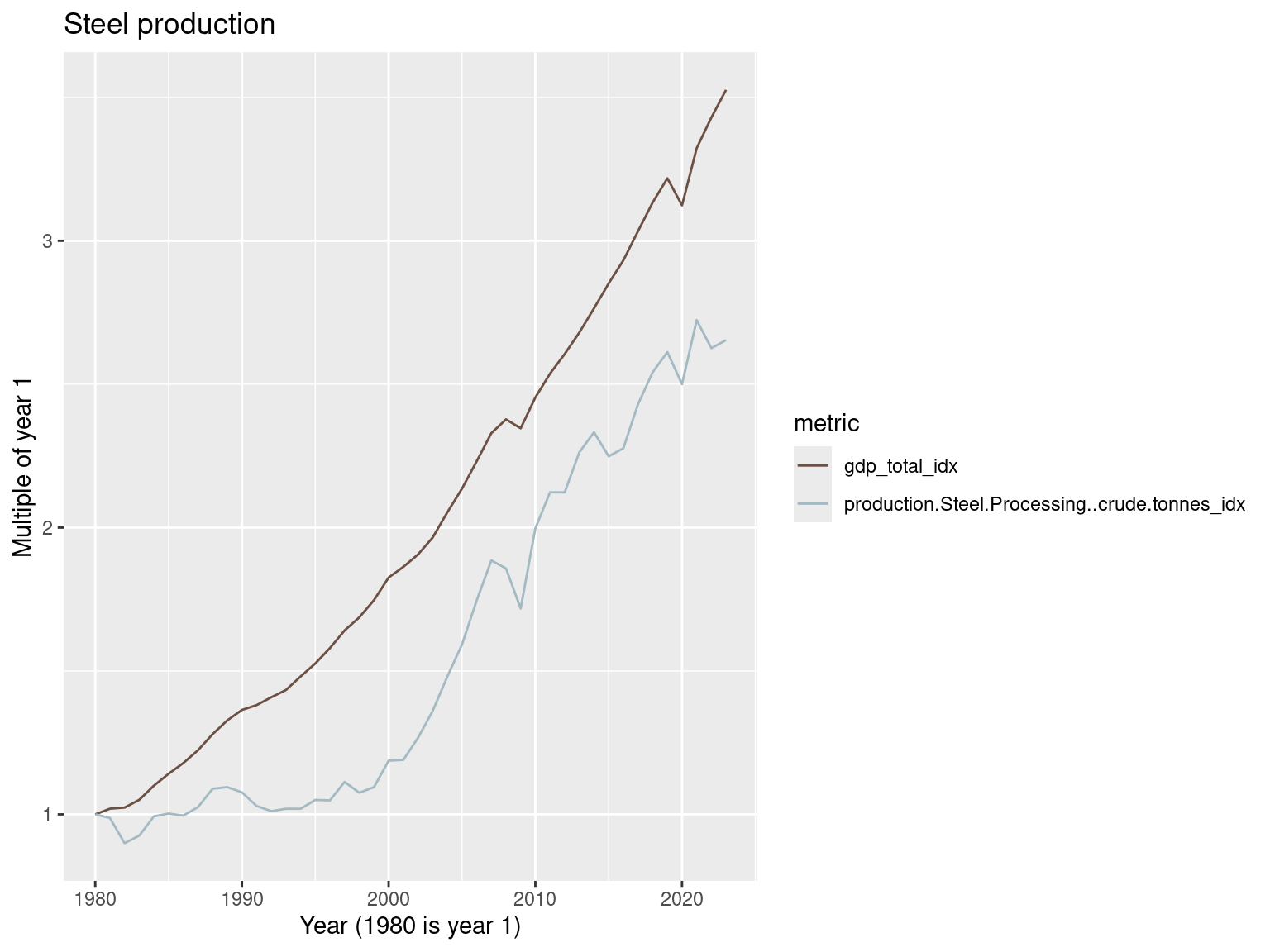
Let’s look at the sum of cobalt, copper, lithium and nickel production.
world_metrics_df |>
  mutate(CCLN_production = rowSums(cbind(production.Cobalt.Mine.tonnes,
           production.Copper.Mine.tonnes,
           production.Lithium.Mine.tonnes,
           production.Nickel.Mine.tonnes), na.rm = T)) |>
  mutate(gdp_total_idx = gdp_total / gdp_total[1],
         CCLN_production_idx = CCLN_production / CCLN_production[1]) |>
  select(year, gdp_total_idx, CCLN_production_idx) |>
  pivot_longer(cols = c(gdp_total_idx, CCLN_production_idx),
               names_to = 'metric', values_to = 'value') |>
  ggplot() +
  geom_line(aes(x=year, y = value, color = metric)) +
  scale_color_manual(values = c("#A3BAC2FF", "#6C5043FF")) +
  labs(x = "Year (1980 is year 1)", y = "Multiple of year 1",
       title = "Total cobalt, copper, lithium, and nickel production")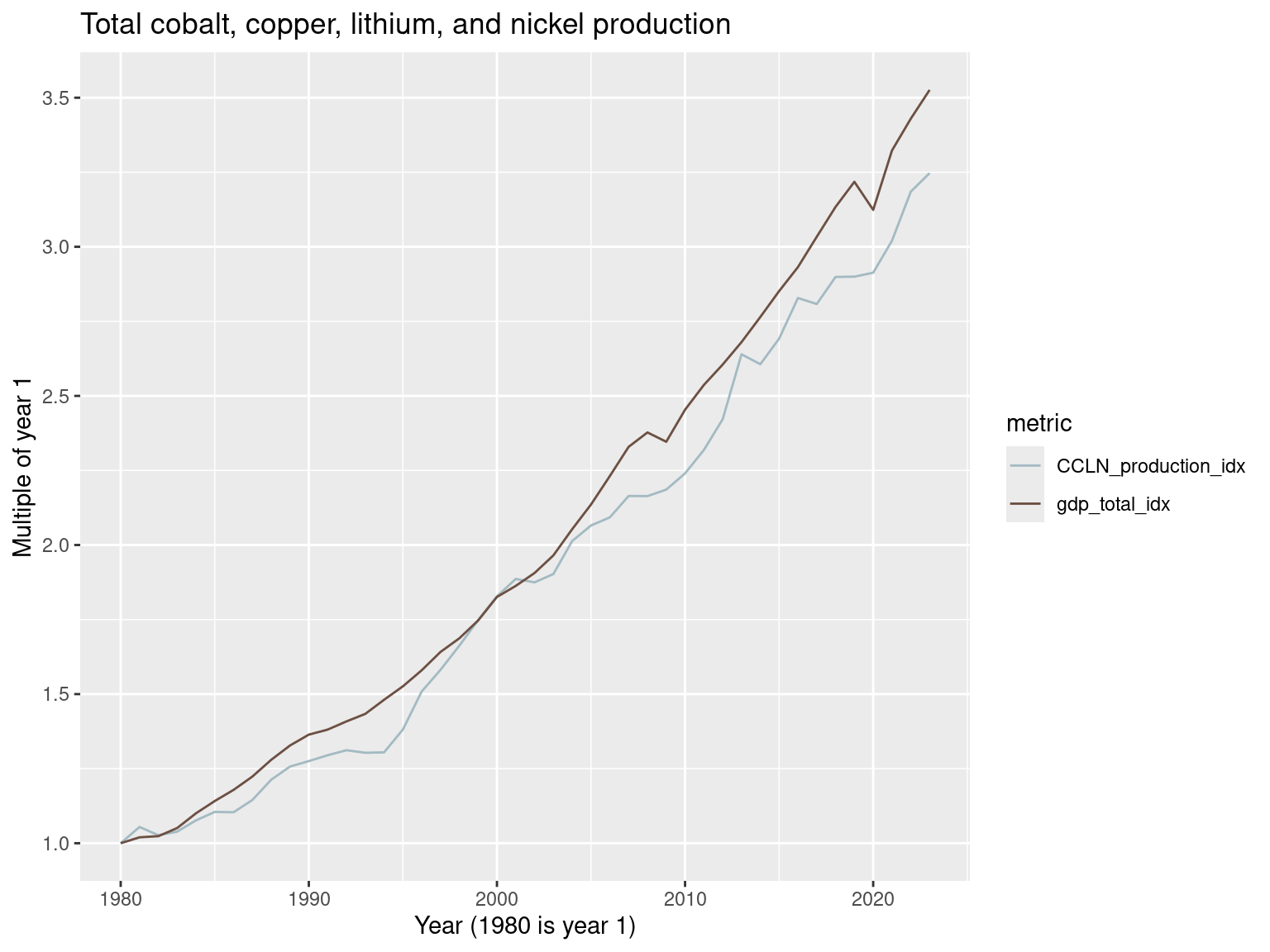
No decoupling here.
Water
Water consumption is another important resource use to consider. Data availability only lets us look at 2014-2021.
world_metrics_df |>
  filter(between(year, 2014, 2021)) |>
  mutate(gdp_total_idx = gdp_total / gdp_total[1],
         freshwater_withdrawals_m3_idx = freshwater_withdrawals_m3 / freshwater_withdrawals_m3[1]) |>
  select(year, gdp_total_idx, freshwater_withdrawals_m3_idx) |>
  pivot_longer(cols = c(gdp_total_idx, freshwater_withdrawals_m3_idx), names_to = 'metric', values_to = 'value') |>
  ggplot() +
  geom_line(aes(x=year, y = value, color = metric)) +
  scale_color_manual(values = c("#A3BAC2FF", "#6C5043FF")) +
  labs(x = "Year (2014 is year 1)", y = "Multiple of year 1",
       title = "Freshwater withdrawals")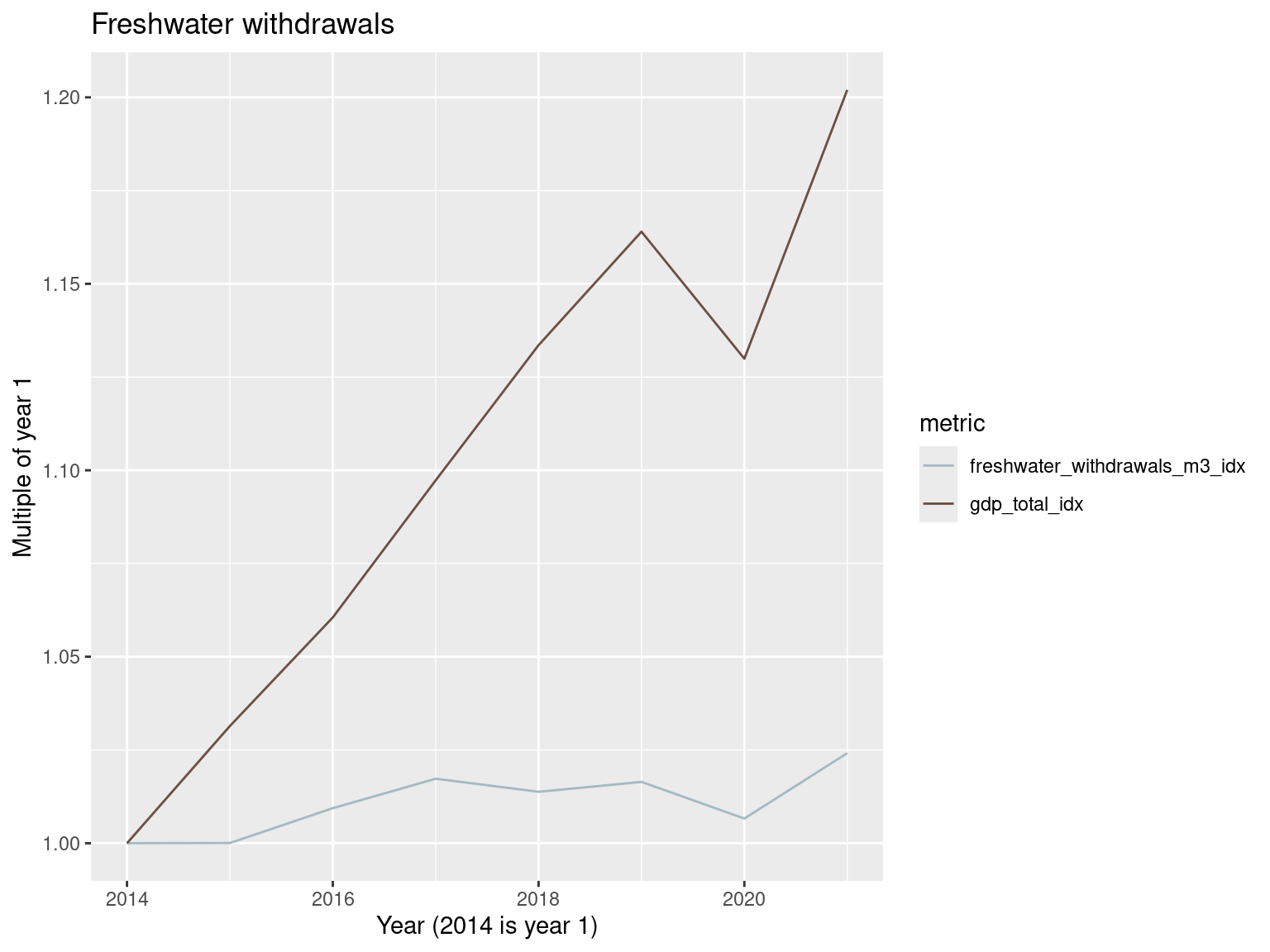
This will be one to watch as temperatures rise and the boom in data center construction continues to meet the energy needs of the recent advances in AI models. Data centers needs plenty of water for cooling.
US, Canada, Mexico
Let’s look at these three countries in comparison to each other and as a group.
north_america_metrics_df <- country_metrics_df |>
  filter(country == 'United States' | country == 'Canada' | country == 'Mexico') |>
  group_by(year) |>
  summarise(
    tot_fossil_fuel_consumption_twh = sum(tot_fossil_fuel_consumption_twh),
    primary_energy_consumption_Twh = sum(primary_energy_consumption_Twh),
    annual_emissions_ghg_total_co2eq = sum(annual_emissions_ghg_total_co2eq),
    gdp_total = sum(gdp_total)
  )
Primary energy consumption in US, CA, MX
north_america_metrics_df |>
  mutate(gdp_total_idx = gdp_total / gdp_total[1],
         primary_energy_consumption_Twh_idx = primary_energy_consumption_Twh / primary_energy_consumption_Twh[1]) |>
  select(year, gdp_total_idx, primary_energy_consumption_Twh_idx) |>
  pivot_longer(cols = c(gdp_total_idx, primary_energy_consumption_Twh_idx), names_to = 'metric', values_to = 'value') |>
  ggplot() +
  geom_line(aes(x=year, y = value, color = metric)) +
  scale_color_manual(values = c("#6C5043FF", "#A3BAC2FF")) +
  labs(x = "Year (1980 is year 1)", y = "Multiple of year 1",
       title = "Primary energy consumption - US, CA, MX")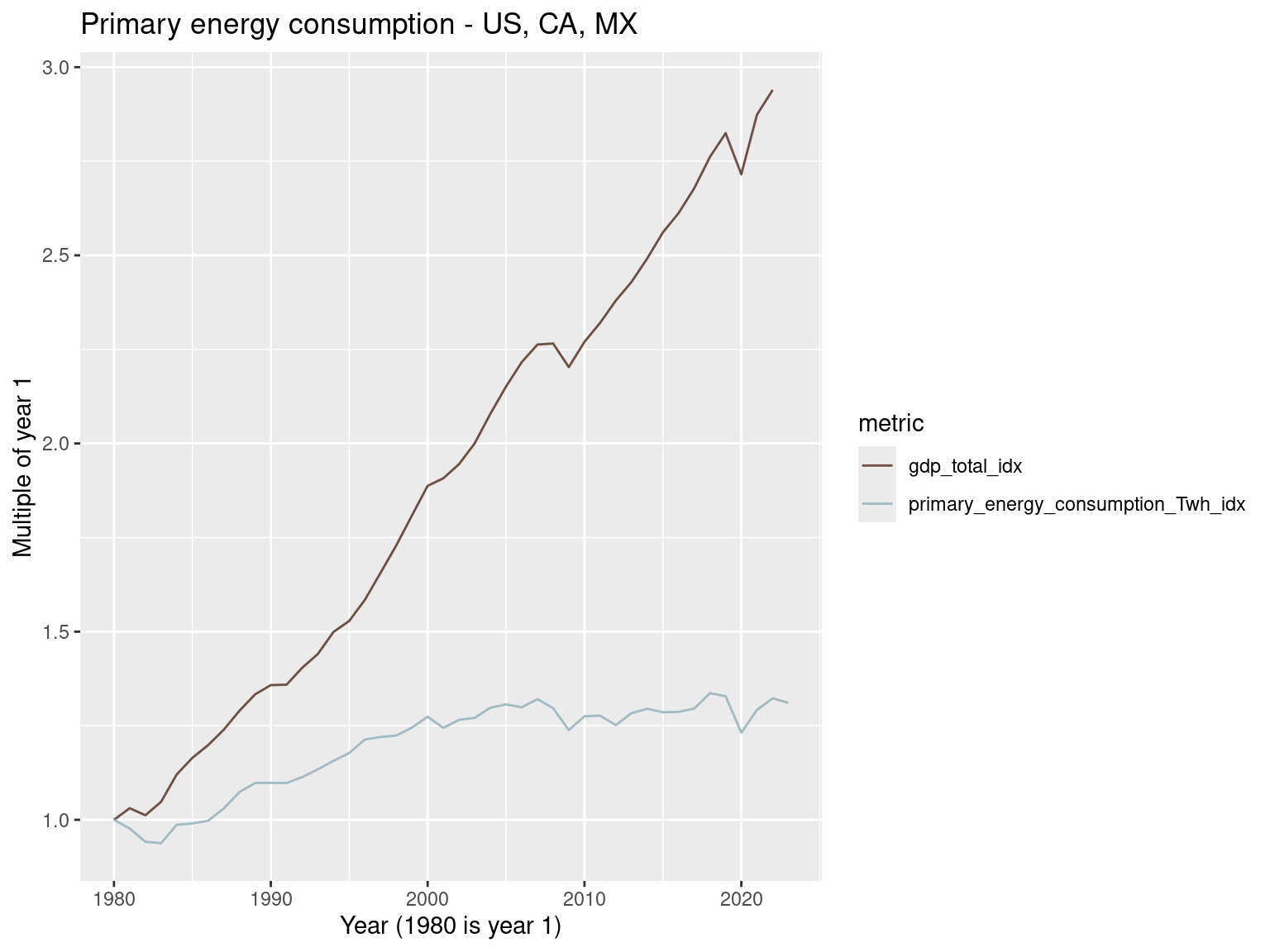
country_metrics_df |>
  filter(country == 'United States' | country == 'Canada' | country == 'Mexico') |>
  group_by(country) |>
  mutate(gdp_total_idx = gdp_total / gdp_total[1],
       primary_energy_consumption_Twh_idx = primary_energy_consumption_Twh / primary_energy_consumption_Twh[1]) |>
  ungroup() |>
  select(country, year, gdp_total_idx, primary_energy_consumption_Twh_idx) |>
  pivot_longer(cols = c(gdp_total_idx, primary_energy_consumption_Twh_idx), names_to = 'metric', values_to = 'value') |>
  ggplot() +
  geom_line(aes(x=year, y = value, color = metric)) +
  facet_grid(country ~ ., scales = 'free_y') +
  scale_color_manual(values = c("#6C5043FF", "#A3BAC2FF")) +
  labs(x = "Year (1980 is year 1)", y = "Multiple of year 1",
       title = "Primary energy consumption - US, CA, MX")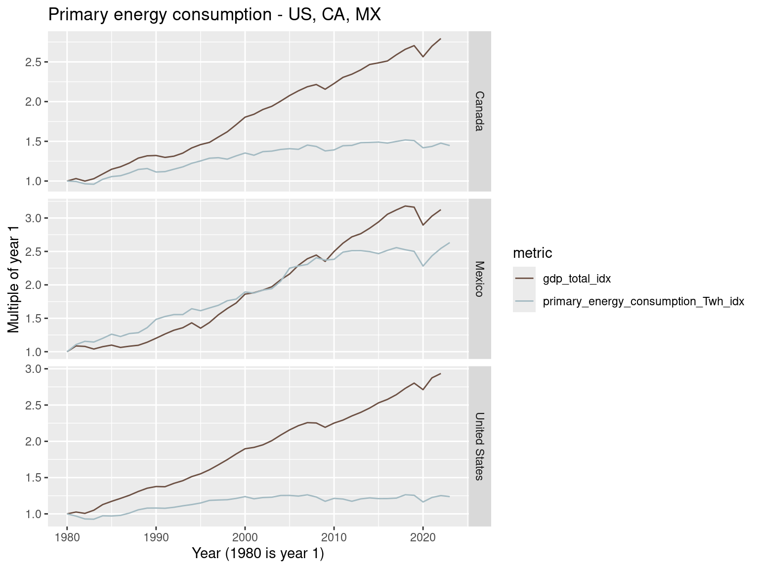
Total fossil fuel consumption in US, CA, MX
north_america_metrics_df |>
  mutate(gdp_total_idx = gdp_total / gdp_total[1],
       tot_fossil_fuel_consumption_twh_idx = tot_fossil_fuel_consumption_twh / tot_fossil_fuel_consumption_twh[1]) |>
  select(year, gdp_total_idx, tot_fossil_fuel_consumption_twh_idx) |>
  pivot_longer(cols = c(gdp_total_idx, tot_fossil_fuel_consumption_twh_idx), names_to = 'metric', values_to = 'value') |>
  ggplot() +
  geom_line(aes(x=year, y = value, color = metric)) +
  scale_color_manual(values = c("#6C5043FF", "#A3BAC2FF")) +
  labs(x = "Year (1980 is year 1)", y = "Multiple of year 1",
       title = "Total fossil fuel consumption - US, CA, MX")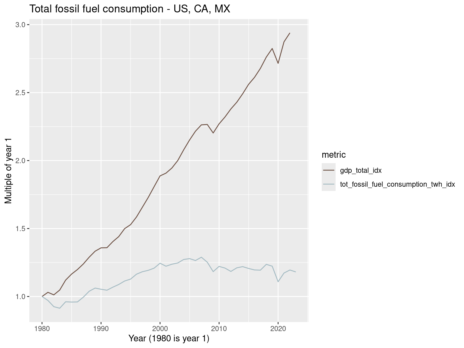
country_metrics_df |>
  filter(country == 'United States' | country == 'Canada' | country == 'Mexico') |>
  group_by(country) |>
  mutate(gdp_total_idx = gdp_total / gdp_total[1],
       tot_fossil_fuel_consumption_twh_idx = tot_fossil_fuel_consumption_twh / tot_fossil_fuel_consumption_twh[1]) |>
  ungroup() |>
  select(country, year, gdp_total_idx, tot_fossil_fuel_consumption_twh_idx) |>
  pivot_longer(cols = c(gdp_total_idx, tot_fossil_fuel_consumption_twh_idx), names_to = 'metric', values_to = 'value') |>
  ggplot() +
  geom_line(aes(x=year, y = value, color = metric)) +
  facet_grid(country ~ ., scales = 'free_y') +
  scale_color_manual(values = c("#6C5043FF", "#A3BAC2FF")) +
  labs(x = "Year (1980 is year 1)", y = "Multiple of year 1",
       title = "Total fossil fuel consumption - US, CA, MX")
Total greenhouse gas emissions in US, CA, MX
north_america_metrics_df |>
  mutate(gdp_total_idx = gdp_total / gdp_total[1],
       annual_emissions_ghg_total_co2eq_idx = annual_emissions_ghg_total_co2eq / annual_emissions_ghg_total_co2eq[1]) |>
  select(year, gdp_total_idx, annual_emissions_ghg_total_co2eq_idx) |>
  pivot_longer(cols = c(gdp_total_idx, annual_emissions_ghg_total_co2eq_idx), names_to = 'metric', values_to = 'value') |>
  ggplot() +
  geom_line(aes(x=year, y = value, color = metric)) +
  scale_color_manual(values = c("#A3BAC2FF", "#6C5043FF")) +
  labs(x = "Year (1980 is year 1)", y = "Multiple of year 1",
       title = "Total greenhouse gas emissions - US, CA, MX")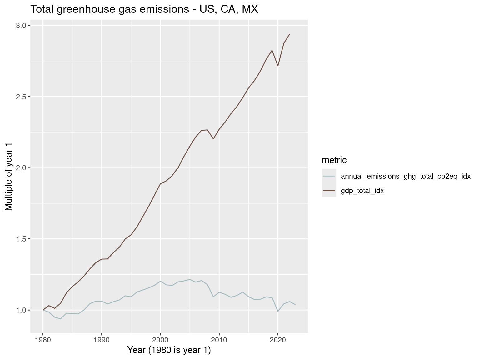
This looks promising.
country_metrics_df |>
  filter(country == 'United States' | country == 'Canada' | country == 'Mexico') |>
  group_by(country) |>
  mutate(gdp_total_idx = gdp_total / gdp_total[1],
       annual_emissions_ghg_total_co2eq_idx = annual_emissions_ghg_total_co2eq / annual_emissions_ghg_total_co2eq[1]) |>
  ungroup() |>
  select(country, year, gdp_total_idx, annual_emissions_ghg_total_co2eq_idx) |>
  pivot_longer(cols = c(gdp_total_idx, annual_emissions_ghg_total_co2eq_idx), names_to = 'metric', values_to = 'value') |>
  ggplot() +
  geom_line(aes(x=year, y = value, color = metric)) + facet_grid(country ~ ., scales = 'free_y') +
  scale_color_manual(values = c("#A3BAC2FF", "#6C5043FF")) +
  labs(x = "Year (1980 is year 1)", y = "Multiple of year 1",
       title = "Total greenhouse gas emissions - US, CA, MX")
Recent increases in wind and solar likely the cause of the stabilization of GHG emissions in US and Canada. Mexico is still seeing increases.
What about coal production in these three countries?
country_metrics_df |>
  filter(country == 'United States' | country == 'Canada' | country == 'Mexico') |>
  group_by(country) |>
  mutate(gdp_total_idx = gdp_total / gdp_total[1],
       coal_consumption_twh_idx = coal_consumption_twh / coal_consumption_twh[1]) |>
  ungroup() |>
  select(country, year, gdp_total_idx, coal_consumption_twh_idx) |>
  pivot_longer(cols = c(gdp_total_idx, coal_consumption_twh_idx), names_to = 'metric', values_to = 'value') |>
  ggplot() +
  geom_line(aes(x=year, y = value, color = metric)) + facet_grid(country ~ ., scales = 'free_y') +
  scale_color_manual(values = c("#A3BAC2FF", "#6C5043FF")) +
  labs(x = "Year (1980 is year 1)", y = "Multiple of year 1",
       title = "Coal production - US, CA, MX")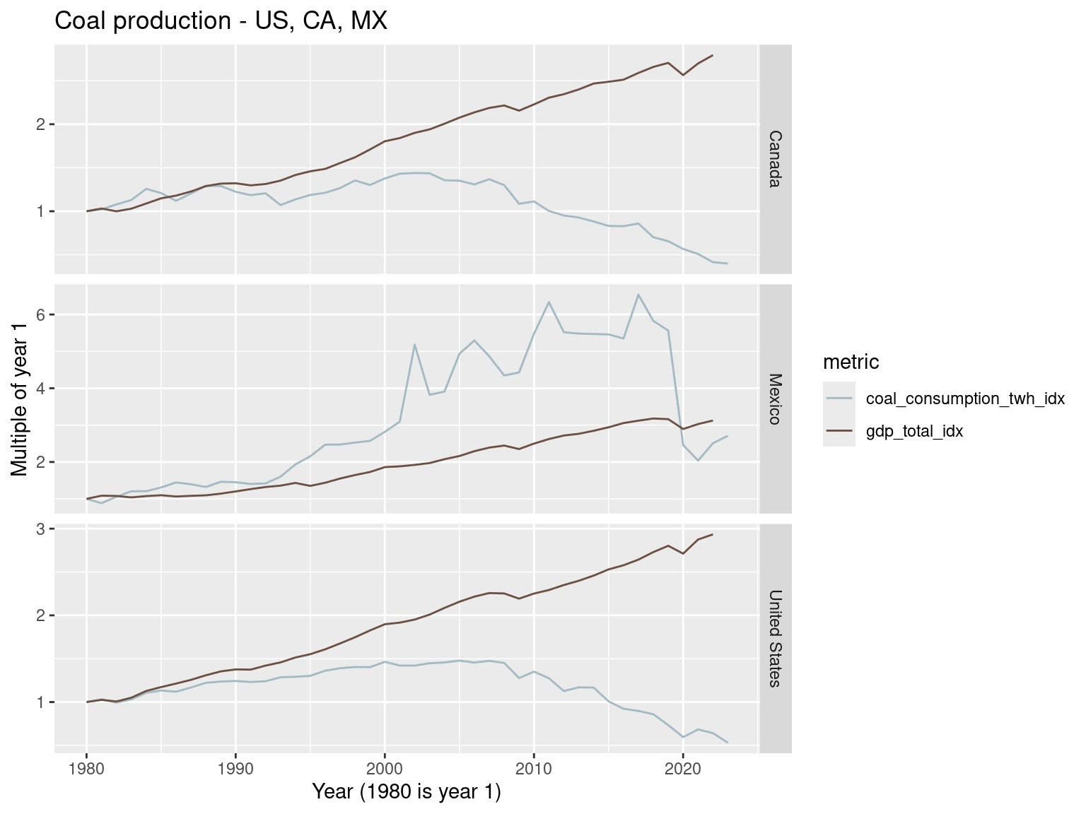
Regional summaries
NOTE Missing data series in some of the following plots are due to lack of data in the index year of 1980.
country_metrics_df |>
  filter(year <= 2022) |>
  group_by(year, region23) |>
  summarise(
    tot_fossil_fuel_consumption_twh = sum(tot_fossil_fuel_consumption_twh, na.rm = TRUE),
    primary_energy_consumption_Twh = sum(primary_energy_consumption_Twh, na.rm = TRUE),
    annual_emissions_ghg_total_co2eq = sum(annual_emissions_ghg_total_co2eq, na.rm = TRUE),
    gdp_total = sum(gdp_total, na.rm = TRUE)
  ) |>
  arrange(region23, year) |>
  group_by(region23) |>
  mutate(gdp_total_idx = gdp_total / gdp_total[1],
       primary_energy_consumption_Twh_idx = primary_energy_consumption_Twh / primary_energy_consumption_Twh[1]) |>
  ungroup() |>
  select(year, region23, gdp_total_idx, primary_energy_consumption_Twh_idx) |>
  pivot_longer(cols = c(gdp_total_idx, primary_energy_consumption_Twh_idx), names_to = 'metric', values_to = 'value') |>
  ggplot() +
  geom_line(aes(x=year, y = value, color = metric)) +
  facet_wrap(~region23, scales = 'free_y') +
  scale_color_manual(values = c("#6C5043FF", "#A3BAC2FF")) +
  labs(x = "Year (1980 is year 1)", y = "Multiple of year 1",
       title = "Primary energy consumption")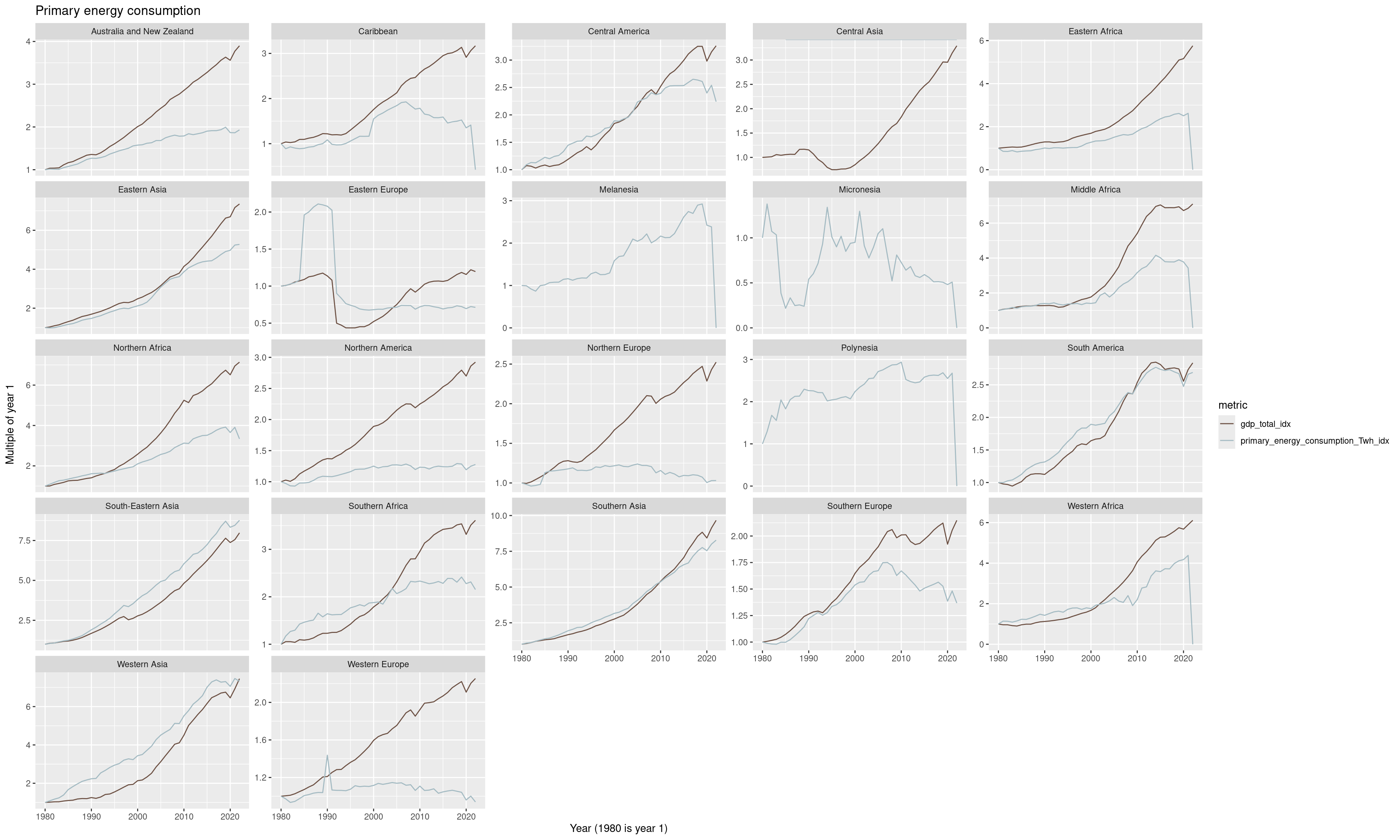
country_metrics_df |>
  filter(year <= 2022) |>
  group_by(year, region23) |>
  summarise(
    tot_fossil_fuel_consumption_twh = sum(tot_fossil_fuel_consumption_twh, na.rm = TRUE),
    primary_energy_consumption_Twh = sum(primary_energy_consumption_Twh, na.rm = TRUE),
    annual_emissions_ghg_total_co2eq = sum(annual_emissions_ghg_total_co2eq, na.rm = TRUE),
    gdp_total = sum(gdp_total, na.rm = TRUE)
  ) |>
  arrange(region23, year) |>
  group_by(region23) |>
  mutate(gdp_total_idx = gdp_total / gdp_total[1],
       annual_emissions_ghg_total_co2eq_idx = annual_emissions_ghg_total_co2eq / annual_emissions_ghg_total_co2eq[1]) |>
  ungroup() |>
  select(year, region23, gdp_total_idx, annual_emissions_ghg_total_co2eq_idx) |>
  pivot_longer(cols = c(gdp_total_idx, annual_emissions_ghg_total_co2eq_idx), names_to = 'metric', values_to = 'value') |>
  ggplot() +
  geom_line(aes(x=year, y = value, color = metric)) + facet_wrap(~region23, scales = 'free_y') +
  scale_color_manual(values = c("#A3BAC2FF", "#6C5043FF")) +
  labs(x = "Year (1980 is year 1)", y = "Multiple of year 1",
       title = "Total greenhouse gas emissions")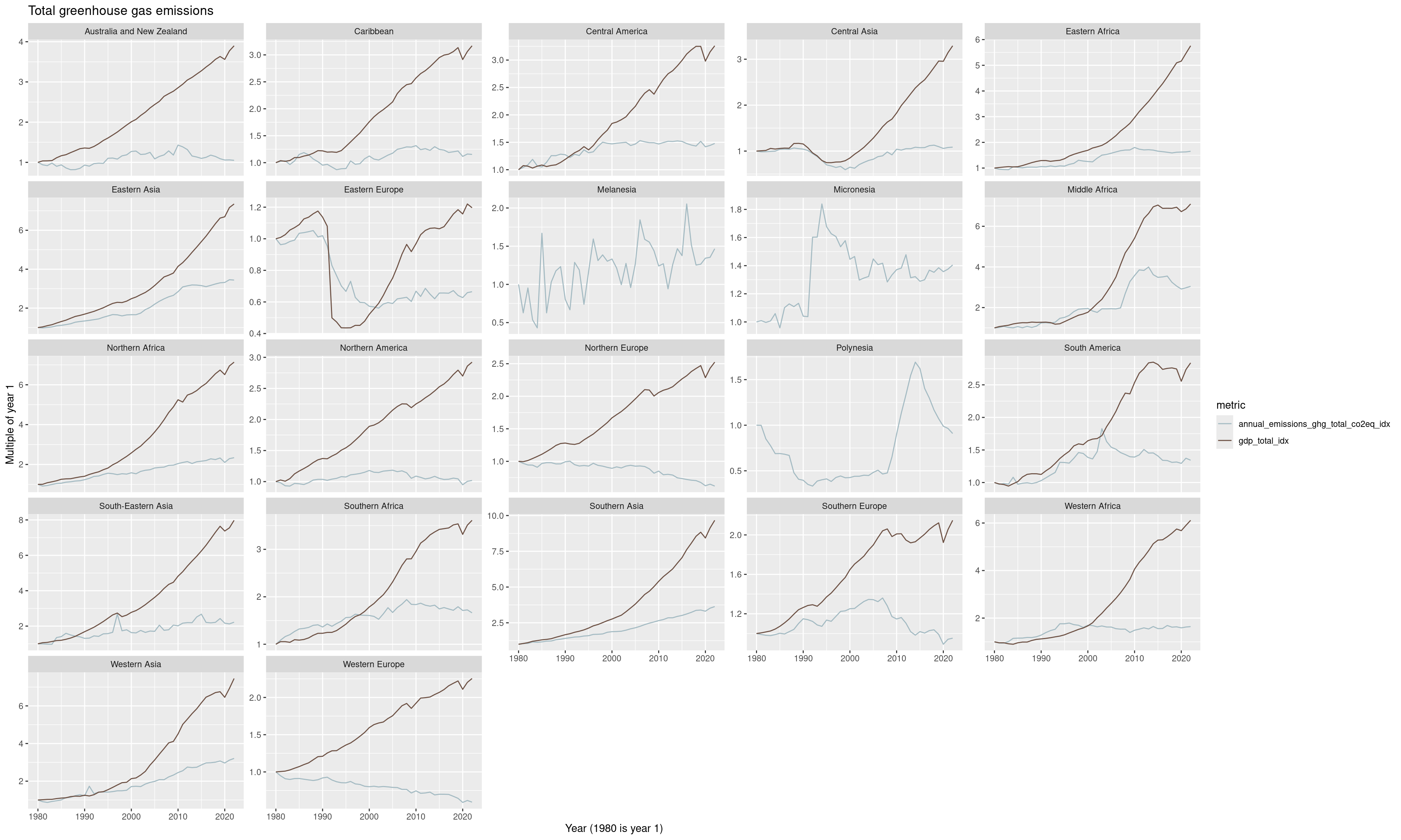
Population
Population marches steadily on.
world_metrics_df |>
  mutate(gdp_total_idx = gdp_total / gdp_total[1],
         population_idx = population / population[1]) |>
  select(year, gdp_total_idx, population_idx) |>
  pivot_longer(cols = c(gdp_total_idx, population_idx), names_to = 'metric', values_to = 'value') |>
  ggplot() +
  geom_line(aes(x=year, y = value, color = metric)) +
  scale_color_manual(values = c("#6C5043FF", "#A3BAC2FF")) +
  labs(x = "Year (1980 is year 1)", y = "Multiple of year 1",
       title = "Population")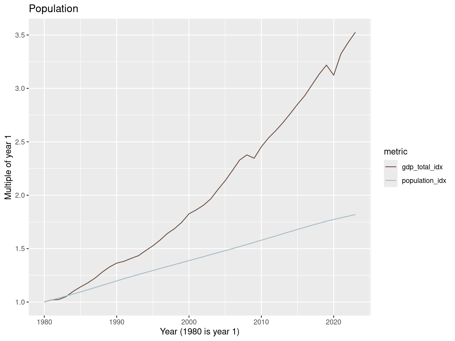
world_metrics_df |>
  filter(year >= 2020) |>
  mutate(gdp_total_idx = gdp_total / gdp_total[1],
         population_idx = population / population[1]) |>
  select(year, gdp_total_idx, population_idx) |>
  pivot_longer(cols = c(gdp_total_idx, population_idx), names_to = 'metric', values_to = 'value') |>
  ggplot() +
  geom_line(aes(x=year, y = value, color = metric)) +
  scale_color_manual(values = c("#6C5043FF", "#A3BAC2FF")) +
  labs(x = "Year (2020 is year 1)", y = "Multiple of year 1",
       title = "Population")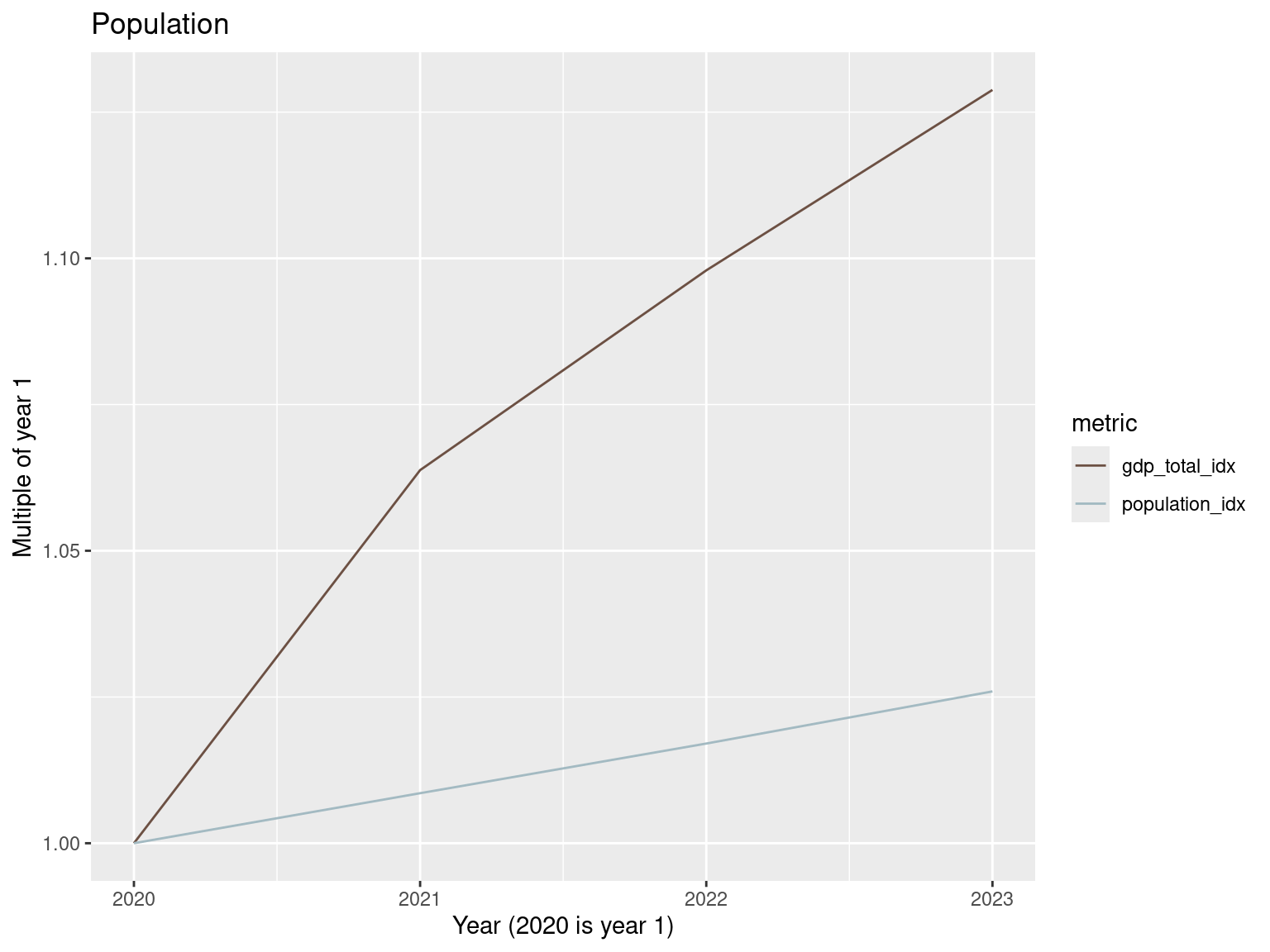
country_metrics_df |>
  filter(between(year, 1990, 2022)) |>
  group_by(year, region23) |>
  summarise(
    population = sum(population, na.rm = TRUE),
    gdp_total = sum(gdp_total, na.rm = TRUE)
  ) |>
  arrange(region23, year) |>
  group_by(region23) |>
  mutate(gdp_total_idx = gdp_total / gdp_total[1],
       population_idx = population / population[1]) |>
  ungroup() |>
  select(year, region23, gdp_total_idx, population_idx) |>
  pivot_longer(cols = c(gdp_total_idx, population_idx), names_to = 'metric', values_to = 'value') |>
  ggplot() +
  geom_line(aes(x=year, y = value, color = metric)) + facet_wrap(~region23, scales = 'free_y') +
  scale_color_manual(values = c("#6C5043FF", "#A3BAC2FF")) +
  labs(x = "Year (1990 is year 1)", y = "Multiple of year 1", title = "Population")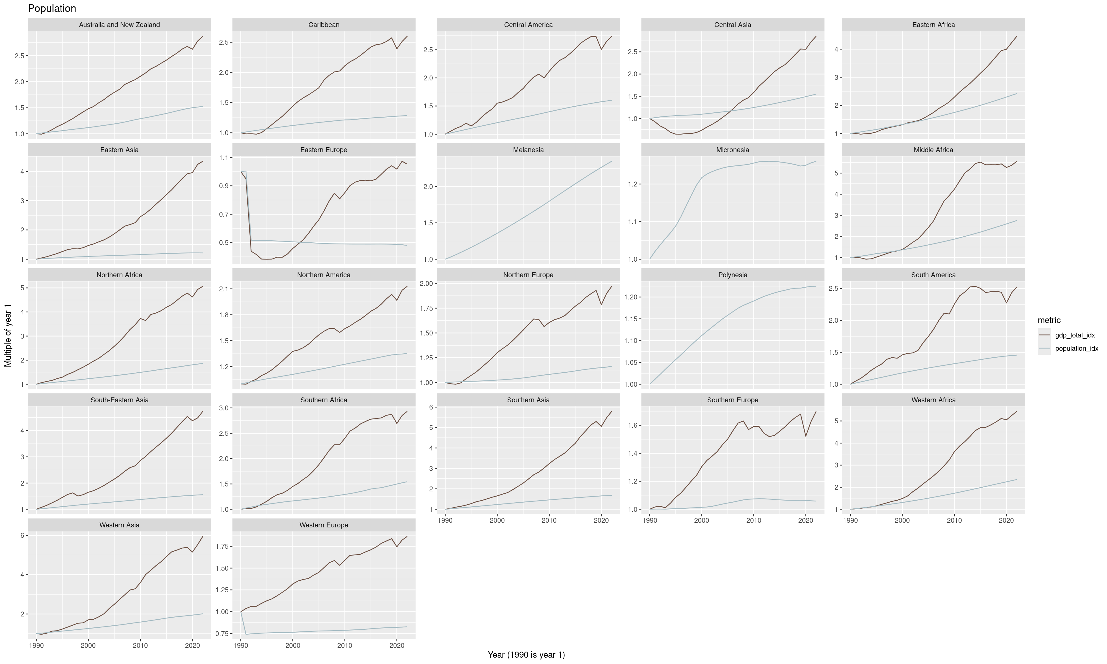
Parting words
From p3 of the 2019 EEB study:
The fact that decoupling on its own, i.e. without addressing the issue of economic growth, has not been and will not be sufficient to reduce environmental pressures to the required extent is not a reason to oppose decoupling (in the literal sense of separating the environmental pressures curve from the GDP curve) or the measures that achieve decoupling - on the contrary, without many such measures the situation would be far worse. It is a reason to have major concerns about the predominant focus of policymakers on green growth, this focus being based on the flawed assumption that sufficient decoupling can be achieved through increased efficiency without limiting economic production and consumption.
Data source citations
Here are the citations from the various OWID data sources used as part of this post.
- HYDE (2023); Gapminder (2022); UN WPP (2024) – with major processing by Our World in Data. “Population” [dataset]. PBL Netherlands Environmental Assessment Agency, “History Database of the Global Environment 3.3”; Gapminder, “Population v7”; United Nations, “World Population Prospects”; Gapminder, “Systema Globalis” [original data]. Retrieved February 13, 2025 from https://ourworldindata.org/grapher/population
- Bolt and van Zanden - Maddison Project Database 2023 – with minor processing by Our World in Data. “GDP per capita – Maddison Project Database – In constant international-$. Historical data” [dataset]. Bolt and van Zanden, “Maddison Project Database 2023” [original data]. Retrieved February 13, 2025 from https://ourworldindata.org/grapher/gdp-per-capita-maddison-project-database
- U.S. Energy Information Administration (2023); Energy Institute - Statistical Review of World Energy (2024); Population based on various sources (2023) – with major processing by Our World in Data. “Primary energy consumption per capita” [dataset]. U.S. Energy Information Administration, “International Energy Data”; Energy Institute, “Statistical Review of World Energy”; Various sources, “Population” [original data]. Retrieved February 17, 2025 from https://ourworldindata.org/grapher/per-capita-energy-use
- Jones et al. (2024); Population based on various sources (2024) – with major processing by Our World in Data. “Per capita greenhouse gas emissions including land use” [dataset]. Jones et al., “National contributions to climate change 2024.2”; Various sources, “Population” [original data]. Retrieved February 17, 2025 from https://ourworldindata.org/grapher/total-greenhouse-gas-emissions-per-capita
- Jones et al. (2024); Population based on various sources (2024) – with major processing by Our World in Data. “Per capita greenhouse gas emissions from fossil fuels and industry” [dataset]. Jones et al., “National contributions to climate change 2024.2”; Various sources, “Population” [original data]. Retrieved February 13, 2025 from https://ourworldindata.org/grapher/per-capita-ghg-excl-land-use
- Energy Institute - Statistical Review of World Energy (2024) – with major processing by Our World in Data. “Coal consumption” [dataset]. Energy Institute, “Statistical Review of World Energy” [original data].
- USGS - Mineral Commodity Summaries (2024); USGS - Historical Statistics for Mineral and Material Commodities (2023); BGS - World Mineral Statistics (2023) – with major processing by Our World in Data. “Copper production” [dataset]. United States Geological Survey, “Mineral Commodity Summaries”; United States Geological Survey, “Historical Statistics for Mineral and Material Commodities”; British Geological Survey, “World Mineral Statistics” [original data].
- Food and Agriculture Organization of the United Nations (via World Bank) (2025) – processed by Our World in Data. “Annual freshwater withdrawals” [dataset]. Food and Agriculture Organization of the United Nations (via World Bank), “World Development Indicators” [original data]. Retrieved February 13, 2025 from https://ourworldindata.org/grapher/annual-freshwater-withdrawals
- Contains modified Copernicus Climate Change Service information (2025) – with major processing by Our World in Data. “Annual average” [dataset]. Contains modified Copernicus Climate Change Service information, “ERA5 monthly averaged data on single levels from 1940 to present 2” [original data].
- Gapminder (2020); UN Inter-agency Group for Child Mortality Estimation (2024) – with major processing by Our World in Data. “Under-five mortality rate – UN IGME; Gapminder – Long-run data” [dataset]. United Nations Inter-agency Group for Child Mortality Estimation, “United Nations Inter-agency Group for Child Mortality Estimation”; Gapminder, “Child mortality rate under age five v7”; Various sources, “Population” [original data]. Retrieved February 20, 2025 from https://ourworldindata.org/grapher/child-mortality
- UN, World Population Prospects (2024) – processed by Our World in Data. “Fertility rate, total – UN WPP” [dataset]. United Nations, “World Population Prospects” [original data]. Retrieved February 20, 2025 from https://ourworldindata.org/grapher/children-per-woman-un
- World Bank Poverty and Inequality Platform (2024) – with major processing by Our World in Data. “Gini Coefficient – World Bank” [dataset]. World Bank Poverty and Inequality Platform, “World Bank Poverty and Inequality Platform (PIP) 20240627_2017, 20240627_2011” [original data].
- UN WPP (2024); HMD (2024); Zijdeman et al. (2015); Riley (2005) – with minor processing by Our World in Data. “Life expectancy at birth – Various sources – period tables” [dataset]. Human Mortality Database, “Human Mortality Database”; United Nations, “World Population Prospects”; Zijdeman et al., “Life Expectancy at birth 2”; James C. Riley, “Estimates of Regional and Global Life Expectancy, 1800-2001” [original data]. Retrieved February 20, 2025 from https://ourworldindata.org/grapher/life-expectancy
- U.S. Bureau of Economic Analysis via FRED®
References
Davis, Steven J., and Ken Caldeira. 2010. “Consumption-Based Accounting of CO2 Emissions.” Proceedings of the National Academy of Sciences 107 (12): 5687–92. https://doi.org/10.1073/pnas.0906974107.
Parrique, Timothée, Jonathan Barth, François Briens, et al. 2019. “Decoupling Debunked.” Evidence and Arguments Against Green Growth as a Sole Strategy for Sustainability. A Study Edited by the European Environment Bureau EEB 3.
Ritchie, Hannah. 2024. Not the End of the World: How We Can Be the First Generation to Build a Sustainable Planet. Random House.
Vadén, Tere, Ville Lähde, Antti Majava, et al. 2020. “Decoupling for Ecological Sustainability: A Categorisation and Review of Research Literature.” Environmental Science & Policy 112: 236–44.
Citation
BibTeX citation:
@online{isken2025,
  author = {Isken, Mark},
  title = {Using {R} to Explore and Visualize Decoupling},
  date = {2025-02-20},
  url = {https://bitsofanalytics.org/posts/searching-for-decoupling/searching_for_decoupling.html},
  langid = {en}
}
For attribution, please cite this work as:
Isken, Mark. 2025. “Using R to Explore and Visualize
Decoupling.” February 20. https://bitsofanalytics.org/posts/searching-for-decoupling/searching_for_decoupling.html.