library(readr)
library(lubridate)
library(stringr)
library(tidyr)
library(dplyr)
library(ggplot2)Using R to download and plot Great Lakes historical water level data
A 2023 update
R
ecology
Note
This post is an update of a post originally done back in 2018. Unfortunately, the URL for downloading Great Lakes Water Levels no longer works and I cannot seem to find a replacement. From their dashboard it seems you can only view the data using their web page and can only download images of the plots.
The past few years we have seen record or near record high water levels in all of the Great Lakes. While plots of historical water levels are available on the web, I thought it would be interesting create my own plots using R. In this post I will summarize the steps for using R to:
- download raw historical water level data for the Great Lakes,
- process the raw data to get it into shape for time series plots,
- create time series plots of monthly water levels using
ggplot.
Getting monthly water level data
We will need a few libraries.
You can download csv files from NOAA containing monthly water levels for all of the Great Lakes at the following location:
Note
Unfortunately, the URL for downloading Great Lakes Water Levels no longer works and I cannot seem to find a replacement. From their dashboard it seems you can only view the data using their web page and can only download images of the plots.
# data_loc <- "https://www.glerl.noaa.gov/data/wlevels/dashboard/data/levels/1918_PRES/"
data_loc <- "data"
Here is what a little bit of the Lake Superior file, superior1918.csv, looks like.
Lake Superior:, Monthly Lake-Wide Average Water Levels (1918 - Present)
Source:, NOAA/NOS; CHS
year,jan,feb,mar,apr,may,jun,jul,aug,sep,oct,nov,dec
1918,183.25,183.2,183.17,183.14,183.22,183.34,183.4,183.43,183.45,183.44,183.46,183.44
1919,183.38,183.32,183.28,183.31,183.38,183.45,183.48,183.47,183.46,183.42,183.43,183.39
1920,183.29,183.27,183.28,183.36,183.43,183.52,183.58,183.6,183.54,183.5,183.43,183.36
A few things to note:
- The top two lines are metadata,
- Data goes back to 1918,
- Data is in wide format in that each month is in its own column.
I used the readr package to read in the csv file for each lake. Notice that there is a single data file for Lakes Michigan and Huron as they are actually just one big lake that we divide at the Straits of Mackinac - see https://www.glerl.noaa.gov/res/straits/.
miHuron1918 <- read_csv(file.path(data_loc, "miHuron1918.csv"))
ontario1918 <- read_csv(file.path(data_loc, "ontario1918.csv"))
erie1918 <- read_csv(file.path(data_loc, "erie1918.csv"))
superior1918 <- read_csv(file.path(data_loc, "superior1918.csv"))
clair1918 <- read_csv(file.path(data_loc, "ontario1918.csv"))
Looking at the structure of one of these tables confirms that it is in wide format with the months as columns.
head(miHuron1918)# A tibble: 6 × 13
year jan feb mar apr may jun jul aug sep oct nov dec
<dbl> <dbl> <dbl> <dbl> <dbl> <dbl> <dbl> <dbl> <dbl> <dbl> <dbl> <dbl> <dbl>
1 1918 177. 177. 177. 177. 177. 177. 177. 177. 177. 177. 177. 177.
2 1919 177. 177. 177. 177. 177. 177. 177. 177. 177. 177. 177. 177.
3 1920 176. 176. 176. 177. 177. 177. 177. 177. 177. 177. 177. 176.
4 1921 176. 176. 176. 177. 177. 177. 177. 177. 176. 176. 176. 176.
5 1922 176. 176. 176. 176. 177. 177. 177. 177. 177. 176. 176. 176.
6 1923 176. 176. 176. 176. 176. 176. 176. 176. 176. 176. 176. 176.str(miHuron1918)spc_tbl_ [105 × 13] (S3: spec_tbl_df/tbl_df/tbl/data.frame)
$ year: num [1:105] 1918 1919 1920 1921 1922 ...
$ jan : num [1:105] 177 177 176 176 176 ...
$ feb : num [1:105] 177 177 176 176 176 ...
$ mar : num [1:105] 177 177 176 176 176 ...
$ apr : num [1:105] 177 177 177 177 176 ...
$ may : num [1:105] 177 177 177 177 177 ...
$ jun : num [1:105] 177 177 177 177 177 ...
$ jul : num [1:105] 177 177 177 177 177 ...
$ aug : num [1:105] 177 177 177 177 177 ...
$ sep : num [1:105] 177 177 177 176 177 ...
$ oct : num [1:105] 177 177 177 176 176 ...
$ nov : num [1:105] 177 177 177 176 176 ...
$ dec : num [1:105] 177 177 176 176 176 ...
- attr(*, "spec")=
.. cols(
.. year = col_double(),
.. jan = col_double(),
.. feb = col_double(),
.. mar = col_double(),
.. apr = col_double(),
.. may = col_double(),
.. jun = col_double(),
.. jul = col_double(),
.. aug = col_double(),
.. sep = col_double(),
.. oct = col_double(),
.. nov = col_double(),
.. dec = col_double()
.. )
- attr(*, "problems")=<externalptr> In order to facilitate plotting with ggplot2, we are going to need to reshape this data into long format. Each row will be a single monthly reading and there will be a month column. This could be done with the melt() function from the reshape2 package or gather() from the tidyr package. Let’s use the tidyr::gather function.
miHuron1918_long <- gather(miHuron1918, "month", "mihuron", 2:13)
ontario1918_long <- gather(ontario1918, "month", "ontario", 2:13)
erie1918_long <- gather(erie1918, "month", "erie", 2:13)
superior1918_long <- gather(superior1918, "month", "superior", 2:13)
clair1918_long <- gather(clair1918, "month", "clair", 2:13)
Take a peek at the Lake Huron data in long format.
head(miHuron1918_long)# A tibble: 6 × 3
year month mihuron
<dbl> <chr> <dbl>
1 1918 jan 177.
2 1919 jan 177.
3 1920 jan 176.
4 1921 jan 176.
5 1922 jan 176.
6 1923 jan 176.The months are three character strings. Let’s create a date column that we can use for joining the individual tables as well as proper sorting.
miHuron1918_long$date <- as.POSIXct(str_c(miHuron1918_long$month, " 1, ",
                                                miHuron1918_long$year),
                                          format="%b %d, %Y")

ontario1918_long$date <- as.POSIXct(str_c(ontario1918_long$month, " 1, ",
                                                ontario1918_long$year),
                                          format="%b %d, %Y")

erie1918_long$date <- as.POSIXct(str_c(erie1918_long$month, " 1, ",
                                                erie1918_long$year),
                                          format="%b %d, %Y")

superior1918_long$date <- as.POSIXct(str_c(superior1918_long$month, " 1, ",
                                                superior1918_long$year),
                                          format="%b %d, %Y")

clair1918_long$date <- as.POSIXct(str_c(clair1918_long$month, " 1, ",
                                                clair1918_long$year),
                                          format="%b %d, %Y")
Check out our work.
head(miHuron1918_long)# A tibble: 6 × 4
year month mihuron date
<dbl> <chr> <dbl> <dttm>
1 1918 jan 177. 1918-01-01 00:00:00
2 1919 jan 177. 1919-01-01 00:00:00
3 1920 jan 176. 1920-01-01 00:00:00
4 1921 jan 176. 1921-01-01 00:00:00
5 1922 jan 176. 1922-01-01 00:00:00
6 1923 jan 176. 1923-01-01 00:00:00Drop the year and month columns as they are no longer needed and move the date to the left most column.
miHuron1918_long <- miHuron1918_long[, c(4,3)]
ontario1918_long <- ontario1918_long[, c(4,3)]
erie1918_long <- erie1918_long[, c(4,3)]
superior1918_long <- superior1918_long[, c(4,3)]
clair1918_long <- clair1918_long[, c(4,3)]
Now we can join the long format tables together using the new date field.
lakes_long <- merge(miHuron1918_long, ontario1918_long, by = "date")
lakes_long <- merge(lakes_long, erie1918_long, by = "date")
lakes_long <- merge(lakes_long, superior1918_long, by = "date")
lakes_long <- merge(lakes_long, clair1918_long, by = "date")
Take a peek.
head(lakes_long) date mihuron ontario erie superior clair
1 1918-01-01 176.71 74.74 173.90 183.25 74.74
2 1918-02-01 176.73 74.72 173.82 183.20 74.72
3 1918-03-01 176.80 74.92 174.01 183.17 74.92
4 1918-04-01 176.89 75.10 174.02 183.14 75.10
5 1918-05-01 176.99 75.09 173.98 183.22 75.09
6 1918-06-01 177.07 75.06 174.10 183.34 75.06Now let’s get our dataframe into “tidy” format by creating a lake field and gathering (melt) the lake fields.
lake_level <-  gather(lakes_long, 2:6, key = "lake", value = "waterlevelm")
lake_level <- lake_level %>%
  arrange(lake, date)
head(lake_level)
date lake waterlevelm
1 1918-01-01 clair 74.74
2 1918-02-01 clair 74.72
3 1918-03-01 clair 74.92
4 1918-04-01 clair 75.10
5 1918-05-01 clair 75.09
6 1918-06-01 clair 75.06Clean up the workspace by getting rid of unneeded dataframes.
rm(miHuron1918, ontario1918, erie1918, superior1918, clair1918)
rm(miHuron1918_long, ontario1918_long,
   erie1918_long, superior1918_long, clair1918_long)
rm(lakes_long)
If we plot all the lake level time series on one plot, we can see the differences in levels between lakes but the intra-lake variation is hidden by the scale.
ggplot(lake_level) + geom_line(aes(x=date, y = waterlevelm, colour = lake)) +
  ylab("Water level (m)")
Warning: Removed 10 rows containing missing values or values outside the scale range
(`geom_line()`).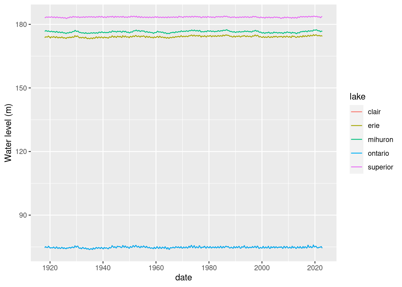
Where did Lake St. Clair go? Probably hidden under Lake Ontario.
lake_level %>%
  filter(lake == 'clair' | lake == 'ontario') %>%
ggplot() + geom_line(aes(x=date, y = waterlevelm, colour = lake)) +
  ylab("Water level (m)")
Warning: Removed 4 rows containing missing values or values outside the scale range
(`geom_line()`).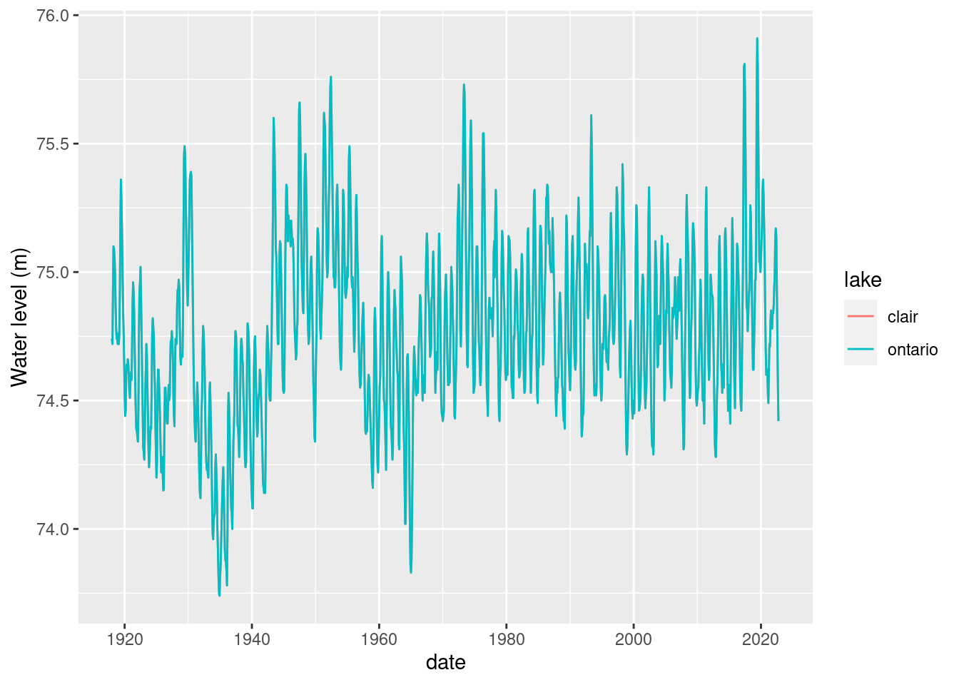
Hmm, are the measurements identical for Lake St. Clair and Lake Ontario?
all(lake_level[lake_level$lake == 'ontario' & !is.na(lake_level$waterlevelm), 3] == lake_level[lake_level$lake == 'clair' & !is.na(lake_level$waterlevelm), 3])[1] TRUEOk, let’s drop Lake St. Clair.
lake_level <- lake_level %>%
  filter(lake != 'clair')
Let’s find the latest month for which we have data and save a version of this dataframe and tag it by the month.
Here’s how we can do this with base R.
last_month <- max(lake_level[!is.na(lake_level$waterlevelm),"date"])
last_month
[1] "2022-10-01 EDT"And, here’s a dplyr approach. Note the use of pull() to convert the the resulting 1x1 dataframe into a value.
last_month_d <- lake_level %>%
  filter(!is.na(waterlevelm)) %>%
  select(date) %>%
  summarize(whichmonth = max(date)) %>%
  pull()

last_month_d
[1] "2022-10-01 EDT"Save as an rds file.
rdsname <- paste0("data/lake_level_", year(last_month), strftime(last_month,"%m"), ".rds")

saveRDS(lake_level, rdsname)
Plotting monthly water level data
For this first plot we will facet by lake and just plot the monthly water level values.
ts_all <- ggplot(lake_level) +
  geom_line(aes(x=date, y = waterlevelm, colour = lake)) +
  ylab("Water level (m)") +
  facet_grid(lake~., scales = "free") +
  theme(strip.text.y = element_text(size = 18),
        axis.text.x = element_text(size = 14),
        axis.text.y = element_text(size = 14),
        axis.title.x = element_text(size=18),
        axis.title.y = element_text(size=18),
        legend.position = "none")

ts_all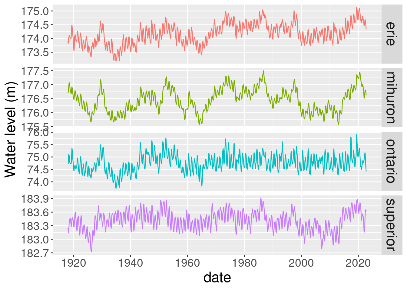
Let’s compute a bunch of overall historical statistics and include a few as reference lines on the plots. I will use dplyr for the stats.
lake_level_stats <- lake_level %>%
  group_by(lake) %>%
  summarize(
    mean_level = mean(waterlevelm, na.rm = TRUE),
    min_level = min(waterlevelm, na.rm = TRUE),
    max_level = max(waterlevelm, na.rm = TRUE),
    p05_level = quantile(waterlevelm, 0.05, na.rm = TRUE),
    p95_level = quantile(waterlevelm, 0.95, na.rm = TRUE),
    sd_level = sd(waterlevelm, na.rm = TRUE),
    cv_level = sd_level / mean_level
  )

lake_level_stats
# A tibble: 4 × 8
lake mean_level min_level max_level p05_level p95_level sd_level cv_level
<chr> <dbl> <dbl> <dbl> <dbl> <dbl> <dbl> <dbl>
1 erie 174. 173. 175. 174. 175. 0.370 0.00212
2 mihuron 176. 176. 178. 176. 177. 0.410 0.00232
3 ontario 74.8 73.7 75.9 74.2 75.3 0.344 0.00461
4 superior 183. 183. 184. 183. 184. 0.204 0.00111Let’s try to combine time series with lines from the stats dataframe just created. Start with just one lake and then we can try with faceted plot by lake. There are a few approaches to doing this. One way is to add geom_hline objects to the plot. Here’s how we could do that for Lake Huron.
lake_level_huron <- lake_level %>%
  filter(lake == 'mihuron')

lake_level_stats_huron <- lake_level_stats %>%
filter(lake == 'mihuron')ggplot(lake_level_huron, aes(x = date, y = waterlevelm)) +
geom_line() + geom_hline(yintercept = lake_level_stats_huron$mean_level)Warning: Removed 2 rows containing missing values or values outside the scale range
(`geom_line()`).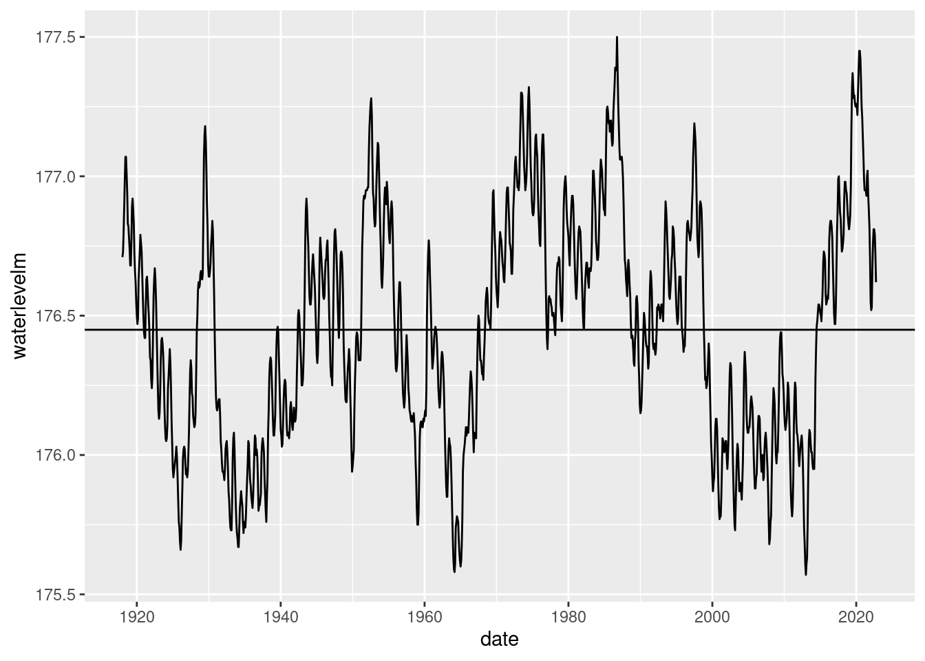
Another approach is to add columns to original dataframe with repeated values or create dataframe by date with repeated valuesand then try to overlay on the original plot. I’m just going to create a merged dataframe containing the monthly data as well as the historical statistics.
lake_level_ts_stats <- merge(x = lake_level, y = lake_level_stats) %>%
  arrange(lake, date)

head(lake_level_ts_stats[lake_level_ts_stats$lake == 'mihuron', 1:8])
lake date waterlevelm mean_level min_level max_level p05_level
1261 mihuron 1918-01-01 176.71 176.4494 175.57 177.5 175.8
1262 mihuron 1918-02-01 176.73 176.4494 175.57 177.5 175.8
1263 mihuron 1918-03-01 176.80 176.4494 175.57 177.5 175.8
1264 mihuron 1918-04-01 176.89 176.4494 175.57 177.5 175.8
1265 mihuron 1918-05-01 176.99 176.4494 175.57 177.5 175.8
1266 mihuron 1918-06-01 177.07 176.4494 175.57 177.5 175.8
p95_level
1261 177.1315
1262 177.1315
1263 177.1315
1264 177.1315
1265 177.1315
1266 177.1315Now it’s easy to add overall mean and percentile bands to our plot
ggplot(lake_level_ts_stats, aes(x = date, y = waterlevelm, colour = lake)) +
  facet_grid(lake ~ ., scales = "free") +
  geom_line() +
  geom_line(aes(y = mean_level)) +
  geom_line(linetype = "dashed", aes(y = p05_level)) +
  geom_line(linetype = "dashed", aes(y = p95_level)) +
  theme(strip.text.y = element_text(size = 18),
        axis.text.x = element_text(size = 14),
        axis.text.y = element_text(size = 10),
        axis.title.x = element_text(size=18),
        axis.title.y = element_text(size=18),
        legend.position = "none")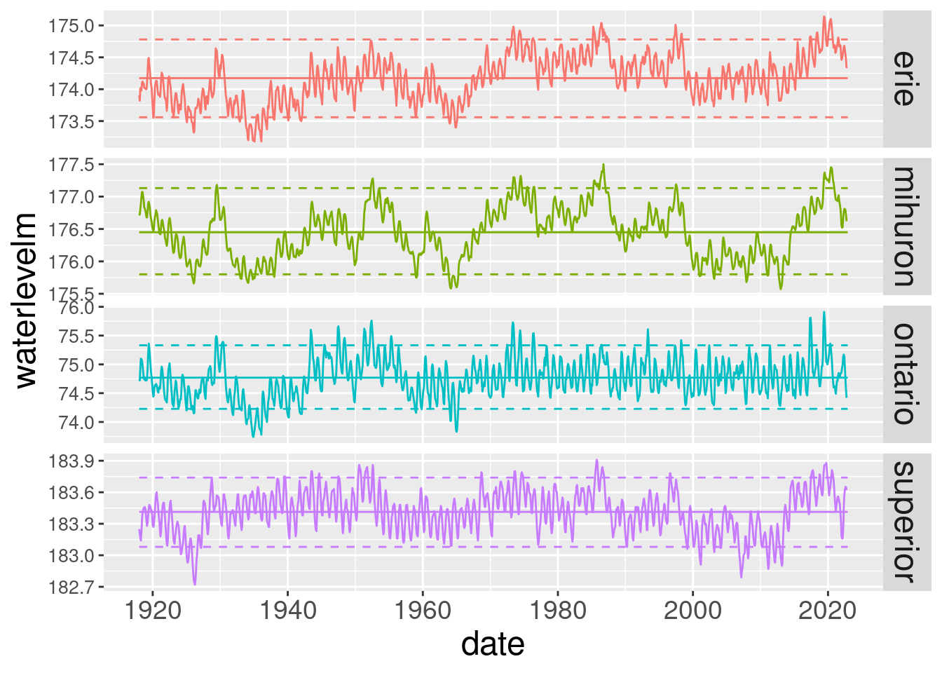
Wow, Lake Michigan and Huron are back near their historic mean level while the other lakes have had some pretty serious level swings the last few years.
We would save this is an image file if we’d like.
ggsave("lake_levels.png")Saving 7 x 5 in imageWarning: Removed 8 rows containing missing values or values outside the scale range
(`geom_line()`).This seems like a good place to stop for this post. I hope to dig into this data a bit using R’s time series analysis capabilities and do some follow up posts. In the next post we’ll pull out the important bits of the work above and create an R function we can call to easily rerun the analysis each month when new data becomes available.
Citation
BibTeX citation:
@online{isken2023,
  author = {Isken, Mark},
  title = {Using {R} to Download and Plot {Great} {Lakes} Historical
    Water Level Data},
  date = {2023-01-15},
  url = {https://bitsofanalytics.org/posts/great-lakes-water-levels/get_plot_gl_water_levels.html},
  langid = {en}
}
For attribution, please cite this work as:
Isken, Mark. 2023. “Using R to Download and Plot Great Lakes
Historical Water Level Data.” January 15. https://bitsofanalytics.org/posts/great-lakes-water-levels/get_plot_gl_water_levels.html.