setwd("<workding directory with your data files and scrips and other stuff>")Getting started with R (with plyr and ggplot2) for group by analysis
Slightly old-school tutorial on group by analysis with R
R
Note
This post is a bit dated. However, it’s worth keeping around as a look back at the days when the tidyverse was not yet a thing, but tools like ggplot2 and plyr were a sign of things to come.
Analysis background
We have a data file containing records corresponding to surgical cases. For each case we know some basic information about the patient’s scheduled case including an urgency code, the date the case was scheduled, insurance status, surgical service, and the number of days prior to surgery in which the case was scheduled. In data model terms, the first 4 variables are dimensions and the last variable is a measure. In R, a dimension is called a factor and each unique value of a factor is called a level. Of course, we could certainly use things like SQL or Excel Pivot Tables to do very useful things with this data. However, here we will start to see how R can be used to do the same things as well as to do some things that are much more difficult using SQL or Excel.
Preliminaries
I’m assuming you’ve got R installed. If not you can get it from the R Project web page. If you’ve never used R before, you might want to spend some time learning the basics before tackling this tutorial.
Some good sites for learning R are: - The R-Project - Quick-R - Cookbook for R
Both Stack Overflow and Cross Validated are good places for Q & A related to R and statistics. Stack Overflow is a general place for programming related questions and Cross Validated focuses on statistical questions.
Yes, R has a somewhat steep learning curve but the payoff is huge.
While R comes with a basic command line environment, I highly recommend downloading R Studio, a really great IDE for working with R.
Before doing anything, set the working directory via the Session menu (in R Studio) or at the command console with:
Load libraries that we’ll need.
library(plyr)      # A library for data summarization and transformation
library(ggplot2)   # A library for plotting
To install a library not already installed (can’t load something if it’s not installed first):
install.packages("plyr")Both plyr and ggplot2 are R libraries created by Hadley Wickham. He is a prolific developer of useful R packages, teaches at Rice University, and is the Chief Scientist at R Studio. His website is: http://had.co.nz/.
The plyr library implements what is known as the Split-Apply-Combine model for data summarization. A great little paper is available from the plyr website at http://plyr.had.co.nz/.
The ggplot2 library is a plotting system for R. It’s based on something called the “grammar of graphics”. The main website is http://ggplot2.org/. The best way to really learn how to use it is the ggplot2 book which is referenced at the main site. In addition, there is a great web based cookbook for doing graphs with ggplot2 at http://www.cookbook-r.com/Graphs/.
You can always get help on any R command or function by typing help(
Load data
Read in the csv file to a data frame.
sched_df <- read.csv("data/SchedDaysAdv.csv", stringsAsFactors = TRUE)  # String ARE factors by default, just being explicit

head(sched_df)  # See the start of the data frame
X SurgeryDate Service ScheduledDaysInAdvance Urgency
1 0 2012-07-05 00:00:00 Cardiology 9 Routine
2 1 2009-10-08 00:00:00 Podiatry 34 Routine
3 2 2009-06-11 00:00:00 Oral-Maxillofacial Surg 22 Routine
4 3 2011-02-18 00:00:00 General Surgery 1 Urgent
5 4 2012-08-20 00:00:00 Orthopedic Surgery 14 Routine
6 5 2010-12-16 00:00:00 General Surgery 38 Routine
InsuranceStatus
1 Private
2 Private
3 Private
4 Private
5 Private
6 Medicaretail(sched_df) # See the end of the data frame X SurgeryDate Service ScheduledDaysInAdvance
19995 19994 2010-10-15 00:00:00 Oral-Maxillofacial Surg 11
19996 19995 2011-04-26 00:00:00 GYN Surgery 36
19997 19996 2009-07-17 00:00:00 Oral-Maxillofacial Surg 22
19998 19997 2010-11-02 00:00:00 GYN Surgery 50
19999 19998 2012-12-20 00:00:00 General Surgery 21
20000 19999 2012-07-26 00:00:00 Obstetrics 1
Urgency InsuranceStatus
19995 Routine Private
19996 Routine Private
19997 Routine Private
19998 Routine None
19999 Routine Medicare
20000 Emergency PrivateYou can also browse the data frame with clicking on the sched_df object in the Data section of the Workspace browser.
Analysis
We will start with basic summary stats, move on to more complex calculations and finish up with some basic graphing.
Basic summary stats
Let’s start with some basic summary statistics regarding lead time by various dimensions, or in R terms, factors.
Since ScheduledDaysInAdvance is the only measure, we’ll do a bunch of descriptive statistics on it.
## Use summary() to get the 5 number summary
summary(sched_df$ScheduledDaysInAdvance)
Min. 1st Qu. Median Mean 3rd Qu. Max.
0.00 5.00 13.00 16.35 24.00 187.00 ## How about some percentiles
p05_leadtime <- quantile(sched_df$ScheduledDaysInAdvance,0.05)
p05_leadtime5%
1 p95_leadtime <- quantile(sched_df$ScheduledDaysInAdvance,0.95)
p95_leadtime95%
43 Histogram and box plot
Graphing and charting in R is a huge topic. A few of the more popular graphics libraries include lattice and ggplot2. All of the plots in this tutorial are done with ggplot2. The qplot command is for “quick plots” that don’t require much understanding of the underlying “grammar of graphics”. It’s a good place to start in learning ggplot2 but you’ll want to learn how to access the power and flexibility of this package available through the ggplot and related commands. While the statements look a little daunting at first, once you get the hang of ggplot2, it’s no big deal.
I “borrowed” the following histogram examples from the Cookbook on R chapter on Plotting distributions.
# Basic histogram for ScheduledDaysInAdvance. Each bin is 4 wide.
# These both do the same thing:
qplot(sched_df$ScheduledDaysInAdvance, binwidth=4)
Warning: `qplot()` was deprecated in ggplot2 3.4.0.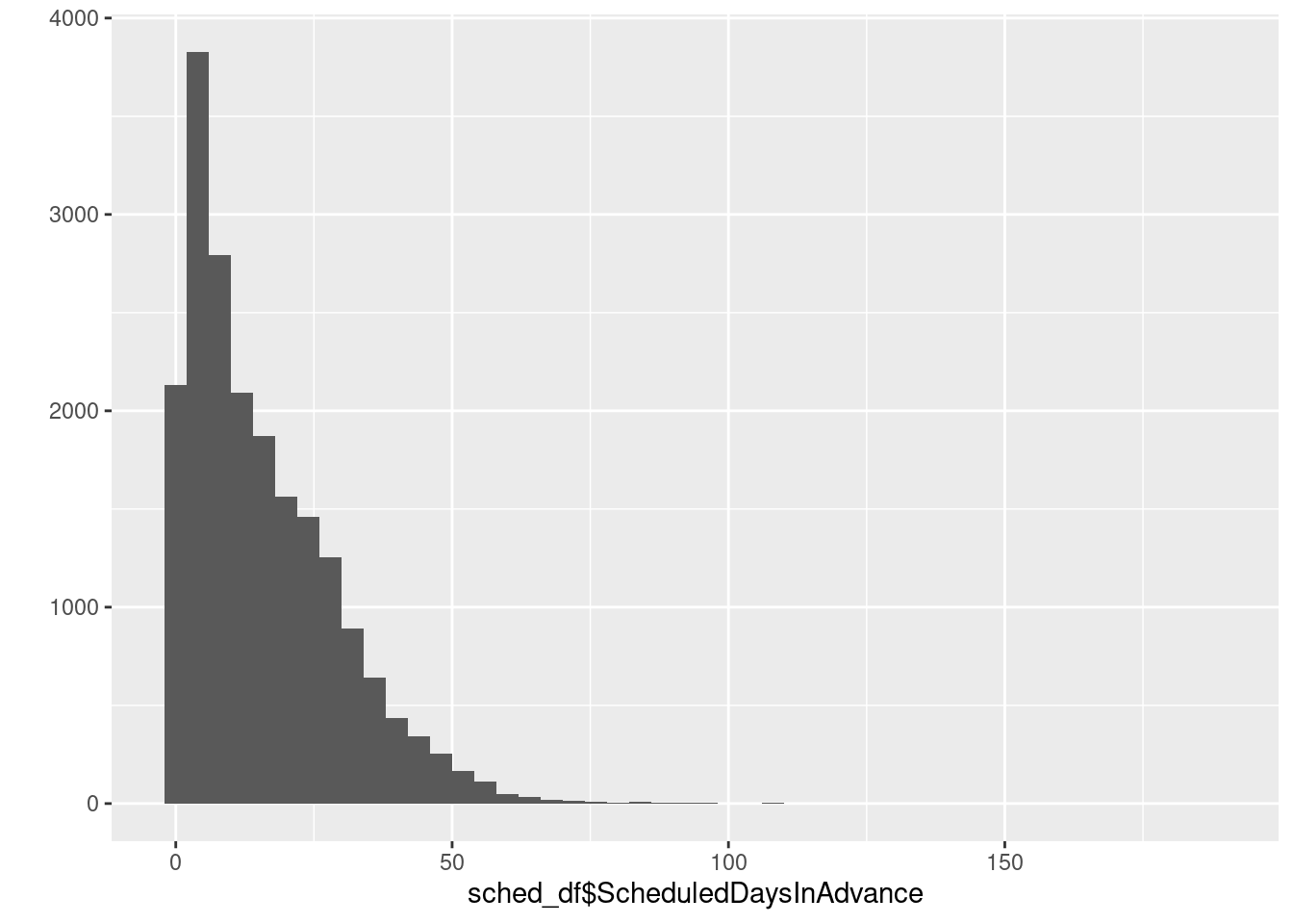
ggplot(sched_df, aes(x=ScheduledDaysInAdvance)) + geom_histogram(binwidth=4)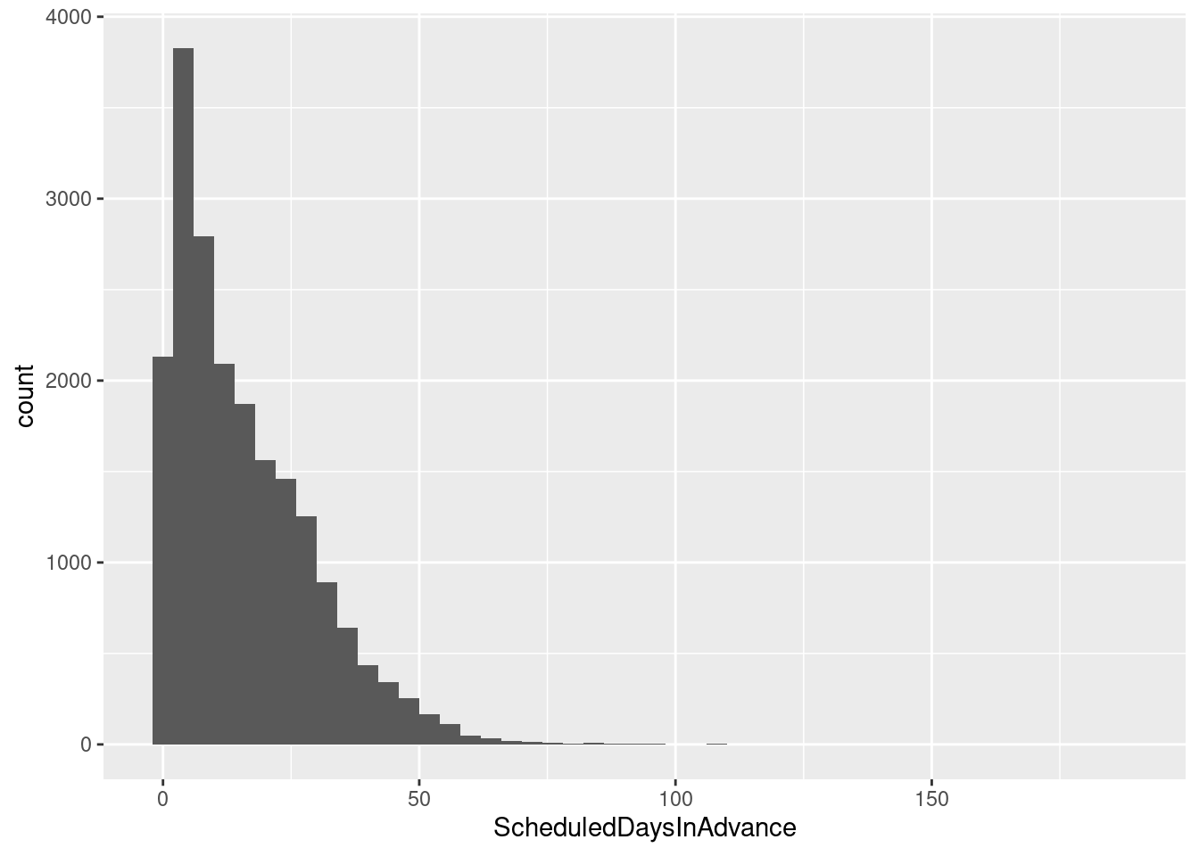
# Draw with black outline, white fill
ggplot(sched_df, aes(x=ScheduledDaysInAdvance)) + geom_histogram(binwidth=4, colour="black", fill="white")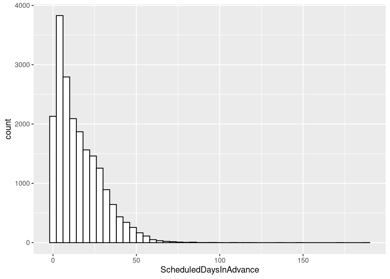
# Density curve
ggplot(sched_df, aes(x=ScheduledDaysInAdvance)) + geom_density()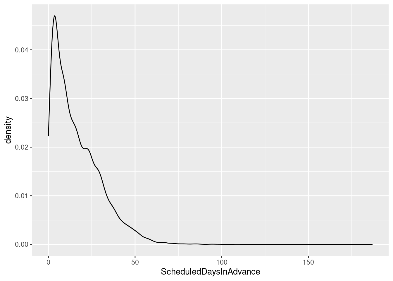
# Histogram overlaid with kernel density curve
ggplot(sched_df, aes(x=ScheduledDaysInAdvance)) +
    geom_histogram(aes(y=..density..),      # Histogram with density instead of count on y-axis
                   binwidth=4,
                   colour="black", fill="white") +
    geom_density(alpha=.2, fill="#FF6666")  # Overlay with transparent density plot
Warning: The dot-dot notation (`..density..`) was deprecated in ggplot2 3.4.0.
ℹ Please use `after_stat(density)` instead.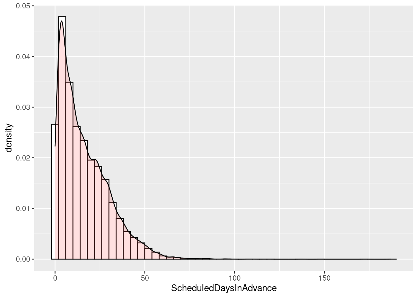
Near the end of the tutorial we’ll revisit these and do them by various groupings.
For box plots, let’s do a little grouping as well.
# A basic box plot by InsuranceStatus
ggplot(sched_df, aes(x=InsuranceStatus, y=ScheduledDaysInAdvance)) + geom_boxplot()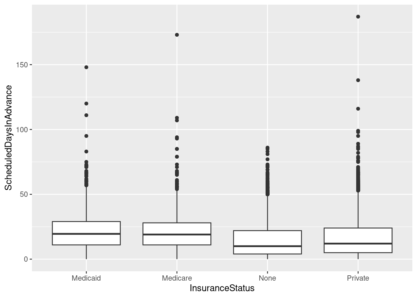
# A basic box with the InsuranceStatus colored
ggplot(sched_df, aes(x=InsuranceStatus, y=ScheduledDaysInAdvance, fill=InsuranceStatus)) + geom_boxplot()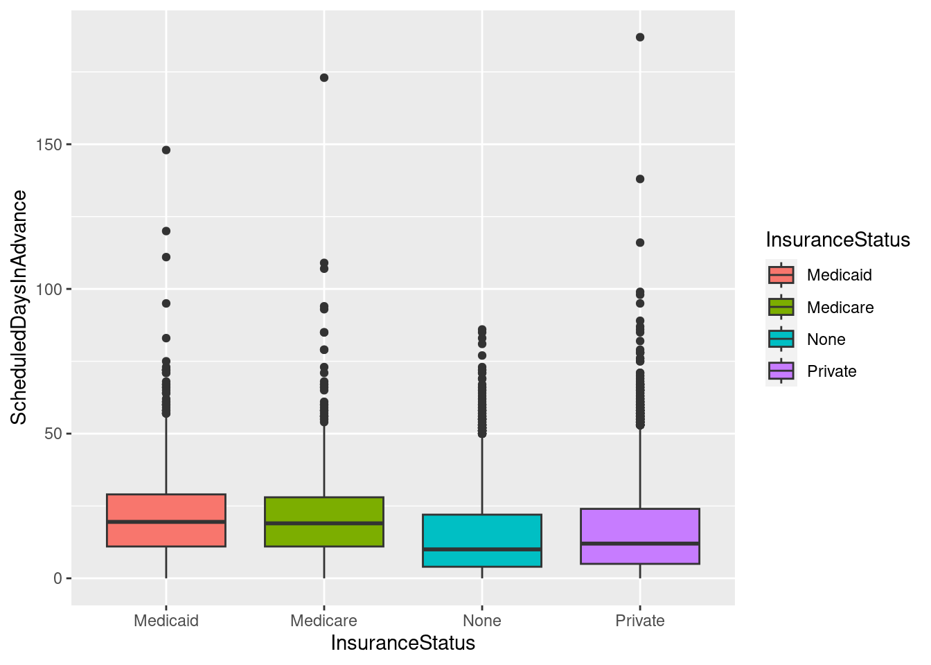
# The above adds a redundant legend. With the legend removed:
ggplot(sched_df, aes(x=InsuranceStatus, y=ScheduledDaysInAdvance, fill=InsuranceStatus)) + geom_boxplot() +
    guides(fill=FALSE)
Warning: The `<scale>` argument of `guides()` cannot be `FALSE`. Use "none" instead as
of ggplot2 3.3.4.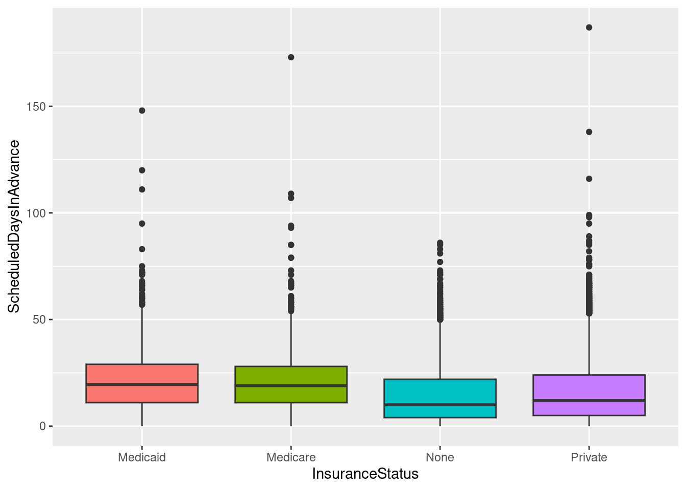
# With flipped axes and a different grouping field
ggplot(sched_df, aes(x=Urgency, y=ScheduledDaysInAdvance, fill=Urgency)) + geom_boxplot() +
    guides(fill=FALSE) + coord_flip()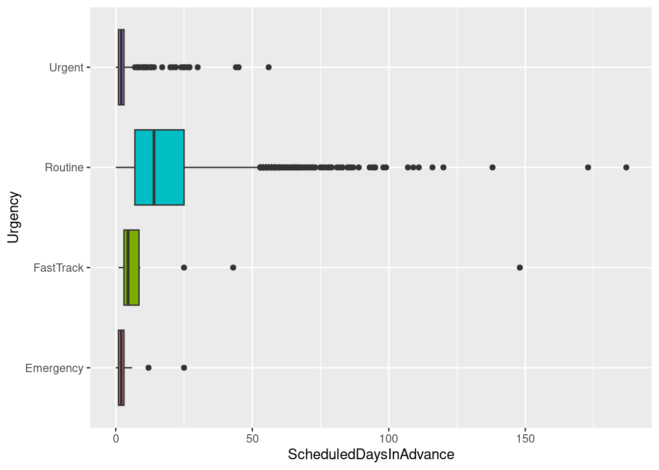
Group-wise summaries
Everything we’ve done so far (except for the box plots) has not considered any of the dimensions (factors, group by fields, etc.).
R has a family of functions called the apply family. They are designed when you want to apply some sort of function(either a built in function or a udf) repeatedly to some subset of data. There a bunch of apply functions and it can be difficult to remember the nuances of each. Good introductory overviews include:
- http://nsaunders.wordpress.com/2010/08/20/a-brief-introduction-to-apply-in-r/
- http://www.r-bloggers.com/say-it-in-r-with-by-apply-and-friends/
Let’s compute the counts, mean and standard deviation of lead time by urgency class. We’ll use the tapply function. According to help(tapply):
Apply a function to each cell of a ragged array, that is to each (non-empty) group of values given by a unique combination of the levels of certain factors.The “ragged array” refers to the fact that the number of rows for each level of some factor might be different. In this example, there are likely a different number of cases for each value of the urgency column (a factor).
## Count(ScheduledDaysInAdvance) by Urgency
tapply(sched_df$ScheduledDaysInAdvance,sched_df$Urgency,length)
Emergency FastTrack Routine Urgent
256 14 18492 1238 ## Mean(ScheduledDaysInAdvance) by Urgency
tapply(sched_df$ScheduledDaysInAdvance,sched_df$Urgency,mean)Emergency FastTrack Routine Urgent
2.171875 18.642857 17.465120 2.520194 ## Mean(ScheduledDaysInAdvance) by Urgency and store result in an array
meansbyurg<-tapply(sched_df$ScheduledDaysInAdvance,sched_df$Urgency,mean)
## Std(ScheduledDaysInAdvance) by Urgency
tapply(sched_df$ScheduledDaysInAdvance,sched_df$Urgency,sd)Emergency FastTrack Routine Urgent
2.122187 38.978509 13.654883 3.528495 What if you want to compute means after grouping by two factors? Well, tapply will take a list of factors as the INDEX argument.
tapply(sched_df$ScheduledDaysInAdvance,list(sched_df$Urgency,sched_df$InsuranceStatus),mean) Medicaid Medicare None Private
Emergency 0.500000 2.166667 1.880000 2.317919
FastTrack 148.000000 NA 4.500000 15.400000
Routine 22.535554 21.785600 15.945669 17.047674
Urgent 2.466667 2.240000 2.741176 2.441281The results of tapply are generally arrays. What if we want a data frame with the factors appearing as columns?
aggregate(sched_df$ScheduledDaysInAdvance,list(sched_df$Urgency,sched_df$InsuranceStatus),mean) Group.1 Group.2 x
1 Emergency Medicaid 0.500000
2 FastTrack Medicaid 148.000000
3 Routine Medicaid 22.535554
4 Urgent Medicaid 2.466667
5 Emergency Medicare 2.166667
6 Routine Medicare 21.785600
7 Urgent Medicare 2.240000
8 Emergency None 1.880000
9 FastTrack None 4.500000
10 Routine None 15.945669
11 Urgent None 2.741176
12 Emergency Private 2.317919
13 FastTrack Private 15.400000
14 Routine Private 17.047674
15 Urgent Private 2.441281Aggregate returns generic column names for the resulting data frame. We can make our own.
meansbyurgstatus <- aggregate(sched_df$ScheduledDaysInAdvance,list(sched_df$Urgency,sched_df$InsuranceStatus),mean)
names(meansbyurgstatus) <- c("Urgency","MilStatus","MeanLeadTime")
Check out http://nsaunders.wordpress.com/2010/08/20/a-brief-introduction-to-apply-in-r/ for more on these and related functions in the apply family.
Using plyr for group wise analysis
While tapply and friends are great, they can be a bit confusing. plyr was designed to make it easier to do this type of analysis. Check out the highlights at http://plyr.had.co.nz/. One way that plyr is easier to use than tapply and friends is that it uses a common naming convention that specifies the type of input data structure and the type of output data structure. So, if have a data frame and you want a data frame as output, you use ddply. If you wanted an array as output you’d use daply. Again, check out the article on Split-Apply-Combine that is the basis for plyr to get all the details.
The summarise function (in plyr) summarizes a field over entire data set (i.e. no grouping fields). Result of following is 1 x 6.
summarise(sched_df, mean_leadtime=mean(ScheduledDaysInAdvance),
  sd_leadtime=sd(ScheduledDaysInAdvance),
  min_leadtime = min(ScheduledDaysInAdvance),
  p05_leadtime = quantile(ScheduledDaysInAdvance,0.05),
  p95_leadtime = quantile(ScheduledDaysInAdvance,0.95),
  max_leadtime = max(ScheduledDaysInAdvance))
mean_leadtime sd_leadtime min_leadtime p05_leadtime p95_leadtime max_leadtime
1 16.3451 13.77599 0 1 43 187The above isn’t super useful but shows how to do a basic summary of a field in a data frame. The summarise() function will get used in other plyr commands shortly. Note also that no assignment is done and that the command merely outputs the results to the console. To store the results in data frame, we do this:
overall_stats <- summarise(sched_df, mean_leadtime=mean(ScheduledDaysInAdvance),
  sd_leadtime=sd(ScheduledDaysInAdvance),
  min_leadtime = min(ScheduledDaysInAdvance),
  p05_leadtime = quantile(ScheduledDaysInAdvance,0.05),
  p95_leadtime = quantile(ScheduledDaysInAdvance,0.95),
  max_leadtime = max(ScheduledDaysInAdvance))
## Count(ScheduledDaysInAdvance) by Urgency
ddply(sched_df,"Urgency",summarise,numcases=length(ScheduledDaysInAdvance)) Urgency numcases
1 Emergency 256
2 FastTrack 14
3 Routine 18492
4 Urgent 1238## A variant of above but using the special "dot" function so that the splitting variables can
## be referenced directly by name without quotes.
ddply(sched_df,.(Urgency),summarise,numcases=length(ScheduledDaysInAdvance)) Urgency numcases
1 Emergency 256
2 FastTrack 14
3 Routine 18492
4 Urgent 1238## Mean(ScheduledDaysInAdvance) by Urgency
ddply(sched_df,.(Urgency),summarise,mean_leadtime=mean(ScheduledDaysInAdvance)) Urgency mean_leadtime
1 Emergency 2.171875
2 FastTrack 18.642857
3 Routine 17.465120
4 Urgent 2.520194## Mean(ScheduledDaysInAdvance) by Urgency and store result in an array
meansbyurg<-ddply(sched_df,.(Urgency),summarise,mean_leadtime=mean(ScheduledDaysInAdvance))
## Std(ScheduledDaysInAdvance) by Urgency
ddply(sched_df,.(Urgency),summarise,sd_leadtime=sd(ScheduledDaysInAdvance)) Urgency sd_leadtime
1 Emergency 2.122187
2 FastTrack 38.978509
3 Routine 13.654883
4 Urgent 3.528495## Now let's do mean lead time by Urgency and InsuranceStatus
ddply(sched_df,.(Urgency,InsuranceStatus),summarise,mean_leadtime=mean(ScheduledDaysInAdvance)) Urgency InsuranceStatus mean_leadtime
1 Emergency Medicaid 0.500000
2 Emergency Medicare 2.166667
3 Emergency None 1.880000
4 Emergency Private 2.317919
5 FastTrack Medicaid 148.000000
6 FastTrack None 4.500000
7 FastTrack Private 15.400000
8 Routine Medicaid 22.535554
9 Routine Medicare 21.785600
10 Routine None 15.945669
11 Routine Private 17.047674
12 Urgent Medicaid 2.466667
13 Urgent Medicare 2.240000
14 Urgent None 2.741176
15 Urgent Private 2.441281This is just a very, very brief peek into to plyr and data summarization in R. Way more complex stuff can be done. In fact, why don’t we do something that is not easy to do using SQL or Excel Pivot Tables or Tableau. Let’s compute the 95th percentile of lead time by service and insurance status.
ddply(sched_df,.(Service,InsuranceStatus),summarise,p95_leadtime=quantile(ScheduledDaysInAdvance,0.95)) Service InsuranceStatus p95_leadtime
1 Cardiology Medicaid 4.00
2 Cardiology Medicare 27.00
3 Cardiology None 17.20
4 Cardiology Private 23.10
5 Family Medicine Medicaid 36.45
6 Family Medicine Medicare 41.80
7 Family Medicine None 32.90
8 Family Medicine Private 48.00
9 Gastroenterology Medicaid 36.90
10 Gastroenterology Medicare 41.90
11 Gastroenterology None 26.00
12 Gastroenterology Private 40.00
13 General Surgery Medicaid 41.00
14 General Surgery Medicare 45.10
15 General Surgery None 41.00
16 General Surgery Private 37.00
17 GYN Surgery Medicaid 48.00
18 GYN Surgery Medicare 34.60
19 GYN Surgery None 41.80
20 GYN Surgery Private 47.00
21 Obstetrics Medicaid 21.60
22 Obstetrics Medicare 27.00
23 Obstetrics None 35.00
24 Obstetrics Private 40.00
25 Ophthalmology Medicaid 70.85
26 Ophthalmology Medicare 60.00
27 Ophthalmology None 59.40
28 Ophthalmology Private 60.00
29 Oral-Maxillofacial Surg Medicaid 24.50
30 Oral-Maxillofacial Surg Medicare 15.30
31 Oral-Maxillofacial Surg None 35.00
32 Oral-Maxillofacial Surg Private 22.00
33 Orthopedic Surgery Medicaid 30.00
34 Orthopedic Surgery Medicare 43.95
35 Orthopedic Surgery None 43.00
36 Orthopedic Surgery Private 44.00
37 Otolaryngology Medicaid 53.80
38 Otolaryngology Medicare 44.75
39 Otolaryngology None 50.00
40 Otolaryngology Private 47.00
41 Pain Clinic Medicare 28.15
42 Pain Clinic None 30.05
43 Pain Clinic Private 26.00
44 Podiatry Medicaid 52.80
45 Podiatry Medicare 44.50
46 Podiatry None 42.50
47 Podiatry Private 47.00
48 Pulmonology Medicaid 22.40
49 Pulmonology Medicare 19.50
50 Pulmonology None 11.00
51 Pulmonology Private 24.75
52 Urology-GU Surgery Medicaid 60.00
53 Urology-GU Surgery Medicare 31.05
54 Urology-GU Surgery None 34.55
55 Urology-GU Surgery Private 37.65## Now let's do it by Urgency
ddply(sched_df,.(Urgency),summarise,p95_leadtime=quantile(ScheduledDaysInAdvance,0.95)) Urgency p95_leadtime
1 Emergency 4.00
2 FastTrack 79.75
3 Routine 44.00
4 Urgent 4.00## or by service
ddply(sched_df,.(Service),summarise,p95_leadtime=quantile(ScheduledDaysInAdvance,0.95)) Service p95_leadtime
1 Cardiology 25.50
2 Family Medicine 47.10
3 Gastroenterology 40.00
4 General Surgery 39.50
5 GYN Surgery 45.20
6 Obstetrics 39.00
7 Ophthalmology 62.95
8 Oral-Maxillofacial Surg 28.00
9 Orthopedic Surgery 44.00
10 Otolaryngology 48.10
11 Pain Clinic 26.15
12 Podiatry 47.00
13 Pulmonology 22.85
14 Urology-GU Surgery 37.00Even within R, there are several other ways of doing this type of analysis. For example, the sqldef package lets you execute SQL statements in R. Other packages for doing group by type analysis include data.table and doBy.
Histograms revisited
Let’s just see how easy it is do a matrix of histograms - something that is no fun at all in Excel.
# Histogram with counts
qplot(ScheduledDaysInAdvance, data = sched_df, binwidth=4) + facet_wrap(~ Service)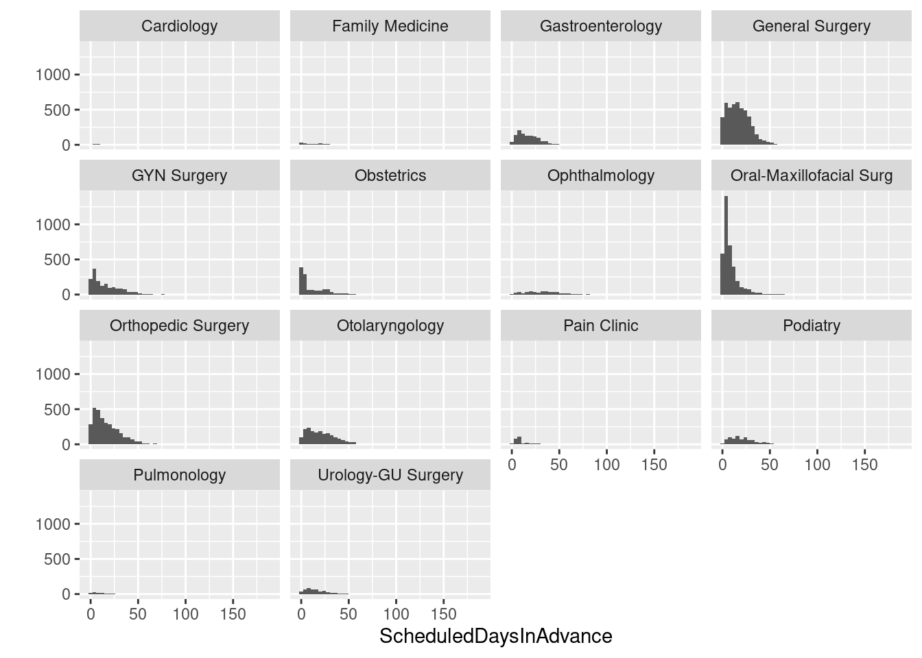
# Histogram with frequencies
ggplot(sched_df,aes(x=ScheduledDaysInAdvance)) + facet_wrap(~ Service) +
   geom_histogram(aes(y=..density..), binwidth=4)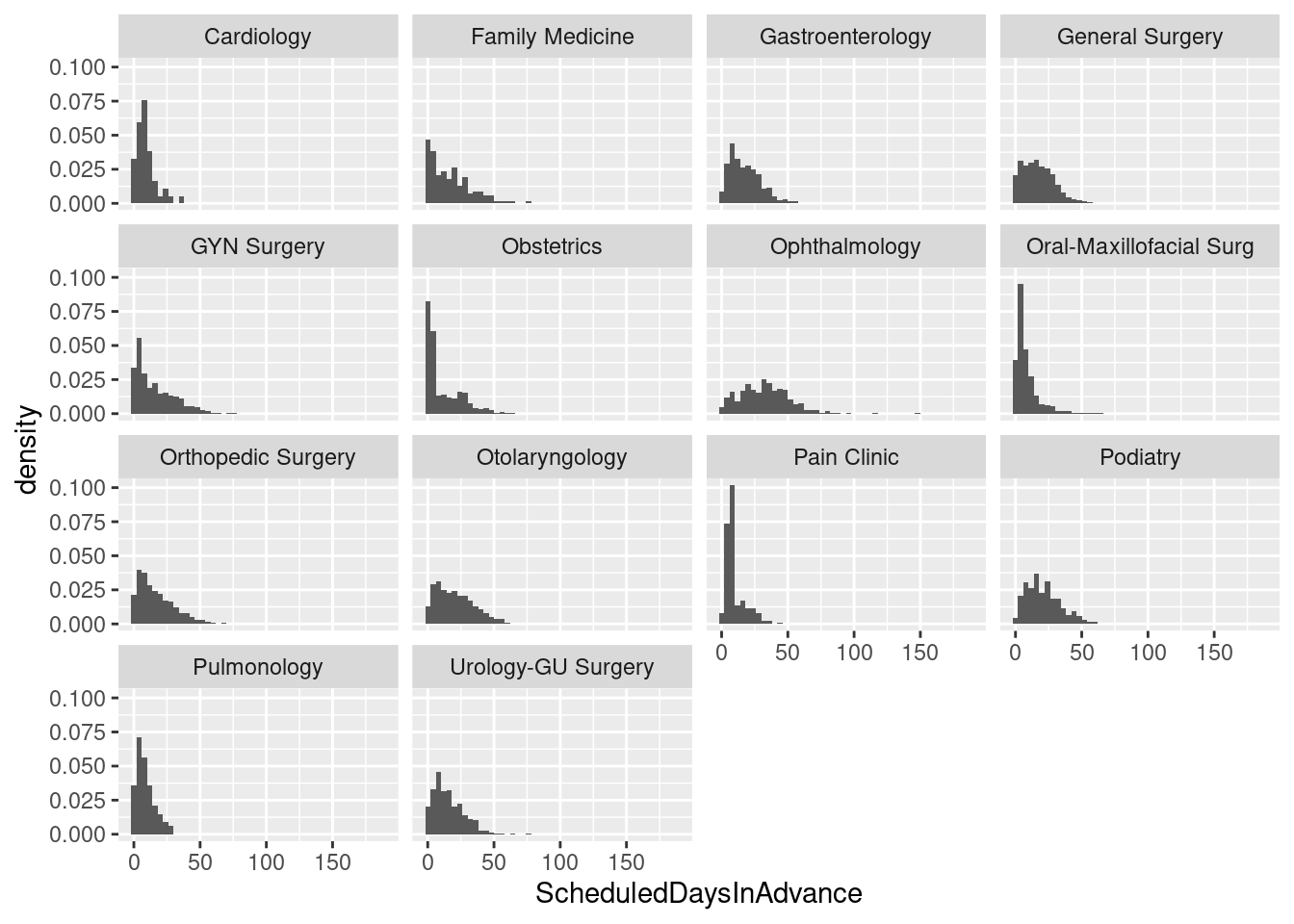
About this web page
This page was created as an R Markdown document using R Studio and turned into HTML using knitr (through R Studio). You can find the data and the R Markdown file in my hselab-tutorials github repo. Clone or download a zip. R Studio is an awesome IDE for doing work in R and keeps getting better in terms of its support for “reproducible analysis” through integration of tools like Markdown and knitr.