from IPython.core.display import Image
Image(filename='images/ipython-qtconsole.png') 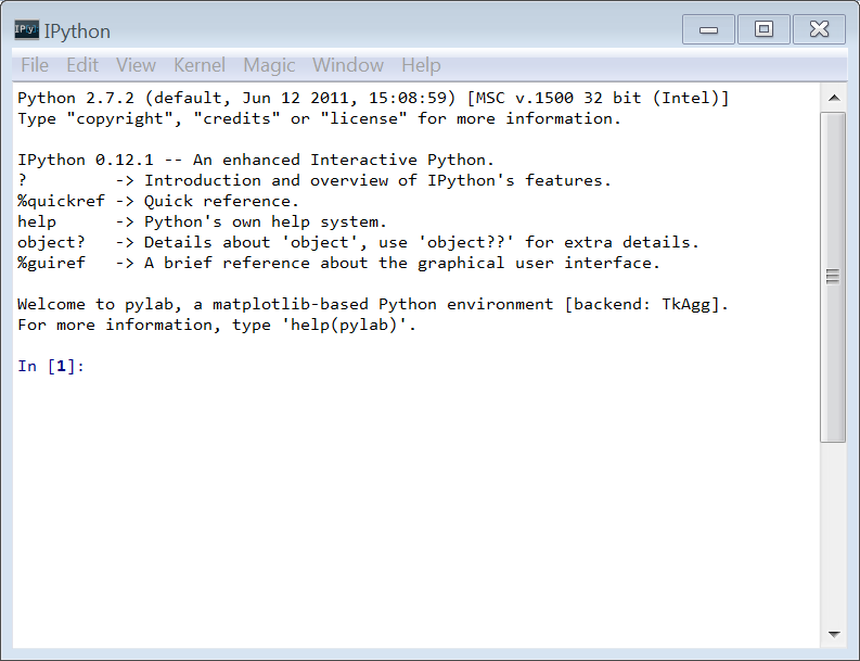
Analyzing schedule lead time for surgery
This post is a bit dated. However, it’s worth keeping around as a look back at the early days of the Python fueled data science boom.
We have a data file containing records corresponding to surgical cases. For each case we know some basic information about the patient’s scheduled case including an urgency code, the date the case was scheduled, insurance status, surgical service, and the number of days prior to surgery in which the case was scheduled. In data model terms, the first 4 variables are dimensions and the last variable is a measure. Of course, we could certainly use things like SQL or Excel Pivot Tables to do very useful things with this data. In a previous tutorial I showed how R can be used to do the same things as well as to do some things that are much more difficult using SQL or Excel. In this tutorial I’ll do the same things as in the R tutorial but will use Python instead.
Python is a major force in the scientific and analytic computing worlds. It’s an easy language to learn, is very list-centric, dynamically typed, and has many contributed modules to facilitate the kinds of computing we do for business analytics. It’s great for rapid development, algorithm testing, interactive data and model exploration, and as a “glue” or scripting language (like Perl or Ruby). It also has some similarities to R and to interactive environments like Matlab or Mathematica. There is a huge community of Python developers creating 3rd party modules for all kinds of computing problems. For example, adodbpi is a module for connecting to databases using ADO from Python. I use it in my new Python based Hillmaker (coming soon). Python is open source, free, and cross-platform. It is fun to program in Python.
Python itself is free as are the gajillion modules out there for doing various computing things. Some folks have created specific “Python distributions” which are nothing more than Python and a collection of packages that have been tested and configured to play nicely together. Downloading such distributions can be a huge time saver compared to installing Python and then finding, downloading and installing the various modules you want (e.g. numpy, scipy, pandas, matplotlib). A few very good Python distros for scientific computing are:
Enthought Python Distribution for Scientific Computing - a really nice commercial distribution of Python for scientific computing. There is a free version that comes with six core modules for getting started with scientific computing. >EPD is a lightweight distribution of scientific Python essentials: SciPy, NumPy, IPython, matplotlib, pandas, SymPy, nose, Traits, & Chaco
Python(x,y) - “the scientific Python distribution” >Python(x,y) is a free scientific and engineering development software for numerical computations, data analysis and data visualization based on Python programming language, Qt graphical user interfaces and Spyder interactive scientific development environment.
If you want to intall the base Python yourself, you can get it at the Python Download page. You will see that there are two active Python distros, the 2.x and 3.x versions. Version 2.7.3 is the production version that you’ll want to download for now. I haven’t moved to 3.x yet as it isn’t backwards compatible with 2.x and some of the modules I use weren’t quite ready for 3.x yet. That said, it’s been about three years since 3.x was released and at some point the Python world will move to it. A little Googling of “Python 2 vs 3” is worth some time. Bottom line, I’m using 2.7.3.
For this tutorial you also need to make sure you have numpy, scipy, and pandas installed. You should also get IPython (more on it below.) They all have binary installers for Windows. Again, if you just use the EPD or Python(x,y) distros, you’ll get Python along with these (and many other) modules.
I suggest using the IPython interactive shell for this kind of learning and exploratory analysis. I copied the following directly from the IPython website:
IPython provides a rich architecture for interactive computing with:
- Powerful interactive shells (terminal and Qt-based).
- A browser-based notebook with support for code, text, mathematical expressions, inline plots and other rich media.
- Support for interactive data visualization and use of GUI toolkits.
- Flexible, embeddable interpreters to load into your own projects.
In the Linux world, the regular old bash shell is fine for IPython sessions (which can be started by simply typing “ipython” at a command prompt). However, the Windows command shell is horrible (it’s too small, can’t resize it, can’t handle inline graphics, copying and pasting is clumsy, etc.). There is a bare bones Python terminal called IDLE that comes with every Python installation and runs on all platforms. However, it’s pretty limited compared to IPython. So, what to do in Windows for running IPython? When you install IPython you get an app called IPythonQt which is IPython embedded in a PyQt GUI console. To run IPython as a Qt console, just open a command prompt, change directories into some working directory and type:
ipython qtconsole --pylabBy default, plots (graphs) will show up in a separate plot window. It will be dynamic in the sense that you can “layer” on additional matplotlib statements to modify the appearance of the plot. It is possible to have plots show up “inline” in the Qt console but I’ve had trouble then modifying them. So, separate plot windows it is.
IPython has something called magic functions which start with the % sign and facilitate common tasks like interacting with the OS, controlling the IPython session, timing code, profiling code, getting a history of your session and many, many more. Just type %magic at the IPython prompt to get an overview. Hit
from IPython.core.display import Image
Image(filename='images/ipython-qtconsole.png')
You’ll notice in the screenshot above that version 0.12.1 of IPython is running. This is the version that came with the Enthought Python Distribution that I installed. However, you’ll want to install the latest version (currently 0.13.1). It’s got a bunch of new features and improvements. This is especially true for IPython Notebooks.
Finally, you can actually run IPython as a notebook inside your browser. In fact, I’m writing this tutorial as an IPython notebook. It’s really terrific for mixing Python use and supporting text. Just as I used R markdown within R Studio to create the R based tutorial, I’m using markdown within this IPython notebook to create this tutorial. The sessions itself gets saved as a .ipynb file which is nothing more than JSON. The whole thing is amazing. To run IPython as a browser based notebook, just open a command prompt, change directories into some working directory and type:
ipython notebook --pylab=inlineat the command prompt. Notice here I am telling IPython to display plots inline because I’m using the notebook to create this tutorial and I just want to display the plots within the flow of the surrounding text.
from IPython.core.display import Image
Image(filename='images/ipython-notebook.png') 
Some good sites for learning Python (and learning how to be a better programmer) are:
Stack Overflow is a good place for Q and A related to Python and specific Python modules like pandas.
You certainly can just write Python in a good text editor but several good IDEs exist for both Windows and Linux. They have all the niceties you’d expect like syntax highlighting, code completion, debuggers, interactive consoles, and various editing and development tools. I’ve bounced around among three IDEs (all free):
Lately, since I develop both in Windows and Linux, I’ve been using Spyder and been quite happy. I do wish it had the visual debugging features of PyScripter or Eclipse. The integrated IPython console is a huge plus with Spyder though inline graphics no longer work with latest version of IPython (separate graph windows get created). I’m sure I’ll bounce around some more between these IDEs as they evolve.
Here’s a shot of Spyder in use for a typical session of learning to use matplotlib.
from IPython.core.display import Image
Image(filename='images/spyder-hacking.png') 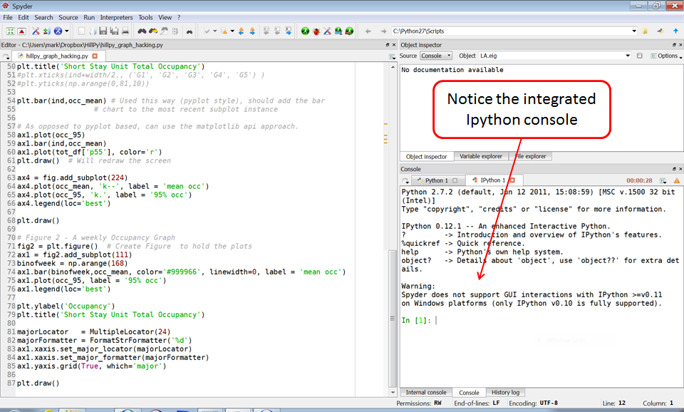
Okay, let’s get going. We’ll use IPython through the qtconsole as our interactive shell. So, open a command prompt window and type:
ipython qtconsole --pylabIf you didn’t get yourself into the directory containing the data file for this tutorial, you can use the !magic to do so. If that doesn’t work, try %cd magic.
%cd <some working directory with the data you want to analyze>[Error 123] The filename, directory name, or volume label syntax is incorrect: u'<some working directory with the data you want to analyze>'
C:\Users\mark\Documents\Work\teaching\GroupByAnalysisImport some modules we’ll need.
import pandas as pd
import numpy as np
import matplotlib.pyplot as plt
Pandas is a somewhat new Python module for data analysis. It focuses on data structures that make it efficient and easy to do “group by”, time series and other data analytics types of things. It’s not a stat package. Wes McKinney developed pandas while working as a quant in the financial services industry and recently published Python for Data Analysis (a must have). His Quant Pythonista blog has tons of great stuff on pandas and the computational aspects of data analytics. It uses numpy as its underlying numerical array engine.
One of he main data structures in pandas is the DataFrame. It’s similar to a data frame in R and you can think of it as just a data table with field names and an index. A simple way to create a data frame is to read a csv file into pandas with the read_csv function.
sched_df = pd.read_csv('data/SchedDaysAdv.csv')sched_df<class 'pandas.core.frame.DataFrame'>
Int64Index: 20000 entries, 0 to 19999
Data columns:
Unnamed: 0 20000 non-null values
SurgeryDate 20000 non-null values
Service 20000 non-null values
ScheduledDaysInAdvance 20000 non-null values
Urgency 20000 non-null values
InsuranceStatus 20000 non-null values
dtypes: int64(2), object(4)Notice that sched_df just has a default integer index. Very complex hierarchical indexing can be done as well as using time series as indexes.
sched_df.head() # Check out the first few rows of sched_df| Unnamed: 0 | SurgeryDate | Service | ScheduledDaysInAdvance | Urgency | InsuranceStatus | |
|---|---|---|---|---|---|---|
| 0 | 0 | 2012-07-05 00:00:00 | Cardiology | 9 | Routine | Private |
| 1 | 1 | 2009-10-08 00:00:00 | Podiatry | 34 | Routine | Private |
| 2 | 2 | 2009-06-11 00:00:00 | Oral-Maxillofacial Surg | 22 | Routine | Private |
| 3 | 3 | 2011-02-18 00:00:00 | General Surgery | 1 | Urgent | Private |
| 4 | 4 | 2012-08-20 00:00:00 | Orthopedic Surgery | 14 | Routine | Private |
sched_df.tail() # Check out the last few rows.| Unnamed: 0 | SurgeryDate | Service | ScheduledDaysInAdvance | Urgency | InsuranceStatus | |
|---|---|---|---|---|---|---|
| 19995 | 19995 | 2011-04-26 00:00:00 | GYN Surgery | 36 | Routine | Private |
| 19996 | 19996 | 2009-07-17 00:00:00 | Oral-Maxillofacial Surg | 22 | Routine | Private |
| 19997 | 19997 | 2010-11-02 00:00:00 | GYN Surgery | 50 | Routine | None |
| 19998 | 19998 | 2012-12-20 00:00:00 | General Surgery | 21 | Routine | Medicare |
| 19999 | 19999 | 2012-07-26 00:00:00 | Obstetrics | 1 | Emergency | Private |
We will start with basic summary stats, move on to more complex calculations and finish up with some basic graphing.
Let’s start with some basic summary statistics regarding lead time by various dimensions.
Since ScheduledDaysInAdvance is the only measure, we’ll do a bunch of descriptive statistics on it.
sched_df['ScheduledDaysInAdvance'].describe()count 20000.00000
mean 16.34510
std 13.77599
min 0.00000
25% 5.00000
50% 13.00000
75% 24.00000
max 187.00000How about some percentiles?
p05_leadtime = sched_df['ScheduledDaysInAdvance'].quantile(0.05)p05_leadtime1.0p95_leadtime = sched_df['ScheduledDaysInAdvance'].quantile(0.95)p95_leadtime43.0A popular plotting module for Python is matplotlib. The project homepage has many links to resources for learning it, with a very good place to start being the official documentation and the gallery of graphs. The are a few modes of using matplotlib. There is a pyplot mode which is particularly well suited for interactive plotting in a Python shell like IPython (much like one would work in Mathematica or MATLAB). IPython rocks. You can also use matplotlib within Python scripts either with the pyplot commands or via an objected oriented API (similar to ggplot2 for plotting in R).
Here is a basic histogram for ScheduledDaysInAdvance. For a more API based approach, see this example from the matplotlib page as well as the next version of our histogram below.
plt.hist(sched_df['ScheduledDaysInAdvance'], 50, normed=1, facecolor='green', alpha=0.75) # normed=1 plots probs instead of counts, alpha in [0,1] is transparency level (RGBA colors)
plt.xlabel('Days')
plt.ylabel('Probability')
plt.title(r'Histogram of Schedule Lead Time')
plt.axis([0, 200, 0, 0.06])
plt.grid(True)
plt.show()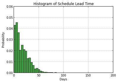
Now let’s make the bars white and plot background grey so we can start to see how to reference plot parts and modify them. This takes a while to learn and I make heavy use of Stack Overflow - http://stackoverflow.com/questions/14088687/python-changing-plot-background-color-in-matplotlib. The matplotlib hist() documentation is essential. A useful demo is included in the matplotlib examples area.
The pyplot.hist() function actually returns a tuple (n, bins, patches) where n is an array of y values, bins is an array of left bin edges on x-axis, and patches is a list of Patch objects (the bars in this case). By creating histogram and capturing the return values, we can make it easier to make changes to the graph. In addition, notice that we are saving the Figure and Axes objects. If we were writing code in Python script, we could iteratively update a graph with a sequence of pyplot commands since they always correspond to the current figure. However, in an IPython notebook, the reference to the current figure is lost everytime a cell is evaluated. By creating the variables fig and ax below, we can get around this problem. Remember, we can still create a plot with a sequence of pyplot commands as long as we do it all within one cell (just as we did above with the first histogram).
fig1 = plt.figure()
ax1 = fig1.add_subplot(1,1,1)
n, bins, patches = plt.hist(sched_df['ScheduledDaysInAdvance'], 50, normed=1, facecolor='grey', alpha=0.75)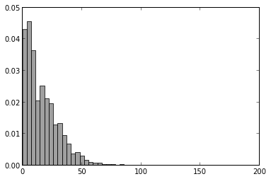
Now let’s change the bars to white and the plot area background to a light grey. For both, we will be setting a facecolor property. For the bars it will be the facecolor of the Patch objects in the patches variable and for the plot area background it will be the facecolor of the Axes object associated with this plot. So, plots are housed inside figures. A figure could contain multiple subplots (more on this soon). Each plot contains an Axes object that knows all about the axes of the plot. Time spent perusing examples and checking the documentation at the matplotlib site is time well spent if you want to learn matplotlib.
ax1.patch.set_facecolor('#F0F0F0')
ax1.set_title('Histogram of Scheduled Lead Time')
ax1.set_xlabel('Days')
ax1.set_ylabel('Probability')
ax1.grid(True, color='k')
[axp.set_facecolor('white') for axp in ax1.patches] # Seems like there should be a simpler way. Of course, it's easy to just rerun the plt.hist() with the desired color.
                                                   # However, this fine level of control makes it possible to set individual
                                                   # bar colors based on some condition. In fact, when you originally create the histogram and are specifying the
                                                   # color property you can actually set color=[<some list>] where the list contains the colors of each bar. In the
                                                   # process of generating the color list you could do all kinds of logical tests to pick the color of each bar.
display(fig1)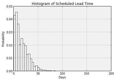
Admittedly, matplotlib can be tricky to work with because of it’s very detailed API. The pandas project provides some higher level wrapper functions to matplotlib to make it a little easier to create standard plots. This is an area that pandas is actively working to expand. Let’s recreate the first histogram with pandas and overlay a density plot on it as well. Let’s also truncate the x-axis at 100 so we can see the details a little better.
sched_df['ScheduledDaysInAdvance'].hist(bins=50, color='k', alpha=0.3, normed=True)
sched_df['ScheduledDaysInAdvance'].plot(kind='kde', style='k--', xlim=[0,100], title='Histo of Sched Lead Time (using pandas)')
<matplotlib.axes.AxesSubplot at 0x6a6a0d0>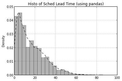
We’ll start wiht a basic box plot of lead time grouped by military status. The matplotlib boxplot demo and more advanced demoare quite helpful. In particular, we see that stacked box plots are possible by passing in a list of data vectors to be summarized. So, we could do the group by data shaping to create the list to pass in to matplotlib boxplot() function. Seems like a job for pandas.
bp = sched_df.boxplot(column='ScheduledDaysInAdvance', by='InsuranceStatus')
fig2 = gcf() # 'g'et 'c'urrent 'f'igure so we can use it later
ax2 = gca()  # 'g'et 'c'urrent 'a'xes so we can use it later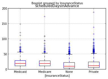
Let’s try rotating x-axis labels. Much searching and trying leads to learning how to set X-axis label rotation. It’s easier if you are creating the plot rather than modifying and existing plot.
labels = ax2.get_xticklabels()
for label in labels:
    label.set_rotation(90)
display(fig2)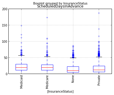
Still hard to read, let’s recreate the boxplot as a horizontally oriented set of plots.
bp = sched_df.boxplot(column='ScheduledDaysInAdvance', by='InsuranceStatus', vert=False)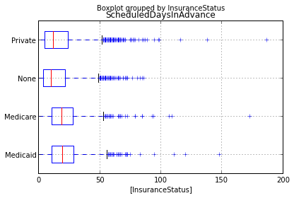
Everything we’ve done so far (except for the box plots) has not considered any of the dimensions (factors, group by fields, etc.). Pandas is well suited for grouping and aggregation. We’ll do means and 95th percentiles of ScheduledDaysInAdvance by Urgency.
Start by creating a GroupBy object.
sched_df_grp1 = sched_df.groupby(['Urgency'])Now we can use it to compute whatever summary stats we’d like.
sched_df_grp1['ScheduledDaysInAdvance'].mean()Urgency
Emergency 2.171875
FastTrack 18.642857
Routine 17.465120
Urgent 2.520194
Name: ScheduledDaysInAdvancesched_df_grp1['ScheduledDaysInAdvance'].quantile(0.95)Urgency
Emergency 4.00
FastTrack 79.75
Routine 44.00
Urgent 4.00Now group by Urgency and InsStatus and recompute the summary statistics.
sched_df_grp2 = sched_df.groupby(['Urgency','InsuranceStatus'])
sched_df_grp2['ScheduledDaysInAdvance'].mean()
Urgency InsuranceStatus
Emergency Medicaid 0.500000
Medicare 2.166667
None 1.880000
Private 2.317919
FastTrack Medicaid 148.000000
None 4.500000
Private 15.400000
Routine Medicaid 22.535554
Medicare 21.785600
None 15.945669
Private 17.047674
Urgent Medicaid 2.466667
Medicare 2.240000
None 2.741176
Private 2.441281
Name: ScheduledDaysInAdvancesched_df_grp2['ScheduledDaysInAdvance'].quantile(0.95)Urgency InsuranceStatus
Emergency Medicaid 0.95
Medicare 4.25
None 4.00
Private 4.00
FastTrack Medicaid 148.00
None 8.30
Private 39.40
Routine Medicaid 51.00
Medicare 47.00
None 42.00
Private 43.00
Urgent Medicaid 4.55
Medicare 4.00
None 5.00
Private 4.00Let’s just see how easy it is do a matrix of histograms - something that is no fun at all in Excel.
sched_df['ScheduledDaysInAdvance'].hist(bins=50, color='k', alpha=0.3, normed=True, by=sched_df['Urgency'])array([[<matplotlib.axes.AxesSubplot object at 0x07300E50>,
<matplotlib.axes.AxesSubplot object at 0x0923B510>],
[<matplotlib.axes.AxesSubplot object at 0x08C78E10>,
<matplotlib.axes.AxesSubplot object at 0x0957A4D0>]], dtype=object)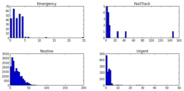
The output of the hist() function with the by keyword is an array of lists of AxesSubplotObjects. Each row of the array contains a list with two elements each. If you don’t want to suppress that Out[] message above the graph, just end the In[] line with a ;.
It looks like a pandas bug in that the histogram properties (such as color) specified aren’t having any effect. Perhaps they can be changed after the plotting. Something to explore later.
You can find the data and the .ipynb file in my hselab-tutorials github repo. Clone or download a zip.
Check out the IPython doc on the notebook format to learn all about working with IPython notebooks. A few highlights include:
.ipynb extension..py file with a File|Download As… and setting the download filetype to py..py file, you can open it as a notebook file by dragging and dropping the file into the notebook dashboard file list area. See the doc link above for the details on how to comment your Python file so that this works well.