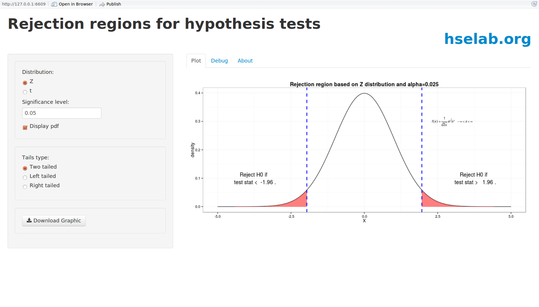
This is my first RStudio Shiny application. I wanted to learn Shiny, a way to make R based interactive web based apps, and at the same time produce something at least a little useful. While creating a solution guide for a hypothesis testing assignment I had assigned in my statistics class, I realized it was a pain to create little plots showing rejection regions for two sample tests on the mean (based either on Z or t distribution). Hmm, seemed like a good candidate for a Shiny app. The user can specify the distribution, the significance level, which tails to show, and (eventually) some style related things like colors. The resulting plot can be downloaded to a PNG file. I then inserted the file into my homework solution guide. While there isn't a whole lot of code needed for this app, there were numerous "gotchas" and much trial and error. I am super grateful to the folks at the Scenarios Network for Alaska & Arctic Planning who have created numerous Shiny applications and tutorials and have shared them via their blog. I learned much from their examples and "borrowed" many ideas from their series of introductory tutorials on plotting random variable distributions . Hopefully this is the first of many Shiny apps for me. This post is not a Shiny tutorial. If you have no experience with Shiny, start at http://shiny.rstudio.com/tutorial/.
You can get the source code at my github repo for R Shiny apps. The source code is pretty heavily commented and includes the various trials and tribulations I had in getting this to work.