import pandas as pd
import hillmaker as hmAnalyzing bike usage by time of day and day of week
Using hillmaker for occupancy analysis of cycle share data
python
hillmaker
occupancy analysis
pandas
matplotlib
bikeshare
The bike use plots
Four different plots are created using matplotlib to explore time of day and day of week patterns in bike users by different user types.
# Create a Figure and Axes object
#--------------------------------

fig1 = plt.figure()
ax1 = fig1.add_subplot(1,1,1)

# Create a list to use as the X-axis values
#-------------------------------------------

timestamps = pd.date_range('01/05/2015', periods=168, freq='60Min').tolist()

major_tick_locations = pd.date_range('01/05/2015 12:00:00', periods=7, freq='24H').tolist()
minor_tick_locations = pd.date_range('01/05/2015 06:00:00', periods=28, freq='6H').tolist()

# Specify the mean occupancy and percentile values
#-----------------------------------------------------------
mean_occ = total_df['mean']
pctile_occ = total_df['p95']

# Styling of bars, lines, plot area
#-----------------------------------

# Style the bars for mean occupancy
bar_color = 'grey'
bar_opacity = 0.8

# Style the line for the occupancy percentile
pctile_line_style = '-'
pctile_color = 'black'
pctile_line_width = 1

# Set the background color of the plot. Argument is a string float in
# (0,1) representing greyscale (0=black, 1=white)
ax1.patch.set_facecolor('0.95')

# Can also use color names or hex color codes
# ax2.patch.set_facecolor('yellow')
# ax2.patch.set_facecolor('#FFFFAD')


# Add data to the plot
#--------------------------

# Mean occupancy as bars - here's the GOTCHA involving the bar width
ax1.bar(timestamps, mean_occ, color=bar_color, alpha=bar_opacity, label='Mean # bikes in use', width=1/24)

# Some percentile as a line
ax1.plot(timestamps, pctile_occ, linestyle=pctile_line_style, linewidth=pctile_line_width, color=pctile_color, \
         label='95th %ile # bikes in use')


# Create formatter variables
dayofweek_formatter = DateFormatter('%a')
qtrday_formatter = DateFormatter('%H')

# Set the tick locations for the axes object

ax1.set_xticks(major_tick_locations)
ax1.set_xticks(minor_tick_locations, minor=True)

# Format the tick labels
ax1.xaxis.set_major_formatter(dayofweek_formatter)
ax1.xaxis.set_minor_formatter(qtrday_formatter)

# Slide the major tick labels underneath the default location by 20 points
ax1.tick_params(which='major', pad=20)

# Add other chart elements
#-------------------------

# Set plot and axis titles
fig1.suptitle('Bike Usage by Time of Day and Day of Week', fontsize=28, fontweight='bold')
ax1.set_title('All user types', fontsize=24)
ax1.set_xlabel('Time Bin of Week', fontsize=14)
ax1.set_ylabel('# Bikes in use', fontsize=14)

# Gridlines
ax1.grid(True, color='k')

# Legend
leg = ax1.legend(loc='best', frameon=True, fontsize=20)
leg.get_frame().set_facecolor('white')

# Plot size
fig1.set_size_inches(16,12)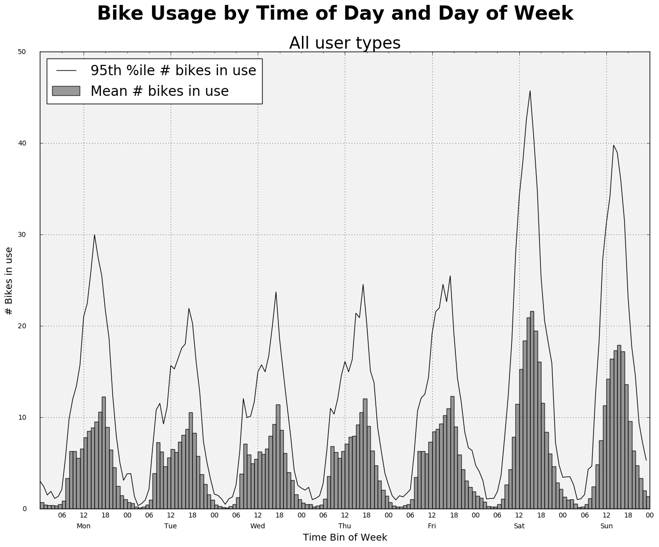
Weekdays only and weekends only
Now we’ll create separate plots for weekdays and weekends and we’ll stack the bars based on user type.
# Gather various series to use in the plots

shortterm_df = occ_df.loc['Short-Term Pass Holder']
member_df = occ_df.loc['Member']

# Remember that weekdays are number 0 to 6 in Python with 0=Monday

wkday_mean_shortterm_occ = shortterm_df.loc[0:4]['mean']
wkday_mean_member_occ = member_df.loc[0:4]['mean']
wkday_p95_total_occ = total_df.loc[0:4]['p95']
wkday_p80_total_occ = total_df.loc[0:4]['p80']

wkend_mean_shortterm_occ = shortterm_df.loc[5:6]['mean']
wkend_mean_member_occ = member_df.loc[5:6]['mean']
wkend_p95_total_occ = total_df.loc[5:6]['p95']
wkend_p80_total_occ = total_df.loc[5:6]['p80']
# Create a Figure and Axes object
#--------------------------------
fig2 = plt.figure()
ax2 = fig2.add_subplot(1,1,1)
# Create a list to use as the X-axis values
#-------------------------------------------
timestamps = pd.date_range('01/05/2015', periods=120, freq='60Min').tolist()
major_tick_locations = pd.date_range('01/05/2015 12:00:00', periods=5, freq='24H').tolist()
minor_tick_locations = pd.date_range('01/05/2015 06:00:00', periods=20, freq='6H').tolist()
# Styling of bars, lines, plot area
#-----------------------------------
# Style the bars for mean occupancy
bar_color_member = 'grey'
bar_color_shortterm = 'green'
bar_opacity = 0.8
# Style the line for the occupancy percentile
pctile95_line_style = '-'
pctile80_line_style = '--'
pctile_color = 'black'
pctile_line_width = 0.75
# Set the background color of the plot. Argument is a string float in
# (0,1) representing greyscale (0=black, 1=white)
ax2.patch.set_facecolor('0.95')
# Can also use color names or hex color codes
# ax2.patch.set_facecolor('yellow')
# ax2.patch.set_facecolor('#FFFFAD')
# Add data to the plot
#--------------------------
label_member = 'Mean # bikes in use - Members'
label_shortterm = 'Mean # bikes in use - Short-Term Pass'
# Mean occupancy as bars
ax2.bar(timestamps, wkday_mean_member_occ, color=bar_color_member, alpha=bar_opacity, label=label_member, width=1/24)
ax2.bar(timestamps, wkday_mean_shortterm_occ, bottom=wkday_mean_member_occ, color=bar_color_shortterm,
alpha=bar_opacity, label=label_shortterm, width=1/24)
# Percentiles as lines
ax2.plot(timestamps, wkday_p95_total_occ, linestyle=pctile95_line_style, linewidth=pctile_line_width, color=pctile_color, \
label='95th %ile # bikes in use')
ax2.plot(timestamps, wkday_p80_total_occ, linestyle=pctile80_line_style, linewidth=pctile_line_width, color=pctile_color, \
label='80th %ile # bikes in use')
# Create formatter variables
dayofweek_formatter = DateFormatter('%a')
qtrday_formatter = DateFormatter('%H')
# Set the tick locations for the axes object
ax2.set_xticks(major_tick_locations)
ax2.set_xticks(minor_tick_locations, minor=True)
# Format the tick labels
ax2.xaxis.set_major_formatter(dayofweek_formatter)
ax2.xaxis.set_minor_formatter(qtrday_formatter)
# Slide the major tick labels underneath the default location by 20 points
ax2.tick_params(which='major', pad=20)
# Add other chart elements
#-------------------------
# Set plot and axis titles
ax2.set_title('Bike Usage by Time of Day - Weekdays', fontsize=16)
ax2.set_xlabel('Time Bin of Week', fontsize=14)
ax2.set_ylabel('# Bikes in use', fontsize=14)
# Gridlines
ax2.grid(True, color='grey')
# Legend
leg = ax2.legend(loc='best', frameon=True, fontsize=10)
leg.get_frame().set_facecolor('white')
# Plot size
fig2.set_size_inches(8,6)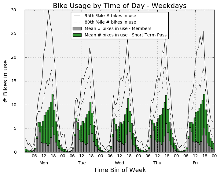
# Create a Figure and Axes object
#--------------------------------

fig3 = plt.figure()
ax3 = fig3.add_subplot(1,1,1)

# Create a list to use as the X-axis values
#-------------------------------------------

timestamps = pd.date_range('01/03/2015', periods=48, freq='60Min').tolist()

major_tick_locations = pd.date_range('01/03/2015 12:00:00', periods=2, freq='24H').tolist()
minor_tick_locations = pd.date_range('01/03/2015 06:00:00', periods=8, freq='6H').tolist()


# Styling of bars, lines, plot area
#-----------------------------------

# Style the bars for mean occupancy
bar_color_member = 'grey'
bar_color_shortterm = 'green'
bar_opacity = 0.8

# Style the line for the occupancy percentile
pctile_line_style = '-'
pctile_color = 'black'
pctile_line_width = 1

# Set the background color of the plot. Argument is a string float in
# (0,1) representing greyscale (0=black, 1=white)
ax3.patch.set_facecolor('0.95')

# Can also use color names or hex color codes
# ax2.patch.set_facecolor('yellow')
# ax2.patch.set_facecolor('#FFFFAD')


# Add data to the plot
#--------------------------

label_member = 'Mean # bikes in use - Members'
label_shortterm = 'Mean # bikes in use - Short-Term Pass'

# Mean occupancy as bars
ax3.bar(timestamps, wkend_mean_member_occ, color=bar_color_member, alpha=bar_opacity, label=label_member, width=1/24)
ax3.bar(timestamps, wkend_mean_shortterm_occ, bottom=wkend_mean_member_occ, color=bar_color_shortterm,
        alpha=bar_opacity, label=label_shortterm, width=1/24)

# Some percentile aas a line
ax3.plot(timestamps, wkend_p95_total_occ, linestyle=pctile_line_style, linewidth=pctile_line_width, color=pctile_color, \
         label='95th %ile # bikes in use')


# Create formatter variables
dayofweek_formatter = DateFormatter('%a')
qtrday_formatter = DateFormatter('%H')

# Set the tick locations for the axes object

ax3.set_xticks(major_tick_locations)
ax3.set_xticks(minor_tick_locations, minor=True)

# Format the tick labels
ax3.xaxis.set_major_formatter(dayofweek_formatter)
ax3.xaxis.set_minor_formatter(qtrday_formatter)

# Slide the major tick labels underneath the default location by 20 points
ax3.tick_params(which='major', pad=20)

# Add other chart elements
#-------------------------

# Set plot and axis titles

ax3.set_title('Bikes Usage by Time of Day - Weekends', fontsize=16)
ax3.set_xlabel('Time Bin of Week', fontsize=14)
ax3.set_ylabel('# Bikes in use', fontsize=14)

# Gridlines
ax3.grid(True, color='k')

# Legend
leg = ax3.legend(loc='upper right', frameon=True, fontsize=10)
leg.get_frame().set_facecolor('white')

# Plot size
fig3.set_size_inches(8,6)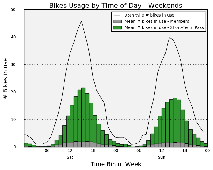
# Create a Figure and Axes object
#--------------------------------

fig4 = plt.figure()
ax4 = fig4.add_subplot(1,1,1)

# Create a list to use as the X-axis values
#-------------------------------------------

timestamps = pd.date_range('01/05/2015', periods=168, freq='60Min').tolist()

major_tick_locations = pd.date_range('01/05/2015 12:00:00', periods=7, freq='24H').tolist()
minor_tick_locations = pd.date_range('01/05/2015 06:00:00', periods=28, freq='6H').tolist()

# Specify the mean occupancy and percentile values
#-----------------------------------------------------------
mean_shortterm_occ = occ_df.loc['Short-Term Pass Holder']['mean']
mean_member_occ = occ_df.loc['Member']['mean']
p95_total_occ = occ_df.loc['Total']['p95']

# Styling of bars, lines, plot area
#-----------------------------------

# Style the bars for mean occupancy
bar_color_member = 'grey'
bar_color_shortterm = 'green'
bar_opacity = 0.8

# Style the line for the occupancy percentile
pctile_line_style = '-'
pctile_color = 'black'
pctile_line_width = 1

# Set the background color of the plot. Argument is a string float in
# (0,1) representing greyscale (0=black, 1=white)
ax4.patch.set_facecolor('0.95')

# Can also use color names or hex color codes
# ax2.patch.set_facecolor('yellow')
# ax2.patch.set_facecolor('#FFFFAD')


# Add data to the plot
#--------------------------

label_member = 'Mean # bikes in use - Members'
label_shortterm = 'Mean # bikes in use - Short-Term Pass'

# Mean occupancy as bars
ax4.bar(timestamps, mean_member_occ, color=bar_color_member, alpha=bar_opacity, label=label_member, width=1/24)
ax4.bar(timestamps, mean_shortterm_occ, bottom=mean_member_occ, color=bar_color_shortterm,
        alpha=bar_opacity, label=label_shortterm, width=1/24)


# Some percentile aas a line
ax4.plot(timestamps, p95_total_occ, linestyle=pctile_line_style, linewidth=pctile_line_width, color=pctile_color, \
         label='95th %ile total # bikes in use')


# Create formatter variables
dayofweek_formatter = DateFormatter('%a')
qtrday_formatter = DateFormatter('%H')

# Set the tick locations for the axes object

ax4.set_xticks(major_tick_locations)
ax4.set_xticks(minor_tick_locations, minor=True)

# Format the tick labels
ax4.xaxis.set_major_formatter(dayofweek_formatter)
ax4.xaxis.set_minor_formatter(qtrday_formatter)

# Slide the major tick labels underneath the default location by 20 points
ax4.tick_params(which='major', pad=20)

# Add other chart elements
#-------------------------

# Set plot and axis titles
fig4.suptitle('Bike Usage by Time of Day and Day of Week', fontsize=24, fontweight='bold')
ax4.set_title('All user types', fontsize=20)
ax4.set_xlabel('Time Bin of Week', fontsize=14)
ax4.set_ylabel('# Bikes in use', fontsize=14)

# Gridlines
ax4.grid(True, color='k')

# Legend
leg = ax4.legend(loc='best', frameon=True, fontsize=16)
leg.get_frame().set_facecolor('white')

# Plot size
fig4.set_size_inches(12,9)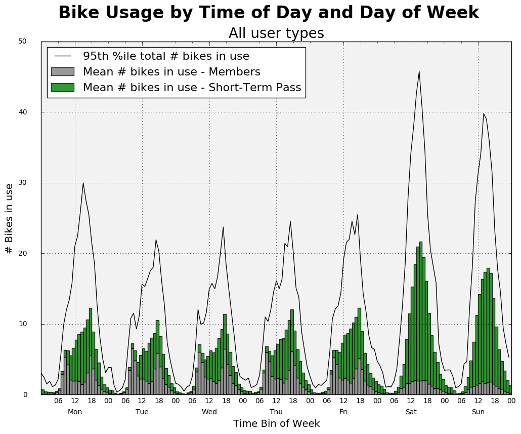
Lots more we can do, but this should illustrate the basic idea.
Reuse
Citation
BibTeX citation:
@online{isken2019,
  author = {Isken, Mark},
  title = {Analyzing Bike Usage by Time of Day and Day of Week},
  date = {2019-01-01},
  url = {https://bitsofanalytics.org/posts/basic-usage-cycleshare/basic_usage_cycleshare.html},
  langid = {en}
}
For attribution, please cite this work as:
Isken, Mark. 2019. “Analyzing Bike Usage by Time of Day and Day of
Week.” January 1. https://bitsofanalytics.org/posts/basic-usage-cycleshare/basic_usage_cycleshare.html.